Something else new for you all to see^.^
Was trying some new filters, techniques, and whatnot.....so tell me how it turn out k!
Thank ya Maru for the render!
AnimeGalleries [dot] Net | AnimeWallpapers [dot] Com | AnimeLyrics [dot] Com | AnimePedia [dot] Com | AnimeGlobe [dot] Com |
Here is a set for Clawdia. She is a HUGE fan of the Kagamine twins from Vocaloid and wanted a set to represent that^.^ Plus I love them too so I couldn't resist making another set of the adorables*squee*
Here it is!
Here are the avie versions:
---
Annndd...here is the tag versions:
O______O
Fantastic! I really love the way you cropped the image different times and added them into the backround. Gives it a very unique and pretty look. And the avis are adorable~ <33
Kagamines rule, I'm so glad I found someone who's as Super Scary Obsessed In Love with them as I am. ^^ And did I mention I'm getting chibi figurines of them soon?
BUT I DIGRESS. You are love, and so's the set~!
Jang Hyunseung is perfect in everyway. SO-1 FIGHTING.
Iceflower made this dazzling signature.
What?! I envy that you get chibis ;_; Post images when you get the time!
Okay, now I've got some icons to post.....since you can't have a set without having an avie so....I had to brush up on my avi game ^.^
Here they go
---
NO! You can not use these....but you can request one if you like! But, I'm curious to see if anyone can name the movie they're from hehehe
nice work and good color combination and the flow of it is great
omg! <33333333 BLADE TRINITY!
The icons/avatars capture the pure coolness of the characters totally :3
Maybe on the Hannibal King avi, make the text a little clearer? Atm it's a bit hard to read, but I like them all. They've got content and they don't look plain. Also, I love the Blade films... especially trinity... because it has King in it :3
I was debating weither or not to put text on that one. Does it look better with no text? Hm, since you did guess what movie.....I'll cave in and make you a BT icon if you like Dynamite^.^
Now, on to my current pressing issue....what is this tag missing?!:
I know it looks cool like that but....it looks so plain to me! ;_;
Atleast you thought so Kmac^.^; I liked that version too.....but just in case here is another one. Some friends on my other forum said that would like to see some of the sword and the swordsman that's holding it lol
So here is their needs satisfied:
How you like this version with dem apples^.^
Oh, and I almost forgot, here is Hannibal King without the little ring flare thingies and the one without the text:
-
Interesting use of image. It really is just an overall strange composition. I would only suggest as a change trying to clean up the overall result a little more and removing the white lines going around the guy. They seem a bit unnecessary.
Hm, will do Serated. I didn't know what looked good for the overrall pic so I just went with something. Was going out of my comfort zone from anime characters again lol^_^;
So, here's an update with two new signatures that I've been burning on. One was an entry in the SOTW and the other was just something I wanted to make with a render I wanted to mess with:
First one is great just make the border a lot smaller because it's huge on it. O_O The second and third one looks so similar and bland to me, their so empty and looks so similar but I llike your other sigs.:3
人類は調和したのか?VY2V3 = Me | Kagamine Len Act 1 = You
Nice to see you using your SoTW 52 tag. :'D
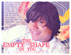
I would have had my vote swing your way but my overall criticism of the tag was it seems too simple. And the text isn't the best I've seen. Not sure that C4D (if not it looks like it) that spans from her neck to to the mid right side is needed at all.
That being said, the colours and the flower effects are executed amazingly well, I THINK you've used a pale blue and light yellow gradient map to pull out some colours but hey whatever you did worked. Everythings placed where it should be picture wise. So good job keep it up!
Lex Luger R.I.P
¦ Sexy Logo By Me ¦ R A R E R E N D E R ¦ Tutorial requests and PSD Requests open ¦ Tag Thread
Hm, I've been trying to see if simple worked for my style for awhile now....guess it doesn't? I didn't want it to look TOO busy. Ah, I had the hardest time choosing a text for it....and it STILL didn't come out right; I'm wondering if no text at all will work. Oh it's a C4D (someone noticed it finally hahahaha) and you're probably right on that too....I just threw it in there to give it some light.
The flowers are from the render itself before I resized it to use as the main focal and it came out pretty neat! Gradient colors? You were REALLY close but I used a pale purple (light lavender) and light yellow gradient from the flower colors lol.
That being said.....let me post another signature for today ^_^:
There are currently 1 users browsing this thread. (0 members and 1 guests)
Bookmarks