


How does mine lack variety?Originally Posted by Light Buster

 AnimeGalleries [dot] Net AnimeGalleries [dot] Net |  AnimeWallpapers [dot] Com AnimeWallpapers [dot] Com |  AnimePedia [dot] Com AnimePedia [dot] Com |  AnimeGlobe [dot] Com AnimeGlobe [dot] Com |
| AnimeGalleries [dot] Net | AnimeWallpapers [dot] Com | AnimePedia [dot] Com | AnimeGlobe [dot] Com |


How does mine lack variety?


Really obnoxious text. Linking to a site that is worse. All it is is a really poor quality image with 2 renders which I have a hard time believing you did. The avatar you can see the white leftovers from when you appeared to try to extract it. Not clean.
0/10 as well.. Give it up.
今日...明日...永遠に...
Interested in Pop-Up Cafes in Japan? Dango News is the place for you.
Dango News | Twitter | Facebook | Instagram
 Light Buster thanked for this post


10/10
Well you know, I really like your set so much. c:

10/10.
Nice colors and pic. I like the text as well :3
[set by blueangel06661]♥


10/10
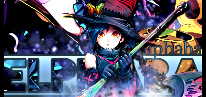
A super cute witch set. What's not to like?
My thanks to Xey Oiz for the awesome new set.
"Screw being normal and be awesome instead!"
I can tell you that I did NOT make those images, they are graphics from a SWF game I did NOT make. I simply extracted them. They ALREADY had transparency (alpha channel) in the images, making extraction VERY EASY. Of course they are not my images (I didn't draw them), but they ARE my rips (I used the appropriate software to extract them myself).
I'll skip the guy in front of me and rate you, @Shinn Kamiyra so your set is a 9/10. I don't like the choice of text so much.
@Videogamer555 Get the hell out of here if you'll whine like a little girl because someone said their own opinion. And fyi, no one really care what you did. Quit whining.
Last edited by FlashD; 05-17-2011 at 07:05 AM. Reason: Let's not curse. ^_^;;


I'll give a 8/10 for the set. Though the set kinda blinded me at first, it was very unique in terms of color and blending.
WARNING: This user is wanted for unauthorized access into Ultratech archives. If you see this user in person, please contact Ultratech immediately.
[I'll do the matching sig and ava]
8/10. Nice colors and effects. I really like the blending :3
[set by blueangel06661]♥
 MisaMisaEK liked this post

Avatar & Signature.
9/10 - Nice style, I love the text and how simple and yet how very well everything works together.

I'll do the set, I'll give the signature a 7/10, I really like it but you need to show more of the character in it, the avatar is showing too much body in my opinion so it gets a 6/10. Also a message, not a single signature should be getting a 10/10. You guys are being WAY too generous, the highest almost every signature of AF should go up to is probably 8/10, blueangel seems to be doing a fantastic job at rating because she's honest. The rest of you guys should try a bit harder to give ratings. I'm pretty sure some people post here to get opinions on their works or others and if you give them a 10/10 nothing is really helping anyones works but only their feelings, I'm not trying to be mean but come on. >_>;;
Last edited by Xeyuzio; 05-17-2011 at 08:43 PM.
人類は調和したのか?VY2V3 = Me | Kagamine Len Act 1 = You
Daken. liked this post

I REALLY like your set.Probably because I suck at graphics, but even so yours is so colorful and its simple, but still done very well, which is what I like.
8/10 (10/10 imo, but considering what you just said... ;p)
Xeyuzio thanked for this post

haha, @Xey Oiz
I'll be honest with myself nao xD
Avatar:
well..since it's not really an edit..I'll just give you 5/10.. [ Only because I like the color xP ]
Signature: 2/10
Only the text are edited and it seems plain
No hard feelings,kay?
Last edited by Xanfiore; 05-18-2011 at 04:33 PM.
Xeyuzio liked this post
I'll give your avatar a 5/10 because the character could be showing more, the signature get a 6/10 because I love it so much but too much light and then it gets really dark and the red text could be closer to your name, great job!
Anyways a new set for me so that's why I posted, please rate my avatar and my signature separately. :3
人類は調和したのか?VY2V3 = Me | Kagamine Len Act 1 = You
Xanfiore thanked for this post

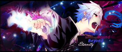
kay, so im not totally sure what the dragon is doing in the avii i can tell they must be apart of the same thing, but it looks a bit odd compared to the sig...so, im going with 5/10
but the sig looks really fun, i would have put something cool to say under it but its really fine, unfortunately i cant see what evers under it but it looks really nice 7/10 =}
Stunnin isn't a habit...it's a day job...
This is what i do in the day
So what do you do at night...?
Eat like the Megatron XD
Holy crap this is too big. 0/10
You should follow the guidelines of signature size.
I'll give you a 10/10 as I've always liked you Sigs @Seung-li ^^
It nice and colourful and the pic is nice too.
Awesome signature made by Ωmega:3
~Pizza is bae~
Avi: 6/10. Nice pic but it looks like its missing something.
Sig: 8/10. Nice pic and I love the effects and colors...very eye catching :3
[set by blueangel06661]♥
set 9/10
It's beautiful and eye catchy, with nice depth and a smooth view of the render only thing - it could use a little more c4d on the right side next to the render and fill the space
Nesh (nɛʃ) dialect adj. - sensitive to the cold
Set made by me
''Do your best, no matter how many times you fail!.''
I'll give 10/10 for sig and 9/10 for Avi
No hard feelings^^I loved your Sig,very eye-catching and lots of red.
@Avril4E ,your Avatar is cool too,except for one missing thing.....mabey.....donno what?
Awesome signature made by Ωmega:3
~Pizza is bae~
Nesh liked this post

6.5 for the avatar and 8.5 for the sig.
-TWM-
...
Anyways I'll give your avatar a 4/10 because it lacks colour and it looks like you just added text to a regular picture although I may be wrong. The signature, non gif, gets a 6/10. There is way too much light in his eye glasses thing and the black background with colourful sparks looks weird, also you need to add more focus to the character, try sharpening him or something.
人類は調和したのか?VY2V3 = Me | Kagamine Len Act 1 = You
Please note that the word "subject" in this review refers to the dragon character displayed in the set. Also this review does not include the signature with the filename "Xeycopy.png" (or the "Snow" signature) otherwise the overall rating would be lowered due to questionable need of having 2 sigs in a set. This review therefore is based on the "Dragon" set only (i.e the avi and the bottom sig).
Additional Notes: Below are the URLs for the images of the rated set, which may be useful should the above set be replaced by the user:
> Avatar: http://www.animeforum.com/customavat...r247698_22.gif
> Signature: http://fc03.deviantart.net/fs71/f/20...iz-d3go0pk.png
Avatar/Sig/Set
For:
> Richly detailed image with an attractive and well focused subject
> Winning layout and presentation
> Font complements images well and is placed just right
> Flawless looking image quality (No sharpness or artefact issues whatsoever
Against:
> Flow from avi to sig is slightly interrupted by varied border effects, mostly in terms of their differing thickness (I'd suggest using a matching border for the sig here)
> Avi doesn't add much value to the set given that it simply appears as a crop of the sig - however, in itself it's well presented and cropped just right
Avatar rating: 7/10
Signature rating: 8/10
Set rating: 8/10
Verdict and Overall Rating: The image itself looks beautiful with overall presentation of the set being a non-issue - but it's difficult to make out exactly how much work you've actually put into making the set (I believe credit for technical skills should be considered here, at least for the sake of regarding the work that other members put into making their sets). Apart from the overlayed text and what appears to be some nice brush effects around it, there seems to be little evidence of applied technical skills (notably a lack of blending and use of effects, although I could be wrong...). But that's having said, perhaps such a rich looking and well defined image doesn't really need interventions such as these, since it does a lot right as it is, and could easily be spoiled with the addition of blends and effects. Questions of applied technical skill aside however, this is a gorgeous looking set nonetheless that pretty much answers all the wishes of the viewer: the dragon subject is well presented, the image is clean and of flawless quality, the text is well placed and stands out just enough to complement the subject without shrinking it's significance. Even if there's not much in the way of additional technical skill applied here, you deserve much credit for sound judgement of what makes a winning set!
PS: I'd be happy to revise my rating if further information is given on how the set was made.
Last edited by .:neuko:.; 05-20-2011 at 05:50 PM.
I don't use brushes.The only brushes I use are splatter brushes because I don't know how to replicate it using the path tool without taking like 120384390257289 hours, anyways the only brush used in this signature was the splatter in the text. ;;>_>
Anyways your rating.
>Avatar: http://www.animeforum.com/customavat...r245915_34.gif
For:
>Okay, the effects on the beutiflies wings are nices, the light even spreads around the image.
Against:
>Overally it could be better, the background just isn't doing it for me, fix it or something.
Avatar Rating: 6/10
Verdict and Overall Rating: The avatar is nice and the lighting is very well made. There isn't really much to comment on since it's just an avatar but the background should go, it just looks like a purple and black avatar.
Last edited by Xeyuzio; 05-20-2011 at 06:28 PM.
人類は調和したのか?VY2V3 = Me | Kagamine Len Act 1 = You
.:neuko:. thanked for this post
The general point I was making is that it's difficult to tell how much work you put into making your set, and therefore it's difficult to rate your set accurately. When rating a set I think it's only fair to consider the effort all members put into making theirs - although I do bear in mind the efficiency of the very techniques they apply; thus I wouldn't necessarily give a set a higher rating just because it has used more (or more complex) techniques, especially if the end effect is no stronger than a set that has used few. However, to rate a set solely on the basis of its effect at face value is to undermine the technical efforts that other members might have applied to make theirs.
Here's a probable scenario that you should perhaps consider: 2 sets to be rated match each other in terms of their effect on the viewer, and both have equally good quality stocks; except one of them has required the use of several tools, blends, custom brushes, masks, alpha channels, and so on, and the other just a simple crop of an image that's already optimised in terms of all attributes desired by the viewer. Would it be fair to give the 2 sets the same rating?
But I do agree with you on one thing: there's certainly no point in doing something the hard way when there's an option to do the same thing in a fraction of the time for the same result.
As for my avi... well any rating past 4/10 is generous as far as I'm concerned, XD because in terms of what I'm capable of I personally wouldn't give it any more than 3/10, and it's not a patch on the last (Midna) avi I made, where I really went to town on the effects and lighting. Since I made the Neukifly avi I can see every technical and conceptual flaw in it, perhaps more than most. And in addition to your comments which I'd agree to, I can see that it's also over-sharpened, the stock is of poor quality (since it was a bad extraction to begin with), and apart from the glow effect, it's basically identical to the original image but for a change of colour palette. I could add in my defence the fact that it was just a quick knock-up and stop-gap of an avi, since I was getting so bored with the last one. But I make no excuses... I don't expect the rating of my avi to be adjusted just because of the circumstances under which it was made.
Anyhoo for the sake of the rules of this thread I'll once again rate your set in the same way as before, although instead of writing all that again I think I'll just put a link to my original post here. XD
There are currently 1 users browsing this thread. (0 members and 1 guests)
 Posting Permissions


Bookmarks