


man, I haven't update in forever. I need to get on that.
 AnimeGalleries [dot] Net AnimeGalleries [dot] Net |  AnimeWallpapers [dot] Com AnimeWallpapers [dot] Com |  AnimePedia [dot] Com AnimePedia [dot] Com |  AnimeGlobe [dot] Com AnimeGlobe [dot] Com |
| AnimeGalleries [dot] Net | AnimeWallpapers [dot] Com | AnimePedia [dot] Com | AnimeGlobe [dot] Com |


man, I haven't update in forever. I need to get on that.
Last edited by Zenister; 03-15-2011 at 07:01 PM.
love is a matter of chemistry, but sex is a matter of physics
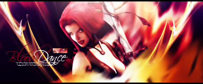
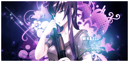
Here's some old SOTW/BOTM stuff and other things:
love is a matter of chemistry, but sex is a matter of physics
Zenister, I completely forgot you had a thread you should definitely post more often. Anyways the one I really want to comment on is the 4th one because it's simply amazing, the blue goes perfect and the text is outstandingly amazing, I expect no less from one of the greatest graphic designers on AF. I can't wait to see more of your work!
人類は調和したのか?VY2V3 = Me | Kagamine Len Act 1 = You
Thanks, dude! That's really awesome of you to say. =]
I just always forget about threads like this, but I'll def try to post more often.
love is a matter of chemistry, but sex is a matter of physics


http://i199.photobucket.com/albums/a...supersharp.png
I love the colors in that signature, but I think it looks a little over sharpened in some places.
I titled it "super sharp" for a reason, ha ha. Thanks for the comment!
I made this yesterday using a friend of mine's artwork. Her Original Character is named Alastor.

love is a matter of chemistry, but sex is a matter of physics


You are getting into C4Ds, nice. A couple prop tips.
First of all, never, ever, make them obvious. I have large collections of C4Ds amassed over years of searching, and at so in some cases I can tell what C4D you are using; I can in some cases in go so far as to know the exact file name of them. So you should add more variety. Like, by the way I am looking at it, here's what you did to the most recent signature:
Layer 1: Background Stock, heavily blurred
Layer 2: C4D, heavily blurred
Layer 3: Effect C4d, Set to Screen or Linear Dodge
Layer 4: Extracted Stock Image
Layer 5: Another C4D
Layer 6: Some sort of Adjustment layer to boost the Red color
Layer 7: Text
More or less, I'm generalizing of course. But long story short, you should add more variety. In some of my tags, I use anywhere from 6-10 C4Ds so its far more difficult to tell what I did, I think that might help you too. Using a larger variety of C4Ds could also help you add more contrast to your colors.
Everything else about the tag is basically fine, but at this point you should start looking into making the tags far more complicated than they really are.
I don't think knowing what c4d I used is that big of a deal, but I can see how it might be detrimental. Does it ruin the magic for you or something?
Everything else is solid advice. The background isn't a stock, though. It's smudging. Also, the 'c4ds' in the background are actually brushes that I layered and added beveling to, to make them look more 3D.
Front part is def a c4d though, and the fractal was set to screen because I use Gimp. You're spot on there.
Thanks for the advice, brorrito.I'll look into doing that for my BOTM entry.
Last edited by Zenister; 03-18-2011 at 04:13 PM.
love is a matter of chemistry, but sex is a matter of physics
love is a matter of chemistry, but sex is a matter of physics
 Elphaba liked this post
I like the first one the best but it needs a little something to complete it, the blue lighting looks amazing and the C4D's seem correctly placed, all it needs is a little text and you're good.
The second one could do without the lighting in her back, the typography could have been better. Also good placement with the C4D's.
I don't really like the last one, that big black spot is really distracting and the render seems a bit small, what I really like in this one is the effects on the right side, they're fantastic.
Overall I like your style but you can always try something new other then C4D's. =P
人類は調和したのか?VY2V3 = Me | Kagamine Len Act 1 = You
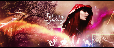
Goal for next few weeks: work on text. It's about damn time.
Step one.
By the way, there are no c4ds in that, and I used brushes and clipping masks for the first time in months. If one person says it looks exactly like all my other stuff -- it doesn't, you're a silly goose -- I'm going to be unhappy.
After that I want to start doing more creative things like these pieces I made yesterday:
They both suck composition wise, but bear with me, this is about trying text out.
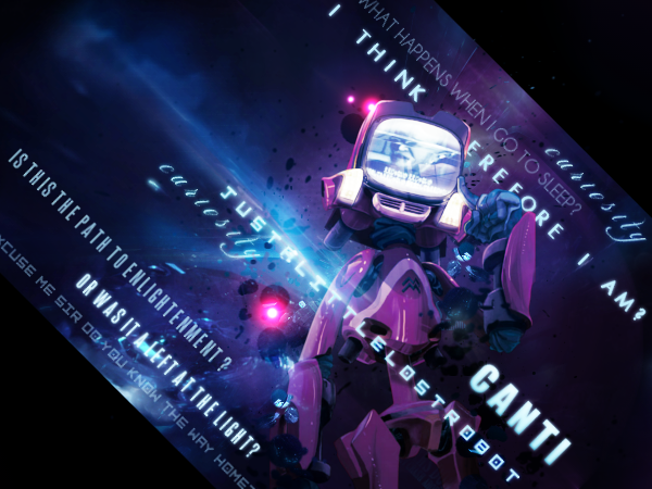
Also, does anyone know why the perspective tool like to make my text look blurry like this?
I think it's the font face, but I could be wrong.
Last edited by Zenister; 06-25-2011 at 03:48 PM.
love is a matter of chemistry, but sex is a matter of physics


What to say what say... I love the first one, it's amazing but the cursive-ish font doesn't really fit with it. Also the little red ball by his head, that layer should be placed below the render layer, it doesn't look well there. The second one has a fantastic light source and the text is well done, great job on that one. I don't really like the last two but on the perspective tool it's going to get blurry and the right side because that side was enlarged which naturally makes things blurry, that's why the other side isn't blurry. ~Xey
Thanks for the compliments, bro! I appreciate it. =]
Hm, I'll have to play with it some. It's definitely worse with serif fonts, I've noticed. Thanks for the advice.
love is a matter of chemistry, but sex is a matter of physics
Lol you've gotten a lot better. I especially like the depth you got going on the first sig on post #34. Lovely colors as well, even though I disagree with Zoi. I think it looks wonderful as it it right now and text would take away from the composition unless you did something amazing with it.
Anyway, I like your latest stuff, hope to see more.
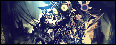
|Power of The Mask|
I appreciate that so much because I'm a huge fan of your style. Thanks. =]
love is a matter of chemistry, but sex is a matter of physics
I'm going to have a very exciting post for you guys in about a week, but until then it dawned on me that I've never posted any of my avatars or my tutorial for making them.
Avatars:

Last edited by Zenister; 07-05-2011 at 04:42 PM.
love is a matter of chemistry, but sex is a matter of physics
Now that SOTW has ended, I can post this:
Thanks for all the wonderful comments you guys made while voting! I blushed repeatedly.
Also, here's my battle of the month entry:
love is a matter of chemistry, but sex is a matter of physics


I'm certainly loving you're typography in the last two. They're both fantastic sigs, and probably some of my Favorites from you (the "Death/Color" one is still my favorite). I can't really point out anything in particular I dislike on either of them (without being a super nit-picky nerd). Your style is like...everywhere; Out of everyone that usually enters sotw I have the hardest time identifying your sigs, so I can't wait to see what you pull out next!
Your Signature's are Getting better,
You have good composition, The Render is Balanced by Proportion, You Are Quite Talented in
putting in the depth of the tag keep it up, Use of colors are okay, improve your lighting with most of the tags.
i like your avatars too clean and professional~ Good luck, this dude wants to see more.
Zenister liked this post
You guys are far too kind to me.
Thank you so much for the comments.
love is a matter of chemistry, but sex is a matter of physics
New avatars. These are up for grabs if anyone wants them.
And then my past two BOTM entries:
I have to admit a serious fault of mine as a GFXer on this last piece. I completely hate it. I mean, completely. I can objectively recognize that it's not that bad, but I had a vision in my head of what I wanted, and even after working on it for seven hours, I just couldn't make that vision come to life. As a result, this entry makes me angry just to look at it.
And now for a piece that doesn't make me angry.
I'm ridiculously in love with this one, and I can't even say why.
love is a matter of chemistry, but sex is a matter of physics
Nesh liked this post


Wohow *0*..amazing pieces !! I love the avatars and the BOTM entries.
And the last one----I adore it **
The rocky texture background, the C4D, light, the text everything works perfectly.
Nesh (nɛʃ) dialect adj. - sensitive to the cold
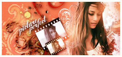
Set made by me
''Do your best, no matter how many times you fail!.''
 Zenister thanked for this post
Almost all your avatars are amazing, I wish mine weren't so bland. xD Anyways your new signatures look great, and you typography is improving quickly. The one after your "Call Me Your King" is almost as dazzling as that one itself. The girl one is intriguing but you should move the text to the right side on my opinion. FANTASTIC job as usual. <333
人類は調和したのか?VY2V3 = Me | Kagamine Len Act 1 = You
Zenister thanked for this post
Thanks you guys ^^. You are far too sweet to me.
I actually have a tutorial for my avatars that I can PM to you if you like. It has "bad language" in it, so I'm not allowed to post it here. XD
love is a matter of chemistry, but sex is a matter of physics
wanted to change my style up again:
I can't seem to settle on any one idea lately. XD
love is a matter of chemistry, but sex is a matter of physics
There are currently 1 users browsing this thread. (0 members and 1 guests)
 Posting Permissions


 Reply With Quote
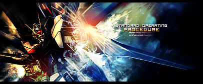


Bookmarks