


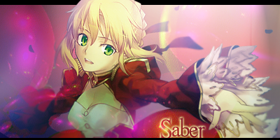
Just started to get into making sigs and I made this recently. Any feedback would be wonderful.

 AnimeGalleries [dot] Net AnimeGalleries [dot] Net |  AnimeWallpapers [dot] Com AnimeWallpapers [dot] Com |  AnimePedia [dot] Com AnimePedia [dot] Com |  AnimeGlobe [dot] Com AnimeGlobe [dot] Com |
| AnimeGalleries [dot] Net | AnimeWallpapers [dot] Com | AnimePedia [dot] Com | AnimeGlobe [dot] Com |


Just started to get into making sigs and I made this recently. Any feedback would be wonderful.

Im seeing a slightly change of color at the right corner of the sig, the down-corner. Don't really want to seem picky but its kinda annoying me, but overall i'll have to say that the sig is awesome, seriously


I think it should be a little smaller, both width-wise and length-wise. Also, your character seems to be blurry. But it's pretty good for a beginner. Keep it up!

I'm not very good at editing stuff so I just found this and shrank the size of it a bit


I have to say that the tag is okay. I think I can see the look you're going for here and that's good. You've captured the "feeling" of it well, but there's more you could have done here.
Firstly, for a tag like this depth is important. I can see that you've blurred in some places, but the blurs don't do much in their current positions. If you are blurring a tag to achieve a good sense of depth, try to do it in one or two main areas. I find that blurring things that are really close or really far away are better. I'm not even close to mastering depth so maybe you should look through some tutorials instead of taking my advice right away; I'm just telling you what I've learned with my experiences. However, it's still a good skill to practice.
Secondly, you might want to improve on the lighting. The character you've used suggests some dramatic lighting effects. See how he's "glowing" bright red-orange on the lower half of his body? It's probably suggesting something like fire or some explosion. You don't have to render either of those to achieve a good effect, although you could if you wanted. I think a large, soft brush could do the trick in the right position.
Thirdly, blending. I don't know if it's just me, but it almost seems as if some of those blurred areas on the character are an attempt at blending him into the BG. I could be wrong, but this is almost never a good method of blending. There are several other better ways to do this. You could add some dust or debris in front of him, maybe some smoke. If you really wanted to get fancy, you could render that fire I was talking about before. Basically, just take something from the BG and cover your character with it in a way that makes sense.
And lastly, text. You've got a good style of font there, but I don't care for the placement. This is totally opinionated from me. Other people might love where you put it. I'm just putting in my two cents for experimentation's sake. Anyway, I always prefer to put my text in a lower portion of the tag, close to my focal, and where it doesn't get in the way of things. You can totally ignore this paragraph if you want; I just thought I'd let you know my thoughts. ;)
Whew! Sorry about the length. I haven't done a good thorough critique like this in a while.
Well, I think you've got good potential, you just have to have the motivation to practice. Have fun on future projects!

^^^Wow, you have sharp eyes! :OOriginally Posted by Ser Ega

Anyway, this signature is good for a beginner! The blurring is a bit off, however. It makes the soldier seem odd. I guess you were trying to bring out focus to the gun? Also, the text for me seems like it doesn't "belong" there. Maybe the sizing needs to be bigger/smaller. :/
But overall it's a fantastic signature! You should continue working on more projects and improving! We all start somewhere, right? Keep it up!
Set by me.
☆*゚ ゜゚*☆*゚ ゜゚*☆|Sigma★|
|Kaitou$|Daken :'D|Neuko's Pokemon Trainer|
|AF onii-chan: Jump_for_Luck||dark_butterfly's mommy|
|Elphaba's Penguin|Proud daughter of Aleyna and Anuket|
~ ♥ ~
There are currently 1 users browsing this thread. (0 members and 1 guests)
 Posting Permissions

 Reply With Quote

Bookmarks