


Your world, my world.

 AnimeGalleries [dot] Net AnimeGalleries [dot] Net |  AnimeWallpapers [dot] Com AnimeWallpapers [dot] Com |  AnimePedia [dot] Com AnimePedia [dot] Com |  AnimeGlobe [dot] Com AnimeGlobe [dot] Com |
| AnimeGalleries [dot] Net | AnimeWallpapers [dot] Com | AnimePedia [dot] Com | AnimeGlobe [dot] Com |


Your world, my world.
Last edited by Vintniv; 02-26-2012 at 10:11 PM.


Kill the borders on all imo, the Jaggy one is love <3
ein, zwei, drei, vier bin endlich weg von Dir
fünf, sechs, sieben, acht Du hast jetzt keine Macht
♥


1: Nice
3: Nice.
4: Hot chick for Jagan there XD
Yeah kill the huge borders.
In sig 1, is that a c4d in the bg or a stock?
Looks like a stock I came over while googling candy shop yeasterday, was thinking aout making a candy theme sig hehe.

Olivia Wilde <3
Thank you so so so so so so so much. You won't even believe how happy this makes me!
You did a really really good job on it too. I love how it came out. I think the border actually looks really nice on this too, so I don't think you should kill borders. The background looks very cool as well, all the lighting and depth you created. Thank you <3


Yay a 4th thread! I hate to be that guy, but pretty much what they said; lose the borders. I actually think the Resistance one would make a cool pop-out sig. I envy your skills with text though D:
Random gift time.
And its House, CARAMELLDANSEN.

Oh my god! That's like absolutely PERFECT!I seriously can't see anything wrong with it! I'm definitely using this one! Thanks!
Nothing all that new.
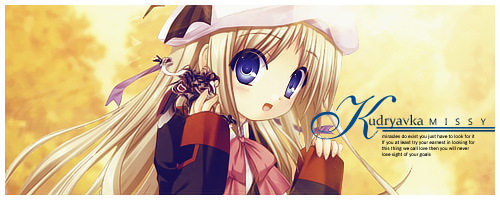
Missy's Request


*-*
Ahhh, thank you so much! I love how the background is part of his "vehicle". If I said any more than that, it would be a tiny spoiler for those who haven't played the game heh.
But as always, great stuff ^_^ Love the lighting in this tag, as well as the second one. Thanks again.
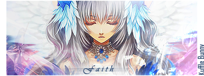
Signature brought to you by Balance.
Seeing that Snow tag made me wanna request a Lightning or Vanille tag from you hehe.
Nice bg on Snow tag
You shant find a better Serah Feron tag mi-Lord.


the lines around her dont suit the image imo (tad too sharp they be too), aside form that, not bad! liking the text and all ^.^
I think it`s great.
Textwork is nice
Effects are cool.
And no huge border XD
Thnx Sera
I really like the ambience sig. Text is amazing, and I think the pieces of light really give it a nice effect.
Good Job. =3
Siggeh made by me. Taking requests ATM! =3
Love for Sazh.

"Luck be a lady" nice touch
Great depth.
Out of curiousity, why is it so long?
And, XIII is amazing XD
Nice c4d work and colors~ But I'm not feeling the lines.
ein, zwei, drei, vier bin endlich weg von Dir
fünf, sechs, sieben, acht Du hast jetzt keine Macht
♥
New stuff from requests and such.


I love the SoulEvans one :33 but of course there's a CoD4 one XD
Sig by the lovely Cotaku
__________
New one for whoever and some completed requests, any sort of critiques or criticisms welcomed.

1st siggy: I enjoy seeing you try out the vectory style but the elements just don't seem to flow well. I think the bright blue lines are very distracting and they take away from that signature. I really like the background, minus the bright blue lines. The foreground needs more development. It seems that you're creating an effect that is "coming forward" so exaggerate it some more. Simple is always nice with vectory sigs, but flow is important.
Requests are strange, because they always want screen shots to be used as signatures. WHY?!?! Dreaming of Topaz Clean, but no such luck.
And a Saber tag. YES.

Paprika:
The foreground is quite lovely. Your lighting skills are so amazing and they really make the signature show a lot of depth. I don't really understand the background though, its some sort of patternish thing, but it doesn't make sense to me. And the purple square on the right side seems a bit too strong. I dunno, overbearing maybe. I am a big fan of the typography you did for the signature. Very pretty outcome on that.
Xriikox:
A really good use of c4ds to make this signature flow. I'm not a big fan of them, but this is just so pretty. I love the colors and the brightness. The quality of this signature is also very high. I do like the text on this, but the stuff written underneath the "Xriikox" is really hard to read. My favorite thing about this sig is the big bright slash that goes through it. You really pulled it off well, so good job.
Saber:
I actually don't know whether I like the black and white one or the color one better. The colors in the color one seem a bit dull and fading though, so I'll go with the black and white sig. The thing that I don't like about this sig is that I'm having a hard time finding a focal point. Everything is in the same scale and it all blends together. Maybe making the lights a little brighter or the Saber stock stand out more would add a bit of contrast to the signature. Really nice overall though.
That Saber tag is godly. I think the text would look better if it were blended in with the sig more though, but I think it's pretty amazing as it is. Though, I'm not sure which version I like better D:
There are currently 1 users browsing this thread. (0 members and 1 guests)
 Posting Permissions


Bookmarks