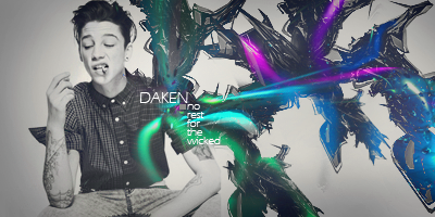
I actually really like your bold side borders, even though I have no idea why XD. I would get rid of the 1 px border on the top and bottom, though. It detracts from the drama.
The sig itself has great placement and colors, but you have too many elements going on. The erraticness of it would suit a more chaotic theme, whereas this one should be more flowing and feminine, in my opinion. Just remove some things (I'd start with that random tab of red on the very left that I can't figure out what it is o.O) and then move some things so they all go in the same direction and you have a general sense of flow, and it'll be a super tag. =]


 AnimeGalleries [dot] Net
 AnimeWallpapers [dot] Com
 AnimePedia [dot] Com
 AnimeGlobe [dot] Com

 Reply With Quote


 Thank you so much! Your so fast to o.o <3


Bookmarks