...ditch the borders O_o;;

Originally Posted by
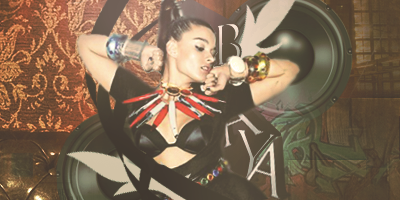
Dreams
For instance, if you made the colored background, the flowers a lighter shade of red, the character in the middle will definitely jump out more.
IMO, that depends to the focus/character used really...
Let's say a pale looking character (...like the being discussed now, unfortunately) is the focus. Using light colors as the main background for this pale character would kind of make the piece boring (or like you said, too blended with the background). But by using stronger colors for the background, the focus should be able to 'Pop' a bit.
But in the end, choose a flashier-looking character, it's much easier ;_;
Err, anyway, I think the colored piece looks too monochrome...


 AnimeGalleries [dot] Net
 AnimeWallpapers [dot] Com
 AnimePedia [dot] Com
 AnimeGlobe [dot] Com


 }
}


Bookmarks