


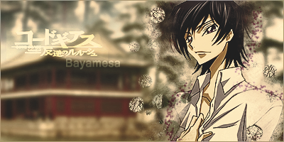
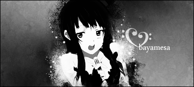
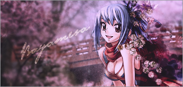
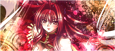
i tried something different.
no c4d's!
i am getting the hang of clipping masks kinda too.
c&c?
 AnimeGalleries [dot] Net AnimeGalleries [dot] Net |  AnimeWallpapers [dot] Com AnimeWallpapers [dot] Com |  AnimePedia [dot] Com AnimePedia [dot] Com |  AnimeGlobe [dot] Com AnimeGlobe [dot] Com |
| AnimeGalleries [dot] Net | AnimeWallpapers [dot] Com | AnimePedia [dot] Com | AnimeGlobe [dot] Com |


i tried something different.
no c4d's!
i am getting the hang of clipping masks kinda too.
c&c?
{}

The background is a bit over-blurred... also, try changing the blurring strength on the house so it'll look clearer than the forest (is it?), that way, you'll achieve a more realistic depth, since the house is closer to the viewers' view.
Good attempt though :3
Over-saturating since '07
hmm maybe Applied Image Layer-Blur-than another Applied Image Layer Sharpened and erase the forest area of that layer?Originally Posted by Unleh

You could do that, but sharpening a blurred image won't do much (it even lowers the image quality!) ^_^;;
I recommend to lightly blur the whole background photo (or stock), and then take out the Blur tool and rub it on the forest without touching the house.
Or you could try this Layer Mask tutorial
lol it's kinda of embarassing to see my old way of tutorial writing xD
Over-saturating since '07
oh, it's some chinese palace thing.. no forest added
but thanks for the c&c ill attempt it once more
{
{
with that much of the BG showing i dont thing you should blur it all, or else all it looks like is a blurred stock image with a render pasted on it.


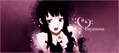
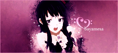
I really really love the new set you made!She looks so pretty!And the colors are awesome!
Lovely set made by the awesome Arxia!Thanks so much girl!♥♥♥
thanks.. >_<
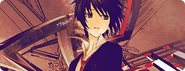
second time trying that type of sig, hopefully ill get better at it..
gonna do some more sigs later.. woooo finals week.
{
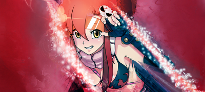
an update..
i'm getting worse but, here is some stuff anyways
{


The first one (saved as "failed one" -.-)
I'm going to assume its been blended in with smudging? This looks pretty sweet, because those 2lines of orbs really over power this piece, so either tone them down or get rid of them D: its kinda hard to convey what i want to help you improve on Dx
Sig 2 (stop naming your tags failed -.-)
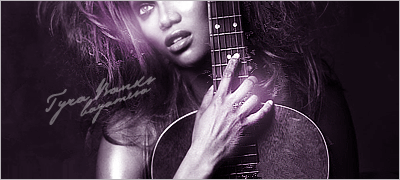
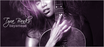
Anywho dear, this next one is just WOW
The lighting is perfect! Also the parts you have made stand out with the light are deft but awesomely done. The text is kinda hard to read though Dx i knbow it says "Tyra Banks, Bayamasa" but if i didnt recognise the the image or your username, i would never have been able to figure it out D;
Just change the text's font on the 2nd tag C:
Great work
Lex Luger R.I.P
¦ Sexy Logo By Me ¦ R A R E R E N D E R ¦ Tutorial requests and PSD Requests open ¦ Tag Thread

lol.. thanks >_<
tyra take 2..
the first one was failed because i just didnt know what to do with it so i left it undone.. x-x
{
The text in version 2 is alot better., I absolutely adore it. Great work there Baya.
Its a shame i already repped you and i'll have to wait before i can again.
Lex Luger R.I.P
¦ Sexy Logo By Me ¦ R A R E R E N D E R ¦ Tutorial requests and PSD Requests open ¦ Tag Thread
lol thank you!
you know what, you inspired me!
i'm making you one.
you dont have to use it, but it'll be a gift!
i knoowwww its a bit bad but i'll retry your gift when i'm better
Last edited by bee.; 12-26-2009 at 06:38 PM.
{

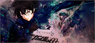
Way too much going on.
ein, zwei, drei, vier bin endlich weg von Dir
fünf, sechs, sieben, acht Du hast jetzt keine Macht
♥
i know.. i went crazy with c4d's.. x_X and i had gone past the point of no return rofl..
{

This is my favorite so far! The only problem that i see is when you do your font it's a little unreadable to me. I mean you can still read it but it's small. Other then that, they're all good! Keep up the good work!
Last edited by UrusaiSevera; 12-29-2009 at 06:12 AM. Reason: Don't quote images
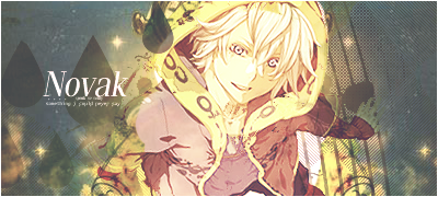
Sig by: Wolley.
made for novak
no c4d's.. did something outta the reg. for me.
thanks..
I HATE THIIISSS. X_x
gonna re-do that..
and this one is an oldie, never posted though. :
Last edited by UrusaiSevera; 12-29-2009 at 08:55 PM.
{
1. Damn thats bright xD try to lower it a bit. Other than that, its thats one smexy sig.
2. ya theres alot of stuff on it that dont really add to the sigs alure. Also red fading into goldish brown very conflicting colors that dont go well with eachother, and an extra shot below the belt (lols just kidding) the render doesnt seem to be in the forground and it makes the sig seem flat.
3. ur far better than that now
thanks ^_^
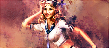
heres a recent oneee... longest.sig.ever.
made for kisses2
ps: i actually tried my hand at vectoring.. >_> that 'funny looking' orange and lime are made by yours truly, since TOUCH PADS are not very good for pen tooling. wooo hoooooooo. happy new years eve guys.
Last edited by bee.; 12-31-2009 at 08:13 PM.
{
Hey there! I thought I'll drop by xD.
I like your newest signature! Great job on it! ^__^ The oranges work nicely with the feel of the picture; but maybe you should keep the text straight in stead of slanting it? I don't know, it seems to be blurring it a little x_x;
thanks
i tried to make it like, go along with the white stripy thingy but.. yeah.. xD
updated:kinda inspired by lovebeat .
Last edited by bee.; 01-02-2010 at 01:23 AM.
{
janeiro

{
thanks ^_^
for *tsuki*
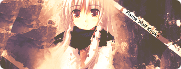
for kirako
{
uninspired!
{
There are currently 1 users browsing this thread. (0 members and 1 guests)
 Posting Permissions
 Reply With Quote


Bookmarks