


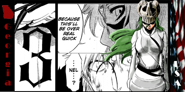
Ok I think I need to do something with the color but I dont know what. any way tell me what you think. ant look at that building what can I do to get it to blur into the backround better. it sticks out to much.
 AnimeGalleries [dot] Net AnimeGalleries [dot] Net |  AnimeWallpapers [dot] Com AnimeWallpapers [dot] Com |  AnimePedia [dot] Com AnimePedia [dot] Com |  AnimeGlobe [dot] Com AnimeGlobe [dot] Com |


Bookmarks