


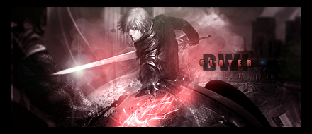
Hey everyone.
Here is one of my most recent sets; please critique it o__o ...
Avatar:
Sig:
 AnimeGalleries [dot] Net AnimeGalleries [dot] Net |  AnimeWallpapers [dot] Com AnimeWallpapers [dot] Com |  AnimePedia [dot] Com AnimePedia [dot] Com |  AnimeGlobe [dot] Com AnimeGlobe [dot] Com |
| AnimeGalleries [dot] Net | AnimeWallpapers [dot] Com | AnimePedia [dot] Com | AnimeGlobe [dot] Com |


Hey everyone.
Here is one of my most recent sets; please critique it o__o ...
Avatar:
Sig:

Pretty nice style you got here :3
You might wanna play around with the bottom left corner there. Clip mask?
Over-saturating since '07
Yeah, I'm new to using clip masks so I really had hardly any idea what I was doing x___x . Is the corner too plain?


I really like the set,, there is just one thing that looked a little bit strange to me..
the blue part at the sig, I don't see the reason of it.. anyway real nice set
Sig by me
Now that you mentioned it... It does seem a bi awkward now. Hue it to red =DOriginally Posted by Jimbow

And yeah, bottom left corner too plain =X Clip mask something to that area. It looks like her arm is dangling randomly at the current signature. Play around with it)
Over-saturating since '07
Okies i took your guys advice, is it better now?
New version:
Last edited by Dottie.; 06-27-2008 at 09:40 PM.

great work with this version the lighting is a bit too strong but the look and text are great. keep up the good work mate its looking good
Blestus Copil
Proud Masterworks Family Member
Graphic Design Consultant/Resourcer
BLESTUS WORKS IMAGERY 2008©
I like your new version.Good wrk. But i think MW+ bwl is right, light is really bit strong.
Okies here are some old signatures cause i r lazy e__e;
These are some that survived my hard drive suiciding. *tear*
--
Comment/Critque if you please~
Now that is uber smexy <3
My concern is the borders though.. maybe removing it would be best
I [definitely] want to see more =]
Bleh. Ok I just finished a request for Eliana. I know it isn't perfect, i've never done this style before but I gave it a go. Hope you like it. C&C please. >:3
signature:
avatar:
*yawn* Now imma go to bed.. xoxo

Yay!
Wonderful to see that you're back in buisness, Myztic :3
Your new stuff is lovely, but nothing will ever beat my Count Olaf tag (oh yes, I still have it =D)
Your latest is awsome.
The colors are nicely done, the sharpening gives the tag a nice depth and the whole thing is... soft, the edges and shapes gives the whole thing a relaxing feel.
The C4D is done stylish and smooth which also compliment the roundness of the whole thing.
The scanlines are sort of... off, but they still fit.
Maybe lower the opacity a little?
And the text looks great.
The avatar... Don't really have a lot to say about it, but it doesn't do the signature justice. It's a little "blurry" compared to the tag, maybe sharpen it up a notch and I think it deserves a tiny piece of text (Eli's name or something).
But overall, great job.
I'm really looking forward to see how your new styles forward will look :3
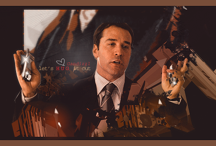
Ari Gold set by dotmyztick <33


Wonderwice fan nr.1
|Gan, Lettuce and CFA.. Corrupting the Masses since 2006|
Gandy-Man and Bunster saving one pimp and one pornstar at a time.
Thanks everyone for the comments and critique. <3
Here is my most recent signature.. had no idea what I was doing and just went with the flow :3
bleh. ~
That just looks so awesome!!
That graffiti styled background really works with a gangsta looking girl :3 And those clip masks are beautifully executed
Best piece of the whole thread
Looking forward to more of your works =D
(I'm thinking of becoming a regular to this thread now)
Over-saturating since '07


Your current is uber smex! (post 13)
The style you've got going there is perfect! The Comp is flawless as well.
Definitely your best so far.
Hope to see more soon!!

I LOVE this one. You've done such a great job ^^ But the right side of the extract should've been a tad bit darker to make the lighting more believable...
ah well...we're all human after all.
Okay. I was bored today so I decided to make a sprite signature of Cloud.. get some diversity going on here. :3 Again, had no idea what I was doing and just did what I thought looked good. I havent smudged in.. forever so im a lil rusty. Also the text placement annoys me but I couldn't get it right. so meh.. ^^;
Version 2
C&C appreciated. <3
Last edited by Dottie.; 07-08-2008 at 08:31 AM.

Loving that one. Uber smexy, what with the lines and all.
I really like this one more than v2.
To me it gives it more a 'breezy' feeling? idk..
it just does to me... The colours are done really good
but maybe lessen the black a little so we can see cloud
BTW what is that font called??
Overall your signatures are amazing! I'll never catch up xD!
Well, this signature is SUPER SMEXY.
Did not expect that you would make this kind of signatures.
Beautiful. Could have made the lighting more realistic, but it's good as it is now.
Shablam, another win.
The distance between the text flowing into distant feels more...correct?
Because when distant is on top, you read that first, and then read the sentence.
The dots (clipping mask perhaps?) are really great.
Daaang, can't wait to see more of your signatures now. =D
@ IchigoKiss: The font is called "Dali" (you know like Salvador Dali) xD
@ Balance: Lighting just isn't my forte, can't get it right x__x and no it wasn't a cclipping mask, just circles. xD
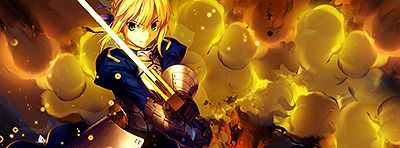
Now that SOTW is over I can post my entry, whom no one seemed to know it was mine xD
Jagan Eye has requested a tutorial on this signature so i will probably make that today. :3

I loved your entry! Colorful = epic win! ♥
I swear your SOTW entry ROCKED!!
ALL HAIL DOTTIE'S ENTRY!!!
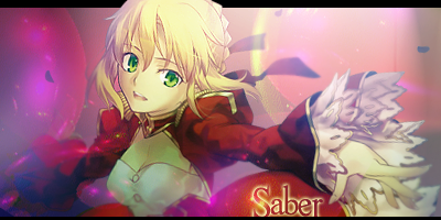
Anyway, that distant cloud sprite sig of yours is very nice. I love what you did with the text. I always suck at textwork...
Very nice sigs you have. I especially love the current one - the colors and masking rawk!
The "distant" sig is my absolute favorite of yours. I prefer the first version better, with the text floating from left to right - it gives it a slightly less-structured and airy feel, which is nice. Great effects also, and I love the color circles - great choice for those.
Your SOTW entry was awesome. The effects and lighting are fantastic, and I love the way you decided to put the text behind the extract instead of trying to cram it in front. Colors are perfect for the sig. Great job! I can't wait to see the tut. ^^
Thanks for the C&C everyone. <3
Wooo. Ok finally I made something ^^; I have school again so I don't have much time ;__;
I think I did something wrong in this signature but can't figure it out. x3 oh wells.

There are currently 1 users browsing this thread. (0 members and 1 guests)
 Posting Permissions


 Reply With Quote


Bookmarks