


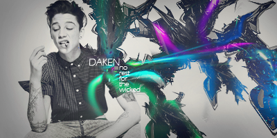
Here is a set i edited a few days ago please give constructive criticism. I hope you all like it.

 AnimeGalleries [dot] Net AnimeGalleries [dot] Net |  AnimeWallpapers [dot] Com AnimeWallpapers [dot] Com |  AnimePedia [dot] Com AnimePedia [dot] Com |  AnimeGlobe [dot] Com AnimeGlobe [dot] Com |
| AnimeGalleries [dot] Net | AnimeWallpapers [dot] Com | AnimePedia [dot] Com | AnimeGlobe [dot] Com |


Here is a set i edited a few days ago please give constructive criticism. I hope you all like it.
8.27.08 <----

Sig made by Novak~
"You know, I don't get it. Since when are you not allowed to ask a Chinese man where a Chinese restaurant is? I mean, aren't we getting a little too sensitive here? If someone asks me, "which direction is Israel," I don't go flying off the handle."
- Jerry Seinfeld


It's not bad at all, I like it. However, I would get rid of the bevel borders, it takes away from both of them. This set would look so much better with just a 1px black or white border. I would also lose the outer glow on the text. It doesn't need it at all. Sharpen up the face in the avatar slightly to give it some definition.
Keep it up. I hope to see more from you.


Since you did no background from the original image, and just added a few things to it like font and that boarder and some little brushes here and there, You could of done a little better with the effects I think. And put more effort in it, but its great like that. I guess you didnt have much to work with so you should of changed things up just a little.
Last edited by Daken.; 07-31-2009 at 10:57 PM.
here is an update

8.27.08 <----
Sig made by Novak~
"You know, I don't get it. Since when are you not allowed to ask a Chinese man where a Chinese restaurant is? I mean, aren't we getting a little too sensitive here? If someone asks me, "which direction is Israel," I don't go flying off the handle."
- Jerry Seinfeld
Well the background matches good with the pic I must say, but for the rising sun brush I wouldnt of added that bevold <- I think, effect to it. Plus the pic looks a little stretched compared to the avatar of it. But overall I like it. It could of had a white 1x or 2x boarder to go with it. Or something. But keep up the good work.

I am really sorry but...
You really think that looks good at all? What have you done to that image?
What effort have you really put into that signature at all?
You did not try to add some flow to it, you did not blend it at all...
And the number one thing that you did not do which you should have ALWAYS done was to keep the proper perspective ratio.
I can obviously tell that you outstretched the extract and it does NOT look natural.
The ratio is the thing that bothers me the most. If you're resizing, resize from the corner and HOLD SHIFT.

She edited the colors.
You don't need to have lots of effects on a tag in order for it to have taken effort; sometimes simple is best. :3
ein, zwei, drei, vier bin endlich weg von Dir
fünf, sechs, sieben, acht Du hast jetzt keine Macht
♥
There are currently 1 users browsing this thread. (0 members and 1 guests)
 Posting Permissions


Bookmarks