
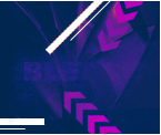


what do you think? this is the A version
 AnimeGalleries [dot] Net AnimeGalleries [dot] Net |  AnimeWallpapers [dot] Com AnimeWallpapers [dot] Com |  AnimePedia [dot] Com AnimePedia [dot] Com |  AnimeGlobe [dot] Com AnimeGlobe [dot] Com |
| AnimeGalleries [dot] Net | AnimeWallpapers [dot] Com | AnimePedia [dot] Com | AnimeGlobe [dot] Com |


what do you think? this is the A version
**Illuminated Spirits member**rem tene, verba sequentur (Cato)
and this is the B version.. which one do you prefer?(naturally, you can not prefer anything ^_^'
**Illuminated Spirits member**rem tene, verba sequentur (Cato)
I like the second one... it's not as plain. But maybe bring the tabs right down to the very bottom instead of stoping on the line like that. It might look better, I'm not sure. But good job =D


Hm, the 2nd, the first is too plain.
good wp!
I like the first one for some reason..maybe because in the second one there is the three stripes of colour that IMO doesn't appeal to me. It's still a good wallpaper.
Kind of torn...I like the second one because it isn't so empty...but the lines seem unatural compared to the rest of the wall. So I guess I'd say, #1.
Nice walls!

I like the first one too, I dont know what it is with the lines but I just dont like them, they don't ballance I guess, or they just don't fit with the rest of it. make them go the whole lenght of the wp. but i do like the first one
[my stuff] I make my sigs.
When one bad reps, its a common curtsy to leave one's name. So one can return the favor, in kind.
[It is your responsibility to keep up the the Magna not mine, so don't be mad at me if you "think" this gives something away.]
MySpace FaceBook
Those with a destiny must be sure of themselves and their purpose. If their motivations are not pure, then they may not be the right person to lead the cause.

I prefer the first one. The second one is too "smooth" for the somewhat rugged look of the picture I think


I like the b version, stripes are cool, they add more color and mesh the wall together better good job.
-=[ねこ 軍]=-
-=[壁 紙 二 裏]=-


I like the second one better; the color adds a nice touch. For some reason the wall and the floor aren't lining up well for me. Perhaps adding a little shadow where the two meet may help finish the 3d illusion.
Pink is the new Pooky
Party it up in Wallpapers | join the AF Gaia guild!
"Spilt coffee has a sad remembrance of old"- from a plastic bag seen on the train
musing of a mod : Illuminated Spirits : Theme: uber_pink
I prefer the 1st one. The vertical stripes in the second don't fit the look of the wp.
:under construction:
:Pthanx for the opinion ^_^
I'll do a better version, so get prepared!
**Illuminated Spirits member**rem tene, verba sequentur (Cato)
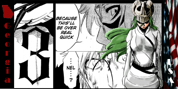
this is the c version...I hope the definitive version... :^_^:
anyway... what do you think now?I've spent much part of the time making the text effect(maybe is one of the most *_* text effect I've done..), and I've removed the japanese text from the top, reorganized the shadows etc...
So, let's start opinion ! :P
**Illuminated Spirits member**rem tene, verba sequentur (Cato)
The last one (C version) is the best!
I like the text effect and also the font!
Good job!
THIS is the definitive version..the famous "D" one
Thanks^_^
If only I think about the work I've done on this image...I don't know if you've already seen this image, but all among the charas in the bottom there's a huge text,


**Illuminated Spirits member**rem tene, verba sequentur (Cato)
The C and the D version is good. I like both version. The D version has that extended wall very nice and the C version is you don't see the other wall. The text effect is also very nice. good job.
It looks better with the new wall in the back. Although there's a bit of white on the guy's - who's squatting - arm and his stomach area. I don't know if it's supposed to be there, it's just bugging me. Maybe you can make the bars of the text just sliiiightly less brighter? Don't know, it's up to you. Good work though
D version is better. Yayy for Tsubasa! Ive just learned yesterday the existence of it, im so happy they made a continuation of ccs (in another universe) it looks cool, now ill just have to wait for the french translation to come to Canada ( will take a while) Did you guys know about it for a long time?
I think you should combine B and D. Get rid of the wacky text box, and put the lines back, they were nice. However, the lines look wierd floating over the cracks like they were, so go in and place the cracks over the lines themself.
http://www.gestahr.com --> gestahr.com ffxi weblog
I like the third one, the lines in the other one didn't wotk in my openion.
[my stuff] I make my sigs.
When one bad reps, its a common curtsy to leave one's name. So one can return the favor, in kind.
[It is your responsibility to keep up the the Magna not mine, so don't be mad at me if you "think" this gives something away.]
MySpace FaceBook
Those with a destiny must be sure of themselves and their purpose. If their motivations are not pure, then they may not be the right person to lead the cause.
I like the new corner in the D version, but I'm not sure about the wiring on the walls. It would be good either way (with or without the wires), but I'm still picking D as my favorite. :^_^:
Niiiiiiiiiiiiiinja
thanks guys!
I'll see what can I do...ah the stomach area was so in the original version, however maybe I'll do something...I Want to read trc in italian!!!!
**Illuminated Spirits member**rem tene, verba sequentur (Cato)
There are currently 1 users browsing this thread. (0 members and 1 guests)
 Posting Permissions


Bookmarks