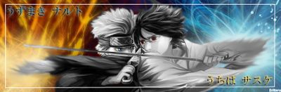
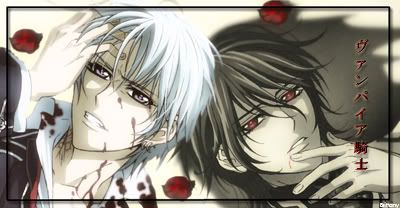
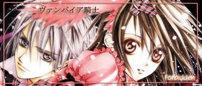
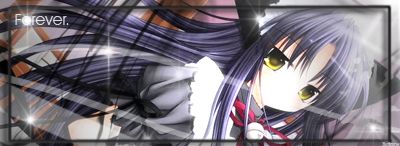
I will take you last 4 tags into account for this.
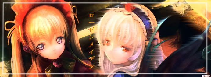
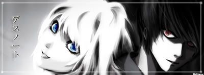
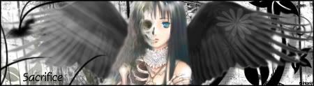
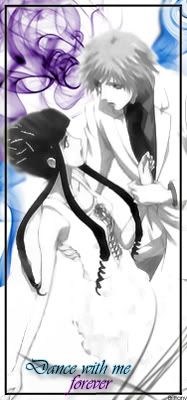
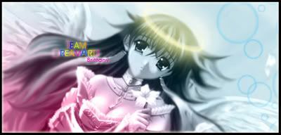
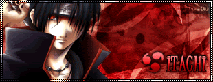
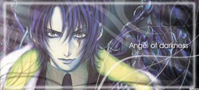
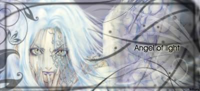
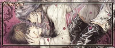
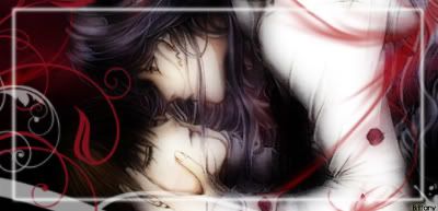
To be honest, they all look the same. If you look at them, you basically run in this order or design, stock image, vector floral brush, border, text. You add no emphasis on anything in particular about your tags. No special effects, nothing ot set any of the m apart from the rest, which is sort of boring.
The one thing that concerns me about them in particular is the lack of emphasis. What do you want me to look at in them? The stock image or the effects? Your focus, the person, always seems smothered by the effects, you throw brushes on top of it and making the focus seem less like something to look at and more like a background.
You should explore more resources other than just brushes. Smudging, C4Ds, something that sets your tags apart, because what your doing is what I call 'Singularity.' Where you just one single effect over and over again in every tag.
I strongly suggest you practice with more tools and filters, and if possible find a few tutorials on blending. (
Simple Blending Tutorial) I hope to see you improve soon, best of luck!
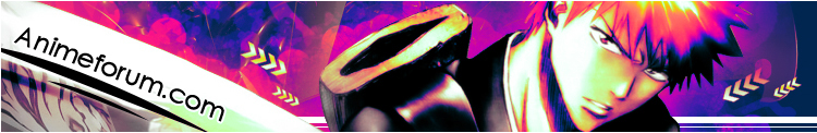


 AnimeGalleries [dot] Net
 AnimeWallpapers [dot] Com
 AnimePedia [dot] Com
 AnimeGlobe [dot] Com


 Just let me know how you want it done, img words etc.
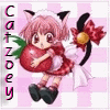
  and can u have it say kitty-catzoey in fancy black writing. thank u so much!


 Ill try and not bore you in the future.
Bookmarks