
Originally Posted by
Konata Izumi

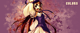
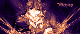
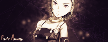
Your overusing the color scheme: orange -> blue. Be careful not to do that or it'll make you sigs seem repetitive and boring. Ok, on your newest update.
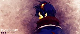
Too many directions of flow, there's stuff going down and stuff speeding diagonally. Keep it all in one direction, less confusion there. Okay, you're overusing C4Ds, one or two should be enough, not four or five that might be where your flow problem arises. Character placement is nice and blends somewhat but text placement could use a little working on.
Hope I helped.


 AnimeGalleries [dot] Net
 AnimeWallpapers [dot] Com
 AnimePedia [dot] Com
 AnimeGlobe [dot] Com
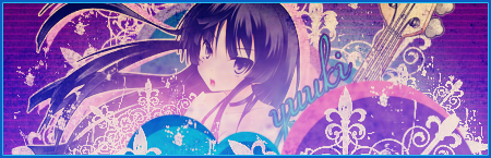


 *thumbs up*


Bookmarks