


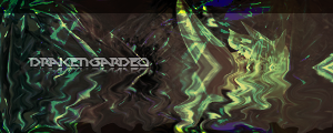
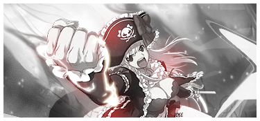
Yeah, that's my nickname, Phluff. These are just random signatures or tags that I made.
Above are my newest, and below are some of my oldest. I tried to pick out my best ones.

 AnimeGalleries [dot] Net AnimeGalleries [dot] Net |  AnimeWallpapers [dot] Com AnimeWallpapers [dot] Com |  AnimePedia [dot] Com AnimePedia [dot] Com |  AnimeGlobe [dot] Com AnimeGlobe [dot] Com |


Bookmarks