AnimeGalleries [dot] Net | AnimeWallpapers [dot] Com | AnimeLyrics [dot] Com | AnimePedia [dot] Com | AnimeGlobe [dot] Com |
Hmm.... That recent one lacks a lot of your usual touches. Not a lot of contrast or emphasis on the focus. The overall signature appears really suppressed by the border too.
I've got a border fetish, lol,l can't help it.
I'm not sure exactly what you mean by contrast (just..contrast in general?), but I can see where you're coming from in terms of the focal. I was kind of more interested in experimenting with texture than I was with the sprite itself. I thought it worked out nicely in the end though, maybe I was wrong xD
Thanks for the Cnc m8, much appreciated.
Typical smudge..trying to practice the old technique
Composition is weird..but I can't really fix it..It's pretty unfinished too, but whatever ^_^
Last edited by Middy; 01-29-2010 at 10:57 PM.
I always stopped at a 4 pixel border, anything larger is a bit much. But that's for borders go all the way around the tag. But if the border is a bottom top thing, or is going to be used on just the left and the right sides, my policy is more like 6 pixels.
As for contrast, I mean the basic overall balance to the light and the dark colors. Probably should have said that instead, but who cares.
Recent tag is a total classic. I still have no idea how to smudge that way. What brushes do you use, and what are your basic settings to them?
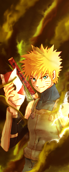
Aside from that, yeah, I think the main problem is all the blue used along with the stock. Sasuke is all in white, so he just really stands out in terms of composition. Like if you look at the bottom middle part, there is almost a perfect line dividing Sasuke from the smudging all around him.
My policy is nothing under 15, nothing over 25
And thanks for clarifying there with the contrast business.
For smudging, I tend to use brushes of my own creation and vary the settings from time to time. On the Sasuke tag I probably should have spent some more time cleaning it up, might have minimized the problems with the composition.
Gift to a friend of mine..first "real life" focal in soo long
Another gift for a friend..Has some LQ parts, but I love the lighting and color
Finally, yet another gift..this one is for Serated
I couldn't get the colors to work for the life of me..Sorry TT_TT
Lol, I will get you to expand your border limit though!!
Feel free to CnC and tell me what you think.
I don't mind criticism.
Last edited by Middy; 01-30-2010 at 11:51 PM.
Two new ones.
Too huge borders :S
Does huge border just looks wierd, on most of your sigs, go down to 4px
Borderless sigs looks better though, imo.
http://avatar.pure34.com/users/midnightrider/fmaarm.png
Too simple, boring.
The sig that I`m looking at in your space now, the one with like a fire almost in the middle of it, blue-ish bg.
That one is pretty interesting
Oh cool. My first signature gift in years.
I found 2 new pieces of criticism for you. The first is your use of colors. What you did in the previous 5 tags is start with a focal, then you used other images of one singular color (yellow and purple corresponding to the tags). A lot of your effects seem to be getting lost in the tag because all the effects used are just one single color. Not only that, but because of your singular color usage, the stocks within them start to stand out a lot more.
Next, text. Why dont you use it more?
I don't know why I"m so attracted to large borders. I'm not a fan of small borders at all - its an all or none deal
Any suggestions for making the FMA tag more interesting? I tried some effects in front of the focal, but I couldn't control the lighting very well.
The sig with a fire surrounded by ice and mountains in the background?
That's a Matte painting by a friend of mine. The LP is wicked sweep. I'm so happy to have had it done for me <3
Thanks again for more cnc, much appreciated. I see what you're saying about the colors, although I admittedly really like the purple one, purple is my favorite colors xD
My typo is really weak. I'm rarely able to make a tag that actually accepts my sub-par text, lol.
Something I need to work on. I don't mind not having text, but there are a few instances where I wish I could have added effective typo, and it's a bad habit to just ignore typo since I'm not good at it.
Last edited by Middy; 02-03-2010 at 02:35 PM.
Not sure if I posted this first vert tag before.
The saber one is the "original" and the others were all made using a similar style. I actually had someone right a tutorial for the tag; It ended up being quite a large tutorial xD
Oh wow!I love your sigs!I love everything,the colors,texts!So good!*_*
Oh I wish I could make sigs like you.
Lovely set made by the awesome Arxia!Thanks so much girl!♥♥♥
Good Saber tag, your starting to use more then one colour
And on the Spidey sig I`m very curious about what`s under the huge border hehe, I bet it would look pretty nice without the border ;D
What are you, a god?
Mad photoshop skills there. I like your work. Do you take requests?
afdgfdg the saber tag <3 I admire your smudging skills ;o;
ein, zwei, drei, vier bin endlich weg von Dir
fünf, sechs, sieben, acht Du hast jetzt keine Macht
♥
@Des - Trust me, you don't want to see what's under the border on that one, lol. All the smudge lines I didn't finish are just chillin under there in a big mess xD Perhaps a crop? ^_^
@Spooky - Thanks man! I'm not very good at taking requests to be honest. I try to get them done, but time is an issue..and certain renders/stocks just don't coincide with where I feel like taking a sig.
@Aiacos (Another name change?) - Thanks m8, appreciate it.
Post a sig for no spam. I'm trying to figure out how to crop it correctly so it won't need a border
Similar to the above vert, but in color and without a render ofc.
I'm quite happy with the outcome.
Link tag..don't like this outcome too much.
Whoa, the purple vertical tag looks very amazing. The dark vibe it gives off is really cool. You did a really good job with the depth as well with how its darker as it recedes. How did you do it? Smudging? Pentool?
Recents
Didn't really finish this one, but I'll post it anyway.
--Request
- Experiment gone wrong, lol
Played some Warcraft last night
I'd forgotten how bad I am that game XD
Someone break my combo before I hit 5
Last edited by Middy; 03-07-2010 at 03:54 PM.
These are all very nice. I like your art style btw it is interesting. I also like the blending you did at least it looks like blending to me. In any case it is a very nice job keep up the hard work.
Gero Server Guru
Oooh very nice. It took me a second to see what I was supposed to be looking at though. I don't really see anything wrong with it, so keep it up!
I love how everything you do has a sort of dark edgey-ness to it.
There are currently 1 users browsing this thread. (0 members and 1 guests)
Bookmarks