


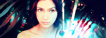
Ava's


sig's
 AnimeGalleries [dot] Net AnimeGalleries [dot] Net |  AnimeWallpapers [dot] Com AnimeWallpapers [dot] Com |  AnimePedia [dot] Com AnimePedia [dot] Com |  AnimeGlobe [dot] Com AnimeGlobe [dot] Com |
| AnimeGalleries [dot] Net | AnimeWallpapers [dot] Com | AnimePedia [dot] Com | AnimeGlobe [dot] Com |


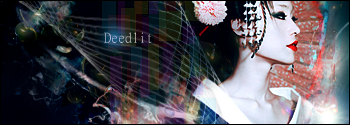
Ava's
sig's


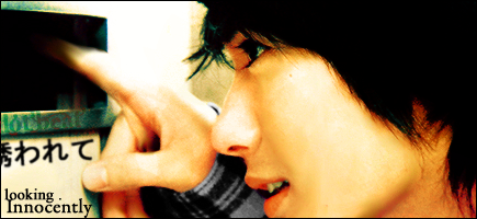
Whoa , beautiful works .
I really like all of them , they have the perfect balance of
colour , and I like the concept . Sooo beautiful .
Mmmmnnn
Last sig and second avatar made me go into my "inspired" mode.
Love the colors of the avatar. Very nice contrasts control!
And the sig is wayyy awesome! The left side is very rocking, brilliant idea on adding the clipmask there! Lighting is pretty nice too ^_^
Although, I'm not liking the color of the thing attached to the right shoulder (well~ just the starting point actually. The purple and blue is made of win).
Welcome to the forum btw, hope to see more of your works ^_^!
Over-saturating since '07
ic ic thanks ^_^
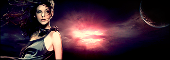
some others~
ava's


(prins.. is prince in Dutch) XD
sig's
ok.. lots.. next time more ~ ^P^
I love your Avi's =3
Your tags just dont catch my interest sadly.
Unleh is mah inspiration ;D

I love how you balanced everything, very artistic!
ic thanx ^p^
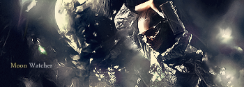
ava's


80's


to be continued Ö
Wow all of these are just so amazing and are just tremendous hats off to you really you've done a great job. your signatures are fabulous and so colorful woahh!! i wish i had made them.
I LOVE YOU PENNY AND I HOPE WHERESOEVER YOU ARE YOU'LL ENJOY THERE.
YOU'VE BROUGHT TEARS IN MY EYES
YOU WERE MY BEST FRIEND AND WOULD ALWAYS REMAIN TO BE.
YOU REALLY WERE A TRUE FRIEND AND I LOVE YOU VERY MUCH
penny is my grandma's dog everyone always remember that true friendship is really rare in this world but dear penny your'e my best friend
dear!!!


I have one word and that is beautiful !!
okay now for other words =D
its artistic , well imagined , and the work is done beautifully...its just amazing and especially your avatars.
Please keep posting your work.
wish me luck for furture guys!!!!Thanks for everything!!! ^___^
^___^

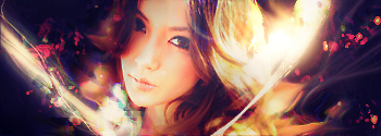
I love your signatures the most <3 The blend of colours in them is sooo~ wonderful. The avatars are really beautiful too, though - muted pale colours and everything, I just love it *_*
Keep it up, you have a real talent for stuff like this~
I could write a book about your mind.
You could never write a word about my life.

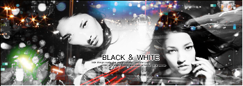
wow, all of them are awesome, but I especially love dsigangel.png (the 3rd signature.) Your blending is seamless, and the colors you used flow together nicely.
They all look great as they are, but they would also look nice with a border around some of them. That's just a suggestion though, it isn't needed.
They are all very eye-catching, though. ^^;
月の光は愛のメッセージ


zomg wow that's awesome. >_< I wish I can do that.
nice and cool avy and sig maybe i can request from you and love you're works
thanks ^p^
ava's


80's


sig's
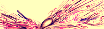
drawing
bad quality scan :C
simple
defaults Ö
collab with KoePaard(cowhorse)
Last edited by Niesja; 03-28-2009 at 10:25 AM.
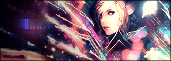
This signature is godlike man , its so beautifully done , i clearly dont have words to say how good you are....Originally Posted by Niesja

simply awesome....
wish me luck for furture guys!!!!Thanks for everything!!!^___^

I thought I recognised your name from somewhere, and when I saw Koepaard I knew it!
Anyways.. I like the overall style of all of your signatures, but some of them seem a bit too messy for me.
These two look the most appealing to me. The colours go well together and it has a nice overall feel to it. And I'm a sucker for nice abstract signatures.
Some of the signatures seem to be a bit too blurry, and even if the image is lq, you could improve the quality.
The avatars are nice... but a lot of them are too sharp and have too oversaturated colours.
and lol your dutch
I'm famous?
tsk Koepaard is more famous X"""D
where may you know me from or.. Koepaard..
and myeah
I tried improving the quality by drawing them over <_>''
but scans are different from stocks.
ah thnx ^p^
new
Last edited by UrusaiSevera; 04-13-2009 at 07:42 AM.
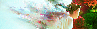
The newest signature, while still pretty, doesn't flow very well together. I do love your style, though, very bright and colorful but the extractions are still clear and focused.
On this day of days, most epic and prideful, you were born 15 whole American years ago!
Through the odds and by doing the impossible, you beat out hundreds of thousands of siblings in the great sperm race for the coveted egg.
Probably via hax.
Regardless! You won!
So remember, whenever someone picks on you or calls you weak or small.
Just remind them that you beat out a few hundred thousand other wimps.
And the grand prize was not dying!
-bump
thanks Ö
some new
collab Koepaard
-ava's-


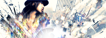
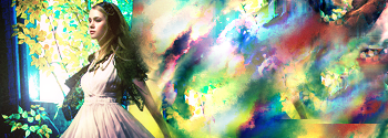
Oh I totally love the third sig you made. It has the correct balance, nice focal, brilliant choice of colours and the text suits it. I love that one, it's my favourite out of that bunch.
In the first one, I dunno, the girl doesn't really fit the rest of the sig. I think it's the drastic change between the left and right. Although I do have to say, it's well blended.
Second one is pretty, the colours are very nice.
The 4th one: I like the the effects and blending. It is very sharpened though. That would be my only criticism.
Last edited by Darkandiel; 05-15-2009 at 03:31 PM.

Your work is absolutely stunning!
Completely mesmeric!
I hope to see much more of your work in the future.
*~P a p u r i k a~*
There are currently 1 users browsing this thread. (0 members and 1 guests)
 Posting Permissions


Bookmarks