


Sorry if they arent very good, I am without photoshop, and use the gimp.
Also, I have no set size I make my sigs. And any of them can be resized.
 AnimeGalleries [dot] Net AnimeGalleries [dot] Net |  AnimeWallpapers [dot] Com AnimeWallpapers [dot] Com |  AnimePedia [dot] Com AnimePedia [dot] Com |  AnimeGlobe [dot] Com AnimeGlobe [dot] Com |
| AnimeGalleries [dot] Net | AnimeWallpapers [dot] Com | AnimePedia [dot] Com | AnimeGlobe [dot] Com |


Sorry if they arent very good, I am without photoshop, and use the gimp.
Also, I have no set size I make my sigs. And any of them can be resized.


Oh what are you talking about , they are well made and i can say really well tried.
If without photoshop you can do like this, then when you will have the photoshop , you will do some great signatures i am sure.
Then you can show proudly=D
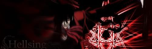
But these signatures arent bad at all really , the first one , Hellsing , i like the background actually , its whole darkness inside it , i like it.
You have tried and you havent done bad.
I hope you keep posting your work , dont worry about how they look , people in this forums will help you out to improve your skills by giving tips so dont worry.
Last edited by Necro'lic Enigma; 03-11-2009 at 09:07 AM.
wish me luck for furture guys!!!!Thanks for everything!!! ^___^
^___^
Thanks, I would love help but I think everyone here uses photoshop xD


Not true. I used GIMP for 1.5 years. And I have made some GIMP tutorials that are on this site. I could link you if you wanted.
You've started out and I think you should really practice making your signatures blend. Tutorials are the best start.


Jose uses GIMP, you should check his sigs out if you haven`t already.Originally Posted by Datenshi25

Wonderwice uses Paintshop pro if I`m not mistaking.
I did use PSP too before. Though back then I didn`t know one thing about what makes a good sig :P
I should try make a sig with psp, to see what I can make now.
And good luck to you on your sigmaking jounrney ^^
I would very much like you to link me.
The Fade one was my first signature ever, I am very new at this
Ok, I tried to follow one of the tutorials but came out with this

Use high quality images.
Uploads section: (Members post their extractions)
http://www.animeforum.com/forumdispl...c&daysprune=-1
Serated's extractions:
http://www.animeforum.com/showthread.php?t=83363
http://www.animeforum.com/showthread.php?t=68157
Those images are preextracted by AF members for your use. High quality images are essential in making good signatures.
Next, those weird white lines that are going horizontally through your signature; DO NOT use them again. They completely kill the quality.
So try out some high quality images for sig making. If you need to figure something out in GIMP, do not be afraid to google it. (ex: resizing images, adding borders, etc.)
Now, I personally don't care about how pixilated the image is. It wont matter 5 years from now. I do like help, but I want stuff like how to make it flow better.
I also think that if I used only high quality images, I wouldn't have as many to pick from, and I like to have alot of pictures to choose from.
And although I don't mind you asking me not to use the white lines again, I prefer you dont call them weird. Also, I prefer not to be told in a statement what to do. I don't mind suggestions, like "Try this" or "Maybe if you did this". However, what you said was a diffinate. Now, I am not trying to sound hostile or ungrateful that you are helping me at all, just telling you.
I tried a border, and it killed the image. So I didn't put one in.
Please dont take my comments offensively, I do appreciate your help.
Last edited by Datenshi25; 03-12-2009 at 06:02 PM.


Well you come off a bit mean mister D:
Trust me Jagan is by far the best GIMPer I know, I thought me pretty much everything I know and I am grateful for any advice she gives me. The fact is in order for you to improve to need to practice, she was an unbias source of criticism. She's right the white line do kill every aspect of signature 0 blending, 0 flow and would of been better had the lines not been present.
You'd be surprise to how many HQ extraction are on this site alone, your variety of images will not be compromised, and the signature will look much more professional and overall better. Try using some of GIMP's default settings, and focus on the focals or faces of the extractions.
I myself use GIMP on 70% of the signatures I make, and I even made a tutorial, you should give it a go =D (it's pretty basic)
Jose's GIMP Tutorial
Last edited by Jose; 03-15-2009 at 07:03 PM.
Sorry, I thought of deleting my post after I typed it.
I was heated from something totaly diffrent and took it out on the nearest person <_<;
No offense taken. I didn't mean my comment offensively either (if thats how you took it).
And Jose's right. There are TONS of high quality stocks on this site alone. Quality really matters with signatures and I feel like there are probably more high quality images then there are not. And there are some very awesome ones in the uploads section on AF. I linked you to Serated's threads and he has very awesome high quality stocks that you may like.
I don't understand how a border can kill the image. Did you use the square tool or the add border function?
Oh and I just remembered! Serated wrote some awesome guides for signatures.
Text guide
Wireframe c4ds
Blending
SOTW Tips
You could also get c4ds from sites like deviantart.com. C4ds really add effect to signatures and really help them look nice.
Other then the text, I kinda like this one. I am going to take out/revise the text soon. It ruins it.
The next one I dont like
And also on the last one credit for the extraction goes to Lovebeat.
And I looked at the Tips and am going to try them out on my next one ^-^
Ok, so thats one for my stepsister, but I am showing it here also

Thats another one done for someone else. THey wanted it for there myspace.
The picture of rin for that one was extracted by Serated
Made this becuse he was my fav comedian for the longest time
Made this for practice
Last edited by Datenshi25; 03-14-2009 at 02:16 PM.
Sorry for the double post D: But my last one was getting really long, and I still have more sigs to show
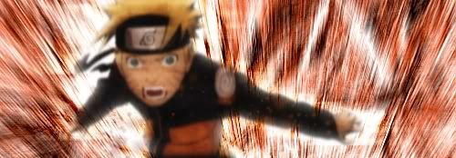
Kazuma!
s-CRY-ed Fan! Awesome i love it....
I loved s-CRY-ed xD
Kazumas so epic
New sig, I think the text means guilty man for judgment
Not your best by far, like the text though...
Only reason I posted it was the text
I have never seen those techniques before, looks unique.
Nice work! I would say they are erratic - some dont work so well, or appear rough edged to me, esp. the one of the comedian, where the background looks to obviously 'wrong' somehow. Maybe its cos Im used to anime based sigs
But I really like some of these -nice design, compilation etc etc! Keep em coming! Could you do a vaguely samurai champloo oriented one?
On that day, all female personelle under my command will be required to wear... Tiny Miniskirts!!!
Tuts made by me:
http://www.animeforum.com/showthread.php?t=76052
http://www.animeforum.com/showthread.php?t=76439
http://www.animeforum.com/showthread.php?t=76093
http://www.animeforum.com/showthread.php?t=76487
There are TONS of GIMP signature tutorials out there. And there are lots of GIMP forums, so try them out. DeviantArt has great tutorials as well.
There are currently 1 users browsing this thread. (0 members and 1 guests)
 Posting Permissions


Bookmarks