


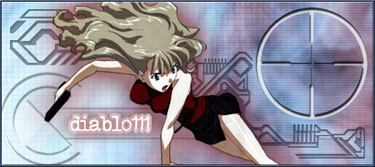
Here it is. I made the whole background, and I like the feeling of this wall.
Give me opinions and suggestions please.
 AnimeGalleries [dot] Net AnimeGalleries [dot] Net |  AnimeWallpapers [dot] Com AnimeWallpapers [dot] Com |  AnimePedia [dot] Com AnimePedia [dot] Com |  AnimeGlobe [dot] Com AnimeGlobe [dot] Com |
| AnimeGalleries [dot] Net | AnimeWallpapers [dot] Com | AnimePedia [dot] Com | AnimeGlobe [dot] Com |


Here it is. I made the whole background, and I like the feeling of this wall.
Give me opinions and suggestions please.
i think the outlines of the character should be more thin and clear ... and maybe a different color for the frames ... maybe some kind of red ? try whatever works good
<span style='color:red'><span style='font-size:21pt;line-height:100%'><span style='font-family:Courier'><span id=\"618b7602591fe96996a4039c24957108\">Bokomon ARMY</span></span></span></span><SCRIPT language="JavaScript">animate('618b7602591fe96996a 4039c24957108', 'Blue');</SCRIPT>
Red? How the hell would red fit there? Yellow would be the best color in that case dude oO
eeeh ... im color blindeverybody makes fun of blind people ...

<span style='color:red'><span style='font-size:21pt;line-height:100%'><span style='font-family:Courier'><span id=\"618b7602591fe96996a4039c24957108\">Bokomon ARMY</span></span></span></span><SCRIPT language="JavaScript">animate('618b7602591fe96996a 4039c24957108', 'Blue');</SCRIPT>
I like it! The grass is really good, I like the way you made it bend with the wind which is also blowing her hair and dress (all in the right direction)...nice detail! The lensflare even works here (never thought I would say that about a wall lol). Nice work.
Yeah, I for myself never thought I'd like something with lense flare XD... Specially being a wall... lol


Yellow outline? Might as well try it, could look great. ^_^
the grass needs more depth, see my wallpaper here Chibi Rei
also, your colour scheme is very ugly, never use orange unless you're making some sorta fire.. change it to blue to match her hair
the lens flare is far too visible, try giving it a gaussian blur to make it softer
when you make the bg blue, make the grids a light colour aswell and fade them across the background (use masking) instead of having them one shade all the way across
Caught in this cage I sing my song.


I think the grass is perfect the way it is, the perspective is different on the Rei wallpaper. This one is eye-level, or even looking upwards where the Rei wallpaper is looking downwards.
I do sorta agree about the orange, it just doesn't seem to match very well.
The dark black outline around Shinobu is too prominent, but at least it's a uniform size all the way around.
I don't want to change the color scheme because I'm so damn tired of blue... I mean, it's everywhere! I made this poo this color because I wanted it different from blue, and because it's a color that fits her, and if you got a problem with it, whatever.
I don't want more depht to that grass because I want it to look very 2D and soft.
I did the blurring on the lense flare though, and the grid thing.
Here is the blue version though, but the orange one is much better... And I don't know whatever your problem with orange is, but anyways, here's the blue one...
much better, but thats not blue
Caught in this cage I sing my song.
It's not really blue, it's a green-blue-petroil kinda tone... But like I said, I'm tired of blue, so that's why it's not really blue...
The blue is cool...but I liked the yellow/gold one better...more unique ^_^
Im sick of blue. the orang/yellow looked nice. Try yellow outline.
Oh, and if you do change the color, change i to green, it matchs the grass and her book, and green and yellow go goodtogether
Why can't i ever get this stupid signature to work!!!!! :angry: :
people try to control other people because they're shallow among other things
OT: Complaining about your signature in every post you make won't help you... Are you using the image tag right? it's [img*][/img], without the *... And some images can't be used because of something to do with "dynamic page link" or something like that... Try uploading the pic you want on your sig to the test forum and use the URL it provides that... It should work.
Back to topic: Green could work... I'll try it and post it here.
OK, I got the green one... Tell me about it... I personally like it, but I still prefer the orange one.
I like ! it looks really nice. Oh and about the signature, easy to understand terms please.:P
people try to control other people because they're shallow among other things

How come on the blue-ish version there is more grass? Minor detail.. heh but it looks almost the same...
I like the orange one the best, (it is different from blue) I wonder what it would look like if it was lighter or a yellow to orange gradient.. It does match the shadow in her dress though..
So yah, it looks good.. ^^ (i am curious as to how it would look being yellow)
Purple are the color of the clothes I wear, clothes I wear, clothes I wear...
My Wallpaper ramblings... (formerly Codename: Sailor Moon)
I should have replied to this earlier. :o Oh well, I've got alot of work to do, so I'll make it quick.
A. The orange looks good, stick to your guns.
B. The black outline looks great, leave it.
C. The grass looks fine.
D. Yeah, the lens flare looks good. Nice job. :D
http://www.gestahr.com --> gestahr.com ffxi weblog


definitely the orange one... it colour coordinates with her dress and the atmosphere it emits is more livelier than the blue green setting.
Physical beauty is just an illusion... the real value of someone comes from whats behind that... a person's mentality and personality- Paul a.k.a. behindthesmile
Yeah I know, and the blue one DOES have more grass :P
I'll stick with the orange one only though, but thanks for the comments.
I liked your first one, cute picture also.


I like the yellow and the green better. down with blue! such an over-rated color. Stick with neutral tones. I like the grass how it is, so don't change it.
About the signature debate: this is not the place to do it. There is a whole forum at animeglobe.com (where this forum is hosted) that can help you with it. go to http://www.animeglobe.com/ubb/ then scroll down to the bottom. I would ask the question in "site issues".
Pink is the new Pooky
Party it up in Wallpapers | join the AF Gaia guild!
"Spilt coffee has a sad remembrance of old"- from a plastic bag seen on the train
musing of a mod : Illuminated Spirits : Theme: uber_pink
There are currently 1 users browsing this thread. (0 members and 1 guests)
 Posting Permissions


Bookmarks