


Im am new to this forum and I would like some feedback on my sig, i just made it, Thanks.

 AnimeGalleries [dot] Net AnimeGalleries [dot] Net |  AnimeWallpapers [dot] Com AnimeWallpapers [dot] Com |  AnimePedia [dot] Com AnimePedia [dot] Com |  AnimeGlobe [dot] Com AnimeGlobe [dot] Com |
| AnimeGalleries [dot] Net | AnimeWallpapers [dot] Com | AnimePedia [dot] Com | AnimeGlobe [dot] Com |


Im am new to this forum and I would like some feedback on my sig, i just made it, Thanks.
Last edited by UrusaiSevera; 01-08-2009 at 08:05 AM. Reason: please post the image, so people know what to comment on. Thanks
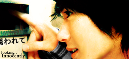
Made by me, I would love feedback xD thanks!V(>.<)V


Not bad for a newbie , I like the concept of the sig , the 2 people really blend in together , but , it would be better if the 2 girl(s) would be in the middle and then put a backround that's heavenly or celestial , to get that mystifying effect to highlight the the girl , and make it a bit sharper but at the same time , its smooth .
Overall , Its not bad . But good ^__^ .
P.s :can you maybe tell me where did u get the girl render ?
Tnx .
Thanks, ya I actually just tryped in google search(image) Heavenly Anime Render lol. As soon as I saw it I wanted it. But thanks for the advice, i am gonna try that.
Oh and how do I get my sig to show up right in my actual sig? I feel dumb haha
Made by me, I would love feedback xD thanks!V(>.<)V

You just started? It's a simple signature but i really like it, lolz. Keep up the good work!
Really, not bad for a newbie.
That's a beautiful sig, the background really matches with the character and the text and color really goes great with the rest of the sig.
I'm not sure if you should make it more angelic or not, the reason being the character's uniform gives the feeling that she's a tough kind of character but you could definatly try experimenting with the background a bit.
Also, try different borders. It looks nice and simple, but simplicity could always be improved on.
Overall, great sig! I love it.
I'm looking forward to seeing more of your work.
By the way, to get your signature to show up just click on the button near the top of the box that looks like a little mountain in a picture, the Insert Image button. Just type in the URL of your image afterwards.
The image hosting makes it look a little small though, so you may want to upload the picture on another site.
Made this one today, I dunno. But let me know what you think compared to my last one!!! Thanks!

Made by me, I would love feedback xD thanks!V(>.<)V

Im new to the forum too..... anyways.....but i liked your first one better. imo, the render is too small, doesn't define the focal very well. Try to also keep a nice colorscheme n also blend the render. I'll let other experts here handle this, but i'll tell u this, you were totally better than me for my first couple sigs XD
both made by me
Thankyou for the input, I will definatly take your advice into my next sig, which should be done tonight! If you can check back and tell me if I corrected myself that would be great! THANKS
Made by me, I would love feedback xD thanks!V(>.<)V
Messing around with some new stuff for the first time, feedback? thanks?

Made by me, I would love feedback xD thanks!V(>.<)V

I really love how the background fits well with the render!
There's something that irks me about the text, the way it's positioned. But that's just me, I'm fussy about most things XD
Love it either way, very good work!
(And yes, I'm new too.)
huge improvement from the previous two sigs. The background adds flow to the sig leading to your focal. Now all you gotta do is improve that text. Here's a good tut you can read ^^
don't worry typography is one of the more difficult things in sigs. Took me a while to learn about it too @_@. Overall gj ^^
Last edited by UrusaiSevera; 01-18-2009 at 05:29 PM. Reason: Please do not direct link off site. Thanks.
both made by me
(X.X) Thanks guys

Last edited by Amon_Amarth; 01-18-2009 at 05:26 PM.
Made by me, I would love feedback xD thanks!V(>.<)V

I love the first one you made! It's awesome!
And it may very well just be me, but the second one I didn't really care for. The picture seemed a little small, and I found that the background didn't really match with the picture...
On the third one, I liked the text at the bottom of the siggy instead of at the side... >.>
Overall, they're great! Please continue! ^.^
Saying of the Week: "Whoa, it's been upgraded to stank. Just last week it was only stink. Stonk can't be far away!"
better job with the typography
both made by me
There are currently 1 users browsing this thread. (0 members and 1 guests)
 Posting Permissions


Bookmarks