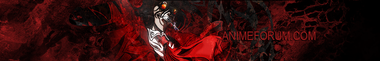


This thing is a "Noir" - wallpaper i created a while ago. As usual the outcome is a whole lot different from what i wanted it to look like <_<, but i think it's quite nice.
Just tell me what you think about it, but be gentle :P
 AnimeGalleries [dot] Net AnimeGalleries [dot] Net |  AnimeWallpapers [dot] Com AnimeWallpapers [dot] Com |  AnimePedia [dot] Com AnimePedia [dot] Com |  AnimeGlobe [dot] Com AnimeGlobe [dot] Com |


 !
!


Bookmarks