


I..
Might as well just start this now. I'm shaking the rust off my PS at the moment, been a few months since I made anything previous to the past few nights.
Constructive criticism is very welcome unless I state otherwise to the piece specifically..
Edit:
About my text, for future reference to everyone: Some people adore it, some people hate it. :3 I know I can go overboard but I like having a lot of text. So please, don't tell me not to use it. I'm not going to listen. I design these much more as banners than I do signatures. Occasionally, I'll go with the keeping the text simple, but that will be at my discretion. I'm not trying to be defensive at all, it's just what I like and that's a lot more important to me than anything else. u.u If you want to give me advice about placement or style, then I'm all ears, but when it comes to how much? :/ No.
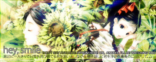
So, recent:
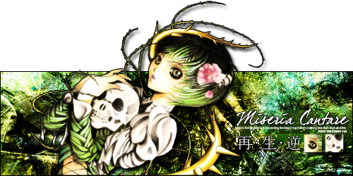
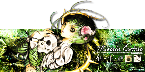
No stroke version:
Just finished this. I don't terribly care for it, but, meh. And the fingers were misshapen in the original scan. So were the vines, partially, but I'm just not sure how to properly shape them to keep the stroke effect from ruining. The stroke makes the pop-out lines look awful and defines the lines of the inside very well; the lack of stroke makes the pop out lines prettier and messes up the inside. It's.. grr.
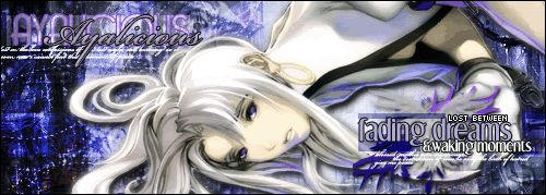
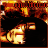
Two days ago: posted for posterity.
This was made for an RPG site, and purposefully kept a bit more simple than normal:
This was my last for another forum, untagged version: Not C&C friendly
And another one I made around that time period, which is by far one of my simplest.. and strangely, one of my favorites.C&C friendly, but there wouldn't be much point.
 AnimeGalleries [dot] Net AnimeGalleries [dot] Net |  AnimeWallpapers [dot] Com AnimeWallpapers [dot] Com |  AnimePedia [dot] Com AnimePedia [dot] Com |  AnimeGlobe [dot] Com AnimeGlobe [dot] Com |


 What's more win than that?


 I think I got that from someone here, actually. Took me twenty minutes to realize they surely couldn't mean with it set to 100% <.<
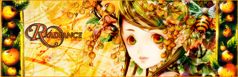


Bookmarks