


Any pointers for a Noob would be great.
Work so far:
 AnimeGalleries [dot] Net AnimeGalleries [dot] Net |  AnimeWallpapers [dot] Com AnimeWallpapers [dot] Com |  AnimePedia [dot] Com AnimePedia [dot] Com |  AnimeGlobe [dot] Com AnimeGlobe [dot] Com |
| AnimeGalleries [dot] Net | AnimeWallpapers [dot] Com | AnimePedia [dot] Com | AnimeGlobe [dot] Com |


Next time, try avoiding using two extracts.
It's really hard to make them both fit into one theme.
Also, in my opinion, the position and placement of the extracts seem kind of random to me...
One more thing, they also don't look like they were resized in proportion. Make sure you hold shift when you are resizing ANYTHING.
Try some tutorials, and you will learn a lot more from that than from a rambling person like me.
So don't give up, and photoshop hard.
Ya the one on the left is a bit out.
Ill probaly be sticking to single pic's like you said... Now I got about 400 new brushes I'm in business.
Most of that Sig is just me Screwing around with Everything photoshop has just seeing what does what etc, which I have most part down pat now.


TUTORIAL TUTORIAL TUTORIAL <<< these are your friends you can find them at google. :3
Do tutorials and you will learn sooo much faster and better. Just one thing, try to keep your characters in the middle of the signature it makes it more focused then.
You shall be good in no time. Keep on truckin' >:3
I agree, take a look at the Tutorial forum here on AF, it has some pretty helpful stuff and it'll help you understand Photoshop a lot more.
Knowledge is power, my friend!
I should write that one down...
Ya thats what Im going to start doing... I got the basics down now, But now I just need to get the move advanced options etc.
Would Anyone Know where I could find some Grid like brushes? Such as Diagonal Lines, or just plain dots in Series. I see alot of People use them and I want to use them too but Ive had no luck finding any brushes for them.


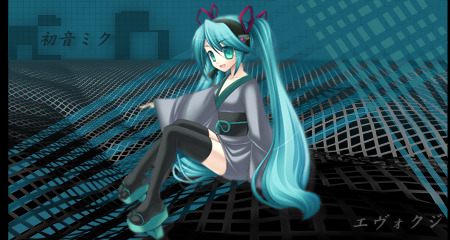
From What anime is she?btw nice signs ^^Originally Posted by Evockzi

Looks cool, the character is a lil too red so he mixes in with the background a bit. And he seems a lil too small for the size of the sig but thats just my opinion. You did a good job on this one. Nice blending :3
Last edited by Dottie.; 07-26-2008 at 07:23 AM.
Ya Ive been working alot lately with Blending different parts, Such as Unlays of the render or C4D's. I just need to learn how to alter the Color all together but I just need to work on it a bit more.
Render turned out smaller then I hoped but not much I can do about that since he's alot taller then Wide.
Got a Really nice Extract I've worked on for good hour now I plan on using just saving it for when I'm better.
Edit: Fooled around with it for lil while to make the Character come out a bit more, added couple affects too.
Looks pretty good man, just that you need to make it little brighter. Contrast is too low. Other than that, very nice.
I love the effects on all of them, personally, I haven't figured out how to do that yet >< But honestly, these are great. Well done.

DOKURO CHAN!!!!! <3
I love the Dokuro chan one!!! And the two under her. But like they said people's tutorials on here can help you make them loads better.
*waves*
Well hi! Welcome to AF! If you need a friend or some help feel free to pm me whenever. Hope you like it here and stay active! ^_____^
LOVE YA: HEG <33 PON, KIBUM <3
"Oh oh oh oh Oppareul saranghae. Ah ah ah ah manhi manhihae." - Girls Generstion "Oh"
So YOU're the one who did that awesome hear-shaped bread sig? =D I really like that one. Not bad for starters, keep practicing, follow tuts and you'll improve in no time. ^^ Keep up the good work!
Hot gift from Midnight Rider Teh Great! Thank you :3
Thank you for the awesome sig, Serated!
-art thread-[VF]-myspace-
Before I do my next sig, I was wondering If Anyone knows where I can get ahold of Brush's of lines and stuff such as Grid's etc, Dot Grids too.
Ive looked everywhere but Can't find any for the life of me.
Uhmm Uhmmm.
Go to deviantart or google and search for Grid photoshop brushes or something like that and you should be able to find some. Theres prob heaps of them out there. C:
Have you tried making you own brushes?? :3
Or you can just use patterns as a substitute
Moving on..
Some nice sigs you have there ^^
Just maybe practice more blending like you current one..
Im fairly happy now with all the Brush's I have now.
Starting to get everything down bit by bit. Sig by Sig... Some reason I just can't use a tutorial o.o... Like a phobia...
Try using the Tutorials we have here, the advance people like Unli. and IchigoKiss, Demoni, who has photoshop. And if you're not pleased with it just add like a twist to it. Or just mess around until you see something you really like. If you want to go into Animation you'll need to learn the basics. But I think you already got that down. Just look more tutorials it'll help! I agree with IchigoKiss on your current sig it's great but the character loos too red plus the character looks a bit blurry to me.(I think that's juts me) Practice your blending and just continue messing around. I look forward to seeing more. Oh and until you get the hang of it I advise to stick to single extracts instead of double and more. And if you want really good extracts google them, loo on deviant art, or look around here. Hope I helped! ^ ^
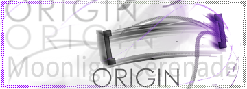
~Moonlight Serenade
latest Sig. Looking for Feed back.
Haven't done one for a bit so just stuck with simple lay out etc, but went for transparent which I think came out well.
edit: If its too inappropriate I'll remove it, I didn't see any rules against it, so I went ahead and put it up.

One big big thing to always remember when making transparent sigs is to make sure that the extract you use is absolutely top notch. Otherwise, it kinda ruins the whole thing because there are little white noises all over the transparent bits, and that's no good.^^' Nice use of lighting though.
ya I became aware of the Flawless factor, I was determined to do a Sig of Lala, I looked everywhere for good extracts and this was the best, after I blurred edges to soften everything it didn't look to bad. On photoshop the white wasn't there even behind the Blue screen. Might try and Fix that.
Edit: ya I tryed everything not much can fix the extract to look better, so Ill just try for a better extract next time and leave this one as is.
had it up on a site that has more of a white background and it looks alot better up there, but can't really read "to-loveる" since its in the transparent part.
There are currently 1 users browsing this thread. (0 members and 1 guests)
 Posting Permissions


 |
| 
Bookmarks