
Originally Posted by
Jagan Eye

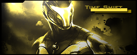
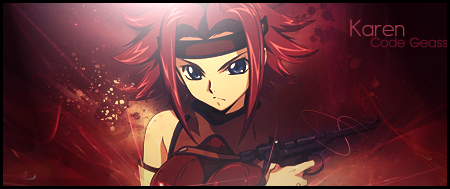
New sig is kwi-ness. I really just don't like the yellow tint though. I guess its part of the theme, but yellow has just never been my color. I also think you should move your text a little to the right, but I do like how you added the boxes behind it. I kinda also feel like the extract is a bit oversharpened, but since the light is falling onto it, it doesn't effect the sig much. I do like the simple splattered background. Nice, and not cluttered. Overall, nice use of effects and lighting.


 AnimeGalleries [dot] Net
 AnimeWallpapers [dot] Com
 AnimePedia [dot] Com
 AnimeGlobe [dot] Com


 |
| 


Bookmarks