


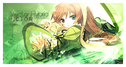
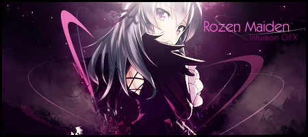
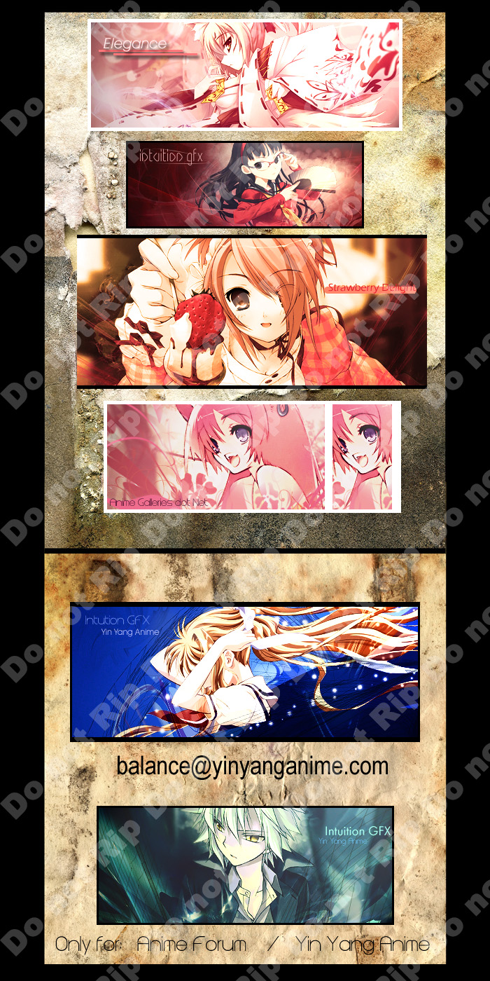
Result from .Lovebeat's Tutorial.
Simple stuff.
But I learned just a little more pen tooling techniques, which is nice. :3
 AnimeGalleries [dot] Net AnimeGalleries [dot] Net |  AnimeWallpapers [dot] Com AnimeWallpapers [dot] Com |  AnimePedia [dot] Com AnimePedia [dot] Com |  AnimeGlobe [dot] Com AnimeGlobe [dot] Com |
| AnimeGalleries [dot] Net | AnimeWallpapers [dot] Com | AnimePedia [dot] Com | AnimeGlobe [dot] Com |


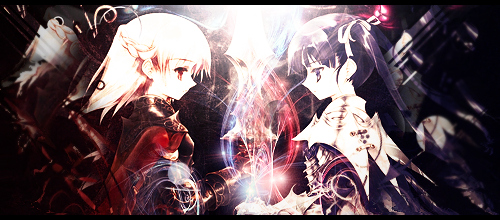
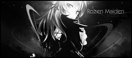
Result from .Lovebeat's Tutorial.
Simple stuff.
But I learned just a little more pen tooling techniques, which is nice. :3


It's flowy and pretty. But too sharp. The edges of all the lines you drew using pentool are too obvious and sharp.
And something else seems a bit off too. I can't figure out what it is though. But you made the extract really flow out and that's my favourite part ^^
Yay for outcome <3
It has a REALLY nice flow and I think the lighting looks good too.
I don't like the shadow of the girl to the left, and whatever you did with your shapes, making them not so "smooth and round" kind of defeats the purpose of making them in the first place imo. XD
But it is a vector hybrid after all, making it what you guys would call it intuitive, right? ;D


Nice result from the tut - lovely colors and lighting especially. It is slightly too sharp I think, and the second "vector" text on the left looks a little grey/dirty, and maybe that is throwing off the left a little bit.Originally Posted by Balance

I like the pen shapes though, on both sides - they looks very nice, and the colors go very well. Great outcome!
These were all experimental, and I had fun doing them.
The Mirror tags were completely a new concept for me, and I found no place for text, so I decided not to.
I also put two versions, because I liked both.
I found this tag to be quite funny.
Reminded me of my old ways.
I know, I know, I've been slacking.
Here is one set.
Gotta make two more.


In a cosmic mood are we? XD
I really love the purple version,
I never did fancy monotone signatures unless there was no other way *shakes fist*.
I love the pentooling, and the distortion? or perspective? that you used with it.
The star/background looks realistic and the lighting is well done.
& SMEXY EXTRACTION CHOICE. o_o

Hm, I might consider that later on.
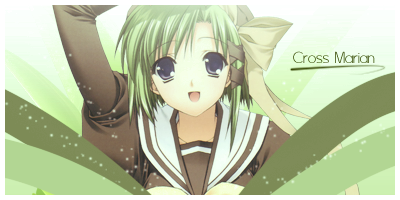
A little something for Miss Cross Marian, who has changed her username quite frequently for a while.
Yes, two times is frequent. ;D
Hah, I remember when Cross was SaucyNinja back in the day.
I call her Shira though, because I talked to her frequently when she was Shirayuki.
I have seen better from you, so don't get hurt on my critic. >_<
I think you got the colors right in the sig, but it looks very dull in my opinion.
I think the quality could look much better.
The fuzzy things look like they're going to blend, a bit too fuzzy.
The thing with the best quality in this sig has got to be the text and the effect underneath the text.
Now I know this is alil something, but if its going to be lil, there should be a bit more care to it to make every little detail in this smaller image, look just right.
Haven't posted here for a long time.
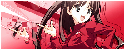
A signature inspired by Fallen.
w00t
Nothing too special.
Its a little blank in the lower left and higher right corners, and maybe the gradiant could have been more.. spaced? If that makes sense.
Other than that I think it is wonderful. I love all the red *0* and the inventive text placement. Also the clip masks are done very nicely.
No signatures today, but I do have an announcement.
From here on today, I will start posting signatures into my blog from now on.
Not the blog on AF, my official blog.
I will also begin to password protect my blog, so if you are interested in viewing it, please PM me and I will give you the password to it.
I will post in here, don't worry about that, but in ways that no one will be able to rip anymore.
Thus ends my announcement.


@ Balance:
Good idea...
But, you could put a signature on your grapjics in a place where it would be difficult to edit it away without ruining the pic ;P
Like half your on top of the figures, and the other half on the bg.
On a place where the colours are more then just one, with shades etc...
Don't worry.
This is what I'm going to do.
Every five signatures I'll make, I will post it up.
Then I'll put all those signatures onto something like a gift wall with an anti-rip image on top of the signatures.
People rip your stuff, huh? Well it must be tempting for them. Almost everyone of your creations rock ^^
I have my own little logo which I use on my wallpapers. Oh and by the way; nice new tags. My favs are the Rozen Maiden and the Rin tohska ones. Nice use of clip masks and brushes.
Naw, my stuff isn't all that great. .__.
Alright, time for something new.
It's a bit big at first, but I think it's actually quite effective.
Try to rip that, fools.
Well, comments or criticisms anyone?

~oiiiii!! so lovely! I love the blue one, with the girl making her hair...and the strawberry one is cute <3 I love their colors...keep it up! great work....=D
and: your work is awsome...i know what i am talking about, so trust moi =)
Last edited by .fnhvmnvmv; 10-20-2008 at 03:33 AM.
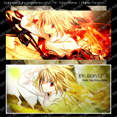
Only two for today.
The first one was a HORRIBLE HORRIBLE FAILURE.
The next one is my improvised one.
Yellow worked a lot better than orange.
I still didn't like it, but hell, it's been a while.
Give me a break.
Bleh.
1st one since Arcuied looks as if she's blasting through the flames ;D Red eyes, red hot background, hotness
(
Overall, imo, pretty balanced (not a pun). Love the contrast at the left, and mostly the right amount of nothingness xD
But the right side looks kinda hectic, cut down on the C4Ds a bit
Over-saturating since '07


WHOA. Your results for the challenge are so pretty! I personally like the first one better. As Unli says, flames, oho, but also reminds me of a guitar. I feel like the text doesn't seem to fit at all in the second one. Maybe get rid of the drop shadow? I love your new anti-rip by the way. Awesome.
i liked the second one better. Flow seems to be better in it to me. The effects seem nicer and softer and fits the extraction better. Only thing i see thats off is the text which has already been stated. I think Face the challenge would probably fit better if you lowered the opacity to it some. It would of given it a softer look.

ARCUIED IS HOT. The first one if a bit too overly sharp but it probably because of the color settings. Everything flows nicely and the depth is really nice. Maybe the drop shadow of the second one could be a little more solid though. 8)
Nice results - I completely agree with Unleh - the first one seems much better suited than the second one. The colors are much better, the flames fit, and I like the overall flow much better. Maybe a little too sharp like Konata said, but other than that, hawtness.
I am loving the last Inuition Gfx Yin Yang Anime one - flow + colors + extract = smexy!

Such large tags.0_0 Good thing you never ran out of ideas to fill those(!) Some tags have too much lighting going on and it's perplexing but still fine. The focus never strays away and the style is still intact.
--I wnna learn the style behind those! Teach me, teach me!--pls;p
There are currently 1 users browsing this thread. (0 members and 1 guests)
 Posting Permissions


Bookmarks