


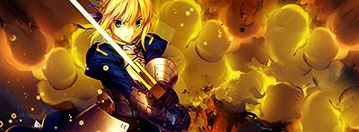
Nice, but i'd have the black line on the right should be going the opposite way, cause you have a good double flow here.
 AnimeGalleries [dot] Net AnimeGalleries [dot] Net |  AnimeWallpapers [dot] Com AnimeWallpapers [dot] Com |  AnimePedia [dot] Com AnimePedia [dot] Com |  AnimeGlobe [dot] Com AnimeGlobe [dot] Com |
| AnimeGalleries [dot] Net | AnimeWallpapers [dot] Com | AnimePedia [dot] Com | AnimeGlobe [dot] Com |


Nice, but i'd have the black line on the right should be going the opposite way, cause you have a good double flow here.
ein, zwei, drei, vier bin endlich weg von Dir
fünf, sechs, sieben, acht Du hast jetzt keine Macht
♥


Double flow?
Well I gave it a go with phail vector signature. (text is in an odd place I know =/)
Comment this, so I can finally close out this thread of... lol nevermind but still CnC (is it just me or did I over do the sharpen?)
EXTRACTION CREDIT TO SERATED!!!!!!!!!!!!!!!!!!!!!!!!!!!!!!!!!!!!!!!!!!! !!!!!!!!!!!!!!!!!!!!!!!!!
Last edited by Jose; 03-10-2009 at 02:47 AM.
Er, yeah, oversharpened from my view too...
The tiny details are disguising as noise! D:
Color scheme is pretty good for the vector style. But I dunno, maybe use some more louder colors to funk it up more (like the white in the gradient, for example)?
BTW, nice choice of borders.
--
http://www.animeforum.com/image/720234993780b6bb64.png
Brilliant!
Love the colors and composition!
Preferring this over the second one cause the color mix has more quality
EDIT
...I follow Balance's comment on the scheme does not match Saber
I need to be more straight forward >_>
Last edited by Famahama; 03-11-2009 at 02:02 AM.
Over-saturating since '07


Very nice sigs there Jose. Liking the coloring. NICE. Just wish I could do that.
Minato Namikaze 2007. www.Minato.us ( Yondaime Hokage. )

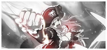
I'm sorry, but the color scheme seriously does not fit Saber.
Something like this:
http://www.animeforum.com/image/720234993780b6bb64.png
is pure win.
And in most centered signatures, double flow is quite common but anyway...
I feel that the colors really don't capture Saber very well, and that art style of Saber, in my honest opinion is very hard to work with and I'd rather use it for a large piece rather than in a signature.
You have been getting extraordinarily talented lately and it's getting quite interesting to see what you'll come up with.
Keep posting, let's see what you make.
I just think it needs forground effects, and maybe re color her dress if you can :3
ein, zwei, drei, vier bin endlich weg von Dir
fünf, sechs, sieben, acht Du hast jetzt keine Macht
♥


I did a vector sig tutorial recently made by Fallen on AR (Unli knows who that is)
And he said that when doing a vector sig, choose colors from the render.
So I agree with Balance about the colors.
Though that Saber render doesn`t have many colors to choose from.
Thanks you guys, I'll redo the Saber signature entirely.
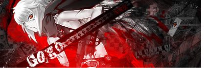
SOTW 41 entry

Joseeeeeee! That was youuuu! I LOVED the textwork on this siggy so much. Its so pretty pretty. The left side feels kinda empty but this siggy just flows nicely.

Hmm, that's a nice siggy. Great concept with the text, integrating the forum name like that. Nice job!

Gorgeous sig!
Love the style, and the typo is excellent.
Not to mention of course that the composition is squared away ^_^
So Colby wanted me to teach him how to use GIMP so I made a basic signature, redoing the Saber one, hopefully this one isn't as suckishOriginally Posted by Jose

=D Midnight, you've return (hurray =D)
Thanks you guys
CnC (almost finished with this thread, help me close it =D)
O____________o;
Wow you guys know how to make a guy wanna make more signatures =D comment galore... Sorry eh, I am slightly sick and came up with this crap
>.>;
(extraction credit...probably Serated)
She seems way too high up in comparison to the buildings, like she's floating. Make sure to make your manips seem real :3 The render itself seems a bit lq
ein, zwei, drei, vier bin endlich weg von Dir
fünf, sechs, sieben, acht Du hast jetzt keine Macht
♥
She's magic =D lol
well here is my entry for the latest SOTW:
I lost to Serated, so I think that's decent ;D
O_____O
still no comments? </3
^ Intuition weekly project thing.
I don't know, to be completely honest your latest signature falls short of my expectations of you, it's just not as good as your others. Not that it's a horrible signature, it just lacks that focus that I expect from a signature. It doesn't draw my attention, the stock and background all blend into eachother, and the colours you chose don't do well to help differentiate them from the other either. The text and composition are okay, but I think you could have done better.
NOW, as for your latest SOTW entry... major props and kudos go to you! Ahh, it's love! Nice choice of stock and the effects that you used are very very well done. I love all the bright colours and your textwork is very well done here, I also really like how you used a chunky border to sort of ground the signature, so that it wasn't all pizazz, and your usage of black and white within the signature also helped to do this. To me this is one of your best [if not your best] and it deserved a win. [though Serated is one tough gfxer to beat haha >_<;] I really have great appreciation for this signature!
I like how you always experiment and try new things with your gfx, your sort of like a gfx chameleon. Keep it up yo! :]
---
&& all the world's a stage
i existed because i dreamed it;
i dreamed the world...//


In my opinion it looks pretty good but I think you should play around with it and somehow it would look interesting.(This what I do my sigs)Do you understand What I mean?Besides that, I really like it.
"Nothings gonna take us down"
Your last signature is too blurry and very not clear. It also lacks a focus and the render is not visible. I believe your other siggies were much better.
For your entry, I admit that it doesn't appeal to my taste, but the background looks like it has gotten a lot of work. Good job with that but the character was a bit blurry and the text looked weird, somewhat.
For the siggie in post #188, I think the character is a bit too small. And the quality is lacking. Plus, it looks a bit too clean.
But your siggies are overall awesome. ^^
www.snowflowergames.withme.us
- Enjoy having friends!
- Enjoy playing games!
- Enjoy doing free activities!
- ENJOY, ENJOY, ENJOY!
Someone has expectations of me?
Wow thanks, that was pretty lame D: so I retired the Intu-challenge
I personally like the first one better.
feedback <3333
ps also made a dorky avatar with gimp's path tool lolololol

Last edited by Jose; 04-11-2009 at 09:22 PM.
Ahh![IMG]http://www.yinyanganime.com/intgfx/intuionpj00.png[/]
The colors!!
I love them!!!
Great job on this one man - And excellent typo too
Last edited by UrusaiSevera; 04-13-2009 at 07:27 AM. Reason: don't quote any of the last posted images.
Can't comment on the intuition one, never got in lol
But the Miku one, yay it's Miku, I find the grungy feel of the background really doesn't suit her, I'd use more vector effects :3
ein, zwei, drei, vier bin endlich weg von Dir
fünf, sechs, sieben, acht Du hast jetzt keine Macht
♥
I really like the effect on the sig it really fits in good!I personally think that the effect is good.
"Nothings gonna take us down"
Looking at most of your sigs, you seem to have a thing for double flow, don't you?
And
http://www.yinyanganime.com/intgfx/intuionpj00.png
is definitely one of your best ones ^^ I love the overall composition. Good text placement too. I like how the text doesn't stand out more than the focal. And those splats! You've done a great job with the colors.
But do you think that white line going upwards towards the left was really necessary? Or was it your habit of putting in double flow?
Jose will you make me a dorky avatar please? XD
I just love your style. I was showing it off to my brother just an hour ago being all <3333 over the siggys. I love the totally awesome shapes and effects you use. The colors all stand out and work together and I love how the foreground jumps off the background. And I am in love with your textwork. You should try some typography. It would be awesomely fun.
There are currently 1 users browsing this thread. (0 members and 1 guests)
 Posting Permissions


Bookmarks