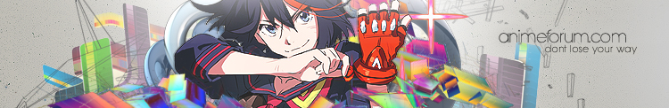


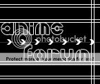
Here's my first try at a banner.

 AnimeGalleries [dot] Net AnimeGalleries [dot] Net |  AnimeWallpapers [dot] Com AnimeWallpapers [dot] Com |  AnimePedia [dot] Com AnimePedia [dot] Com |  AnimeGlobe [dot] Com AnimeGlobe [dot] Com |
| AnimeGalleries [dot] Net | AnimeWallpapers [dot] Com | AnimePedia [dot] Com | AnimeGlobe [dot] Com |


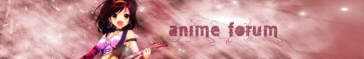
Here's my first try at a banner.


Previews have been put up:
http://www.animeforum.com/banner_hea...iew/index2.php
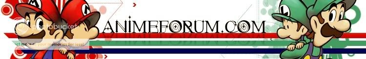
Ellipsis, I need Minako's approval to upload your banner. Mario is not really an anime or manga. ^_^;;
Signature and avatar made by Trinity Muse!


banner is fine
A simple kiss can warm an entire body
My first try at making a banner x_x I hope its not too plain >_<

Preview done Angelic~: http://www.animeforum.com/banner_hea.../angelic01.php
Signature and avatar made by Trinity Muse!
Delete this post, FlashD..or dont! it doesnt matter...
Last edited by THE ICE ANGEL; 09-30-2009 at 11:47 AM.
Ice Angel, your two banners are both rejected.
Also ... next time you take somebody's extraction make sure to credit by posting the extractor's name in your post.
EDIT: I think I forgot to mention the preview list has been cleared and all banners uploaded, but I guess you found that out yourself already. :P
Last edited by FlashD; 10-06-2009 at 06:26 AM.
Signature and avatar made by Trinity Muse!
Alright, here's a second one.
Last edited by Bulf; 10-20-2009 at 05:28 PM.
Preview: http://www.animeforum.com/banner_hea...ellipsis02.php
I find the word "find" hard to read. To me it reads more like an "and". v_v
Signature and avatar made by Trinity Muse!
I thought the same, so I made another versionOriginally Posted by FlashD

Made it easier to read for ya ;D

EDIT: Extraction: Serated
Last edited by Acnologia; 11-10-2009 at 08:53 PM.
ein, zwei, drei, vier bin endlich weg von Dir
fünf, sechs, sieben, acht Du hast jetzt keine Macht
♥


Well, here is my attempt at a banner. I really don't like it, but w/e.

A bit late, but better late than never ... O_o;;
Ellipsis: Banner uploaded.
Silent Requiem: Here is the preview. Please, fix the text. It really doesn't work well with the BG, also the character is totally off. Find something more fitting, right now it really looks like it's there without any purpose. I really like the background, though.
sev121993: Blury and too plain (empty). Banner rejected.
Last edited by FlashD; 11-25-2009 at 01:45 PM.
Signature and avatar made by Trinity Muse!
or

Last edited by Bulf; 12-20-2009 at 01:18 PM.
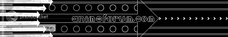
MrNintendo (you and your Nintendo stuff): The banner looks nice, sadly I can barely read the text under the Animf forum (where's the dot O_o;; ) com which is also not our forum's name. :P You did a good job with everything else, though.
Silent Requiem: I'm also rejecting your banner, since until now you didn't fix what I've asked you to fix.
Last edited by FlashD; 12-21-2009 at 02:44 PM.
Signature and avatar made by Trinity Muse!
I don't know...
No, Hyphen, just no. The banner doesn't work at all with AF.
Here is the preview if you are interested: -Click-
EDIT: teed let me know how much the explanation I gave here sucks, so I'm fixing it with this edit. The banner really stands out and doesn't match the site at all. Also the white arrows on the left make the banner heavily contrasted. Then, there are the little arrows in the center, which stop because of the repeating part and then continue at the end. The whole thing really looks weird. v_v
Last edited by FlashD; 02-01-2010 at 10:56 AM.
Signature and avatar made by Trinity Muse!
or
Meh.
Last edited by Bulf; 03-18-2010 at 12:23 PM.
Well Fire Emblem -did- have an anime a long time ago...
EDIT:
(update)
EDIT 2:
I'm pretty much gonna spam banners for a while.
I really hate the last part, so I'll change that when I get ideas v_v
Last edited by Bulf; 05-02-2010 at 09:18 PM.

Hello, this is my 2nd image i've ever made. I followed the instructions properly, I hope. I hope you guys like it!
Edit (12:00am Wednesday March 31th 2010) :
Best Regards,
Brockii.
Last edited by Brockii; 03-30-2010 at 08:00 AM.
CollingWood FootBall Club
Sajin:
- The Sonic banner needs it's repeating part fixed (top horizontal line);
- The Fire Emblem has the border of the right part visible on the banner. Also, the character design doesn't match the background design (rejected);
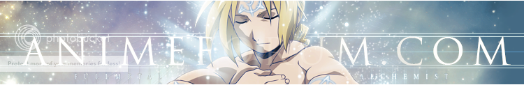
- The Fullmetal Alchemist one needs a more visible "Fullmetal Alchemist" text. Right now I can turn blind just by trying to read it. The "AnimeForum.com" text should be under the character (never over it). Usually I prefer it's clearly visible but the way the banner is made is impossible. Also, there is no need to put the "Anime Forum" text on the main and right part (valid for the Fire Emblem too);
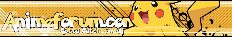
- The Pikachu banner is OK and will be accepted if you won't find anything to fix from the previews.
Brockii:
- Your Pokemon banner is too plain. There is a lot of space you can fill with something (rejected);
- The Naruto one needs better colors. Right now the contrast is huge. Also the space between the F and O in "Forum" needs to be fixed (rejected).
Both check the preview page to see all the banners mentioned in this post on your own screen.
IMPORTANT:
The rules on the first page have been updated. They didn't really change, we only request you attach the names of the characters in the banner and the name of the show/manga/game/etc. the characters are from.
Last edited by FlashD; 05-04-2010 at 08:44 AM.
Signature and avatar made by Trinity Muse!
-Fixed the repeating top line.
-removed random horizontal line in the middle

-Added FMA to the end of the right end, with a transmutation circle in the bg.
-I can't get the other FullMetal text to show up right, but I tried to bring it out a bit.
I don't know what anime she's from, so if anyone knows then tell me so I can add it to the end of the banner
The Fullmetal Alchemist banner is weird now. Remove the text from the right part (the transmutation circle is enough) and the effect on the text "Fullmetal alchemist" or the text itself in the main part. It stands out way too much. Other than that is good.
The Sonic one still has that weird horizontal line on all 3 parts of the banner. Check the attachment.
The last submitted one is ok. I'll double check on my LCD screen in a few days to see if the quality is also decent. On my CRT looks ok though. And try to get me the name for this one ... somehow. u_u
Signature and avatar made by Trinity Muse!
I couldn't get rid of the effect on the text, because it was made with the extraction, so I just tossed it.
For the orangish one up there.
Last edited by Bulf; 06-23-2010 at 12:04 PM.
There are currently 3 users browsing this thread. (0 members and 3 guests)
 Posting Permissions


 Reply With Quote
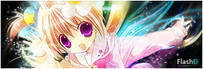


Bookmarks