


::
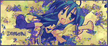
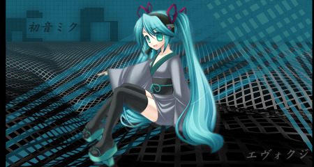
I'm in a Lucky Star mood. :P
I had a bit of trouble placing the text.
C&C?
♥5th Page!♥
 AnimeGalleries [dot] Net AnimeGalleries [dot] Net |  AnimeWallpapers [dot] Com AnimeWallpapers [dot] Com |  AnimePedia [dot] Com AnimePedia [dot] Com |  AnimeGlobe [dot] Com AnimeGlobe [dot] Com |
| AnimeGalleries [dot] Net | AnimeWallpapers [dot] Com | AnimePedia [dot] Com | AnimeGlobe [dot] Com |


::
I'm in a Lucky Star mood. :P
I had a bit of trouble placing the text.
C&C?
♥5th Page!♥
Last edited by Cotaku; 07-24-2008 at 12:54 AM.
I like your work ^_^ And, other than being pixelish around the edges, all of your renders are adorable! I don't suppose the pixelation can be fixed with paint...
Aaaah, it's so cool! Very nice, I like it a lot. I think the text is okay, and what I like too is the border. It's perfect and it blends with everything else nicely. Good job! :]
Hot gift from Midnight Rider Teh Great! Thank you :3
Thank you for the awesome sig, Serated!
-art thread-[VF]-myspace-
Meh. I'm getting bored with that set. xD
Too "spongy" for my taste right now.
New set!
::
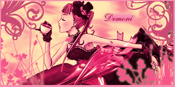
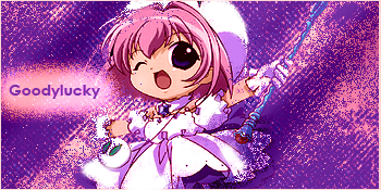
Felt a bit pink today. xD
I think the render is absolutely adorable! Go ahead and question my opinions on cuteness. xP
I was thinking about adding the text, "Try the Tea" but decided not to do that. Would it have been better with that?
C&C is always appreciated. ALWAYS. ♥


I <3 it Demoni!
It's very Pink, haha, but very pretty!
*gives thumbs up*
"For it was not into my ear you whispered, but into my heart. It was not my lips you kissed, but my soul." - Judy Garland
Archmage Evelyn Nightingale, Guardian of the North, at your service.
Formally known as Vanilla Kiss.

Your style reminds me of my own old signatures. O_O
I love the color and the choice of image. I think the sig would look better with a grungier font, and I think the text in placed wrong. The brushes are cute, but I think there is too much.
I think you have a lot of potention though, keep working on making sigs.

In the right hand bottom corner, I don't think the glow on the brush goes very well. D: but its not so noticable.
And the colouring behind your name looks kinda out of place.
but everything else looks really good :3 love the pink colours and I think the extraction is cute, reminds me of alice in wonderland. x3
really awesome set!
like dotmyztick said, the pink part that you put your text on doesn't seem to match. can you maybe erase that pink part behind the text?
and for the avy, maybe you don't need to extract the teapot. maybe you can put the extraction's hand in it too? colour the bg too ^_^
btw, is it just me, or does your border seem uneven for the 4 sides..? maybe I need glasses too...

Nice sig, but I agree with Goodlucky that maybe you should have just cropped the avvy out of the sig because it doesn't look like it matches.
Made by my lover ♥ Jagan Eye
This one's pretteh in pink :L
Just maybe lessen some the floral - swirly brushes and use
textures for the bg so it has some sort of feeling and to make it more blendy.
And I LOVE the extract it's rad dude, yeah. Please send it to me *0*
@dotmyztick: Now that I look at it, the pink behind the text seems...too pink. Darn. D:
@Goodylucky: Yeah, it is uneven. I don't really like the way I'm handling borders in PS. ^_^;;
@IchigoKiss: I thought the jungle of pink plants made it look jungly. *shrug*
~New set~
::
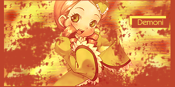
I hate making avatars. D:
I found the Kanaria render and I HAD to have it! x]
C&C?
Last edited by Cotaku; 08-11-2008 at 02:38 PM.
yay, new set!!
for the avy, I think you should put more gray into it and less yellow, too bright >.>
and now for the set, it's really good, but I don't like how you placed the text over rectangles. still, nice blending ^_^
as for borders, I think for PS, you select a new layer, then go to Edit > Stroke, then you choose your pixels and colour for your border.
Last edited by Goodylucky; 08-11-2008 at 03:54 PM.
::
Goodylucky's request~ She extracted the image.
I've been having a really horrible "block", lately. ;_;
So I hope she likes it!
Once again, I hate avatars. *glares at the avatar*
C&C?
Last edited by Cotaku; 08-18-2008 at 01:08 AM.
how can you possibly hate the avatar!!
I love the avatar xD
come to think of it, the character looks kinda scared o_O;; I wonder what will happen if you add a phrase that says: "Ahh! A spider!!"
I think um.. for the sig.. you could make it lighter ^_^;;and try some C4Ds... <-- yeah, I'm addicted to C4Ds that's why I think every sig needs C4D... -_-;;
anyway, try every filter, so you can know what each filter does and it might be useful x.x and mess around super much xD

@Goodylucky: I haven't messed around with C4Ds yet so I'm waiting on that until I get a bit better.
@Evockzi: Lol. I think avatars hate me back, too. : P
Brighter version~
aaah!! too bright!! it hurts my eyes now!!
*runs away screaming xD*
actually, ignore what I said about making it brighter.
the darker one actually looks better now o_O;;
sorry for the trouble, Demoni T_T
ah supaa kawaiiiiiii!!!! loves it!!!! maybe the bg is a lil too plain for me and too flat...like the idea of the pixlated render though....ha i just like it lolOriginally Posted by Demoni

Twilightdreams gifty! ~
I hope she likes it! >.<
C&C?
yay! Fruits Basket xD
okay.. just to point this out.. the border is uneven again >.>
anyway, try to add more colours cuz it looks kinda monotone...
try to make the text smaller also, cuz it takes too much space and it stands out a little too much...
you're improving quickly xD
I'd have to agree with Goodylucky there.
But then again, uneven borders can be good as well.
So I wouldn't worry too much about that.
But yes, the colors need to be a bit more flamboyant in my opinion.
Because without color, we are just like dogs who don't understand the beauty of color.
Also it could probably be a little shorter on the height as well.
Keep up the works. I'll drop by more often from now on. ;D
@Goodylucky: For the color part...would adding more orange make it less monochrome? Or would that be no good?
Before you go saying, "OMG So bright! My eyes!" I was just super bored and challenged myself. I put a flare of light on every layer except the border layer. And other lighting effects.
So yes. It is bright. It is on purpose. And since it was just a fun little project, I didn't add any text.
If you want to, go ahead and C&C. xD
okay, for the Fruits Basket sig, I think orange could work, but try to not to let it fuse together with the original bg, maybe white will work too ^_^
alright, for the new sig... OMG So bright! My eyes!! jk xD
the light sourse is kinda weird, cuz the light should be coming infront of Ichigo, not behind him... I don't really like the border colour for some reason also >.<
hope to see more sigs from you xD
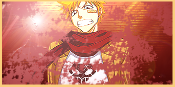
SotW #16 Entry:
@Jagan Eye & YukiOnna: Thank you for the votes. ♥
At first I was just messing around with the Halftone function...Then I ended up really liking the result so I decided to enter.
C&C?
There are currently 2 users browsing this thread. (0 members and 2 guests)
 Posting Permissions


Bookmarks