


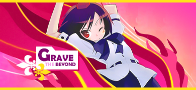
Ahh, that Topaz-alternative?
http://www.animeforum.com/showthread.php?t=73250
Its amazing how a little change can make things looks so awesome
xD
 AnimeGalleries [dot] Net AnimeGalleries [dot] Net |  AnimeWallpapers [dot] Com AnimeWallpapers [dot] Com |  AnimePedia [dot] Com AnimePedia [dot] Com |  AnimeGlobe [dot] Com AnimeGlobe [dot] Com |
| AnimeGalleries [dot] Net | AnimeWallpapers [dot] Com | AnimePedia [dot] Com | AnimeGlobe [dot] Com |


Ahh, that Topaz-alternative?
http://www.animeforum.com/showthread.php?t=73250
Its amazing how a little change can make things looks so awesome
xD
Over-saturating since '07


D-darker than Black? I seriously need to watch that. @__@"
I like the noisy background and the little sprinkles on the left give off a sort of fading effect. The C4D(?) and background at the back gives it a outer spacy look and I ttly love the use of colors.
are you doing requests?


Wow, this looks really good. I like it with the border going all they way around, it suits it well. The back ground it so perfect and you really are good at using c4ds. It looks very flowy together. They dusty particles you added compliment everything nicely and makes it look very spacey. And I love how you are so good at using text and make it look so apart of the background.

I like the new stuff unli. though I think you're overutilizing the C4D's in your work.
All I see is C4D's.. but I'm kind of biased, because I normally don't like C4D's.
I feel like the C4D's are leaving no extra room for different input. Though they look nice... I just don't think they're perfect.
Perhaps this is a case of overdoing it. But because you are relatively new to creating your own C4D's, you'll want to utilize them in your works.. a lot. Perhaps you'll find a balance between the usage of C4D's and other graphic techniques.
Ciao~
<3


I love your border and your text; its unique and original - i love it. Never been a fan of noise effect but i think it goes well in this signature ^^ - one day I hope to be as good as you >:3
Keep on truckin'
Still overusing ;___;
After that LOOOOOOOONNGGGGG 2 weeks of no signature, I rusted and stuff
Viral
(I may extract that, so keep an eye out for it)
I think I achieved a good depth here ^_^ oh well,
C&C
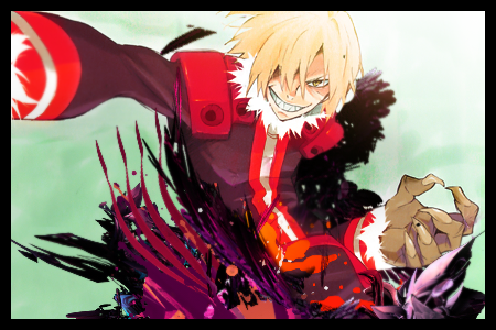
Over-saturating since '07


Its big o_O
But its still nice, nonetheless. I really like the bg with the soft greens and then the vibrant reds in the foreground. Its a tad hard to tell what Im looking at...and it seems his arm is coming out of his stomach >_>;;
Still, 9/10 =D
.-.
(o.o)
|=|
__|__
//.=|=.\\
// .=|=. \\
\\ .=|=. //
\\(_=_)//
(:| |: )
|| ||
() ()
|| ||
|| ||
==' '==
Heh, you finally used that stock image.
Well, personally, I think that the bright green background doesn't fit Viral's overall feel.
After all, he looks pretty menacing.
Also, it doesn't seem like there's THAT much going on, as it's a bit empty.
I like that, and don't at the same time, but it's good.
Very good placement of the C4Ds though.
And yeah, depth is nice. =D
Your last sig is awesome! I like the fact that it's big. [: Depth is very nice. And your other sigs are awesome! So you don't take requests, ha? What a shame. >.> Anyway, can't wait to see more of your works!
Awesome sig by MaruDashi ^^ Thank you!
...
Sun reclines
tease my mind
reminds me what to leave behind
light eats night
and all I never said
reminds me what to do before I'm... dead.
...
~poison.ivy is my blood sucking sister~
~together we shall rule~
*evil grin*
Hm, I really took this sig in. I feel the depth. Its very eye-catching and a very captivating sig. The colors are great and they go very well with each other and its just amazing. *Blown Away*
TEACH ME NAO.
>:]
*cough* >>;
OMG you have to be the C4D master. Everytime I do something ith C4Ds it looks like I just flung them in my sig and moved em around. I lurve this sig. I can see how you acheived your depth in this one >:3 by blurring the arm and sharpening the face. or well.. thats what it looks like. The colours of the C4Ds even blend together and with the extraction. *o*
now. Where do you get your C4Ds?
-forever envies you- xD

Yoh unli! Oh no, w8! Calling you unli-sama better suits you and might trigger something for you to recall!,EhehxD
Not a fan of big sigs. But hey it's just me! ~Great use of c4ds, placement is cool too, yeah lighting(!), yup flow**, good depth. ^_^ Im really digging your current tag too.
=D
@ Balance
I was a lazy tard, so I kinda just burned the background. It turned green O__o I was thinking of dark purple or dark blue because of his sleek and menacing look.
@ .Myztick
PR, dA and Goooooooooogle =DD
Anyway, new one for GRAVE!
(HAHA, EAT THAT CREATIVITY BLOCK)
Theres a good chance I'd make a tutorial out of this. Maybe, if my projects and slacking of extracting duties aren't so tight. Keep an eye out for it ^_^
C&C so I can make tut tutorial better >: D Pure pentooling all the way until the custom shapes, font, and extract.
---
yay, my 3001st post
Last edited by Famahama; 07-29-2008 at 02:15 PM.
Over-saturating since '07
AH! I love the pink! I'm assuming thats a c4d, and if it is, where do you get your c4ds from? The text is so perfect in that adorable little box. Actually, that might be the pentool I hear about that GIMP doesn't have. I like the one with the border better, its more completeish, I feel. I like that this sig isn't distracting and the focus is well focused. xD Beautiful!
Bleh. Jealousy + 20
I love it. The colours and flow of the sig are wonderful. And the text, it's very orginal. I love the simplicity and the use of the pen tool. :3
Make that tutorial. Make it now! >:3

Originally Posted by Tha Veile Ladie*~

I'm happier now =DD
Over-saturating since '07
I'm not digging the black stuff near the right, other than that the sig is hot.
ein, zwei, drei, vier bin endlich weg von Dir
fünf, sechs, sieben, acht Du hast jetzt keine Macht
♥
V3.1
and
V3.2
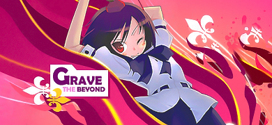
Over-saturating since '07
What's the difference between those two?
Picky picky aren't we people? lol xD
I like the 1st re done version, the one that is more red. It's so good unlehhhh. C:
I like V3.2, the colors in V3.1 were too bright for my tastes. But awesome sig! ^_^
Made by my lover ♥ Jagan Eye
V3.1 is the awesome-est version evuur.
It seems to have more feeling than the other ones anyways,
I love it's vibrant colors and uber pentool-ing
Kudos
Ooh, I like this sig. The C4Ds are great, and I love the lighting. I would have to say that I like the bright coloring of v3.1 The second one is a little too murkish-looking for me. Great sig - it came out awesome!
There are currently 1 users browsing this thread. (0 members and 1 guests)
 Posting Permissions


Bookmarks