


What?
I see no buckets of phail >=O
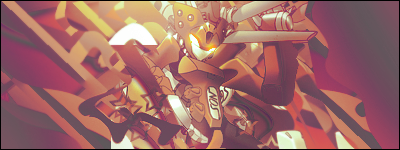
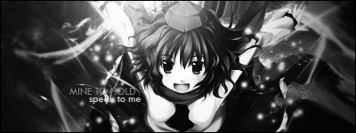
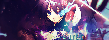
Second one because male tags is rare for male GFX-ers
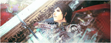
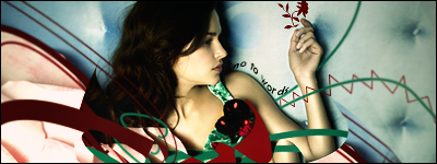
Love the left side, I have to say. Most likely because of the diagonal thing =D
Colors pretty much is a job well done, except that the pattern below the text kinda pulls in attention to that. Probably use the baby blue from the effects you made
Your usage of resource is pretty good btw xD C4D, Pattern, Scanlines. Man, I could NOT pull that off in an image xD;
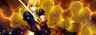
Overall flow is pretty good, though imo, the spear kinda disrupts it, bt nothign that the eraser tool can't do <33
I see negative space at the top right area, >_>
 AnimeGalleries [dot] Net AnimeGalleries [dot] Net |  AnimeWallpapers [dot] Com AnimeWallpapers [dot] Com |  AnimePedia [dot] Com AnimePedia [dot] Com |  AnimeGlobe [dot] Com AnimeGlobe [dot] Com |


 ---->
----> 


Bookmarks