First of all, according to the rules every wallpaper should be in it's own thread. This is because this way people can concentrate on one wallpaper and it's improved versions, rather than just go for a general opinion on all the walls.
Then, I guess it's good I explain a few things about why the first wall was rejected.
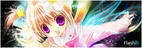
This wallpaper is actually pretty good as of the whole idea. I liked how it was made, but as a validator I had to ask myself a few things:
- as one of the possible candidates to use the wallpaper would I like to have a wallpaper on my desktop where the main character's face is covered with a a moon and stars which don't even blend nicely? (doesn't matter if it's in the background, I'm sure you wouldn't like your face covered with somebody's hand in a group picture)
- would I like to have a wallpaper where the character isn't proportionally stretched?
- would I accept to use a wall where when I open my computer the first thing I notice is a 2px thick border on the character's elbow where from red goes to light brown (sand brown), then moves to white and only then actually meets with the background?
- would I accept to have a background where when I look at the character seems like I'm looking at a girl who has a huge need to go play in the sandbox (I'm referring to the character graininess).
To all these questions I answered with a huge "no".
Now, you can say these are my own preferences, but I'm sure you wouldn't like such a wallpaper either. And I can say the same for every other person that likes to have a nice wallpaper. A bad extraction can be overlooked at times, but not, if when my interface with your wallpaper opens is the very first thing I notice. It might be a small mistake, but if it really is -that- small why is the first thing I noticed? The "bad composition" was just an overall look at the whole wallpaper, since the character in the background is too much to the right and the stars are over the character's face. Why pushing the character out of the wallpaper? Is it that ugly or something? Why not just put it in the center between the main character and the border? Then the stars ... why on the face, why not behind, or why not just around the character? It's not really about preferences, I just can't imagine somebody put a picture on the wall where all the picture shows is them with a huge star over their face.
Oh ... as a side note ... tips are not reasons, but just some help so you know where to start fixing from and are not obligatory to follow.
And as last your second wall ... well ... I guess the first wall was enough of yelling and lecturing so I will stick with personal opinions. x_x;;
As people already pointed out the character is too dark for the background, while the 3 pictures on the background are too bright taking away the view from the main character. Also for the blue background there is a lot of left space. Maybe by using a few brushes and filling that part with some dreamy shapes, would make it look more interesting. Right now the overall wallpaper looks kind of plain. It just seem a weird collage without any meaning. Think about a composition and ask yourself what you want the wallpaper to express.

I really hope the critique about the first wall won't be taken too harshly. It's not intended to criticize you or your work, but just to explain that we as validators can't really look at what we like or how much time somebody put into making the wallpaper, but we have to be "evil" and look for mistakes and decide if the mistake is huge enough for a wide variety of people and eventually reject the wallpaper. v_v


 AnimeGalleries [dot] Net
 AnimeWallpapers [dot] Com
 AnimePedia [dot] Com
 AnimeGlobe [dot] Com


Bookmarks