
Originally Posted by
Khanxay

That was me. (GMGD) I kinda clicked add rep before I realized I forgot to add my name.
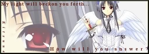
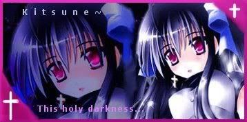
My main complaint for most that you have shown so far is that you keep cutting off the top of the characters head. Either scale them or resize them to get them to fit better. (That's actually my personal preference. You don't have to do that)
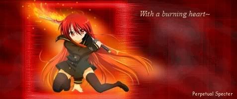
For the background you can try duplication of the render and maybe Gimpressionist? Even now and then I do that and get a result I like. Or play randomly with the filters in different orders. My usual start for a background is a duplication of the render,cubism, directional blur, and a bit of sharpen (40-50ish.)
Go to DaFont and get some fonts there, create a separate fonts folder somewhere and set up your preferences to load them.
Oh, and try learning how to use guides. I think it's under View? They really help out aligning stuff like text.
Just some ideas from a fellow learning Gimpist. =]


 AnimeGalleries [dot] Net
 AnimeWallpapers [dot] Com
 AnimePedia [dot] Com
 AnimeGlobe [dot] Com
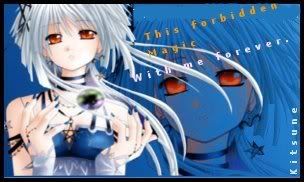


 |
| 


Bookmarks