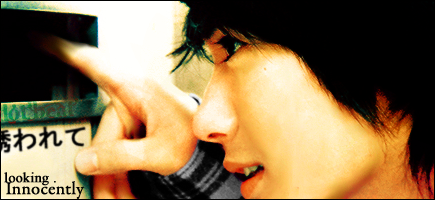
AnimeGalleries [dot] Net | AnimeWallpapers [dot] Com | AnimeLyrics [dot] Com | AnimePedia [dot] Com | AnimeGlobe [dot] Com |
Thanks for the comments guys. ♥
Damn, this one was so hard, one of the worst and hardest one I think I've made this month. But I did my best. I started with only using filters... not a single brush and meh... outcome is not too good. 5 versions, ugh. Text was so annoying. xD
Nice works Lovebeat ^^
I like the text placement on the first one best, but the spot you have the text on the three next on looks empty on the first on.
Like something should be there.
I think I like the smallest one, overall that is.
Whoa.
Whoa.
First one is just, whoa, it's so smexylicious *0* Loving the focus and the lighting and the colours and just about everything in it. Very well done. =D
Yay, thank you lovebeat, awesome job, your great at doing sigs, I love them and I like how you make them, great job.
Nonon Jakuzure - Best Kill la Kill baePretty damn great! #spoke2soonOta "The Cutest Otaku" 2016 - Lol, how's your account doing lately? Oh wait.
~I love them all. But the last one's the best. I love the colors your used. Everything is just perfect in this sig...like always...=) and the text placement is very good.
You are the Siggie Goddess for me....*__*
Last edited by .fnhvmnvmv; 10-21-2008 at 07:03 AM.
Keeping my thread updated with stupid avatars. >_>; Still no Photoshop until Friday, so I'm using Paint.net, which is a proof on how generous my school is with programs in the school laptop. Pssshhh.
I KNOW THEY LOOK SHARP. They become all sharp and stuff when I resize them. This is how good paint.net is. If you (yes, you) are gonna say that they're oversharpened I'm gonna hit you in the head with a bat.
I love the avvies that u made , especially the 4th one . Its a shame do
you could've put L O V E , as a text on the 4th avvie . The 1st one is really unique it shows a particular view of a character . the 3rd one shows emotion and I really liked it . But anyways do , I like the 4th one the best (put the txt L O V E in pink or red it would be 10x better . ^__^)
Awesome avas! <33
On the first one I like the focus on the face and it's
signature like but that's just me.
The second one is very well done but it's crispy
maybe make it smooth and put some tiny text
at the bottom left in white
Sig and avie made by Mira <3
~All of them are very very well created...I'd never thaught that someone could make that with Paint.net oô...
Well, they do a bit. :3
*runs away*
But these are very well done for paint.net
Just the TTGL avatar seems odd and seems unfinished.
And...suggestive because of that black bar that came out of nowhere.
But overall they are not bad.
The second avatar though is probably the best out of them all.
No, I will not add any text to any of my avatars. I have no fonts or any blending mode to make the font blend in and adding a text defeats all sorts of purposes.
Can you guys not see the purpose of the 4th ava?
Does this mask say anything to you?
No? Well I thought so.
Then, does this make better sense? It should.
Horray, free textures.
Thanks for the comments guys.
Also, I can't do anything about the crispyness. Did I not say that in my last post? I don't even think paint.net has it's own blur tool.
Last edited by .Lovebeat; 11-01-2008 at 02:42 PM.
Made a sig out of a sig, heh.
Doesn't really have a fire-feeling to it, but I did my best. =/ Don't want to kill it with C4Ds.
Last edited by .Lovebeat; 11-02-2008 at 01:53 PM.
.......
...................... XD
...you be one of the four signature God's for me...
LOL...seriously,huuuuuge wow for your work...
Heh,this will keep me busy for some time ^^
Tho I'm wondering how come no one replied to latest works...hmmmm...
Post 177:
What the...?Hardest,yes,but worst...?
Nah,I wouldn't call it worst,I wouldn't even call it bad...
The last version of it would be my favorite,since the previous ones,with add-on on right side are drawing attention away from the signature...
With overall nicely looking,I can say that it's a very good,and quite creative siggy...
I love the characters placement,especially their pose,it's sort of heartwarming...
And it sort of screams Ruthless song over here (by Kajiura Yuki) since it's really created in the mood of that song ^^
Anyhow,I love the background too...nicely created,perhaps too much of effects,but that's not necessarily the mistake,since I highly believe that without them,it would be nasty and sort of bad...
Merging colors in background are just giving another beautiful mood to it,creating this certain flow and balance in this,and are nicely pulled out...
Sig itself is sort of "soft" if you know what I mean,and that's another reason why I'm loving it...
Text placement is pretty good,and coloring of it is great...
I like the idea of changed "H" letter,very nice...
Overall,I don't know why you think of it as bad,since it's a very good,and quite unique one... ^^
Post 189:
First one - Ah,the Mewtwo ^^ Nice...Overall good...character placement is good,and overall gorgeous...
Background is pretty good,simple looking with brilliant effects...
I'm especially admiring the lighting effect,it gives out fearfull feeling to the sig (fear Mewtwo),because of characters pose and look in his eyes...
Sig itself is overall brutally balanced,and beautiful in every way...
Again,a feeling of a song seems to be hidden inside of this (wow,I'm so weird,am I..?)...This time it's A Song of Storm and Fire (Kajiura again,lol),but really...It soooo screams that song...dunno why...
Anyhow,I don't know what kind of effect is on the left from Mewtwo,so I'll call it buble-effect (silly me)...
So,for the buble-effect...I really like it...It fills up the left side completely,along with the "true" bg image effecting,and that's another plus to it...
Text is pretty nice,tho some fancier looking one might be better...
That's only a suggestion,not a flaw ^^
Overall,amazing,I love this one...
Second one - on first glance,I must say that there is something wrong with it...
Let's see why I think so,shall we...?
Character placement and pose is good,so that's not it...
Background...ah,so that's why I think so...
Bg image is good,but I kind of dislike effecting in it,since they are not going along with the overall look of the character,which ruins that certain flow...
You did it well,character is emerged with effects nicely and effects are amazing,but colors aren't quite going along with the character,if you know what I mean...This leaves me with desire to stop commenting over this one,fearing that you might get offended by my honesty...
But don't get me wrong,sig itself is good,but I find the balance between background and character ruined with the difference in colors...
Sorry if this offended you...
Third one,ver.2:
Yes,I'm choosing second version,because it's slightly better...
There's no much of a difference,but for some reason I find the second one better...
Aaaaaanyhow...
Magnificent,and very cute ^^
Character is good,and her expression matches the complete mood of the siggy...
I can't help but to think that I've saw here somewhere...???
Bg image is nice,and without too much effects,which satisfies me very much...
Amazingly merged with the character leaves me breathless,and the text is just lovely...
Nice words and I love how you used your username with those words,very nice...
Oh,oh,oh,ans the crown is just lovely ^^
Sadly,I don't know what else to say about this one,but I really love it...
Post 190,ver.2:
Hmmm...I can't help but to think that this one was pretty random...?
Anyhow,I like it...Character is good,and her face expression goes well with the mood of the signature...
Background is nicely created,and effects in it are pretty good...
I'm confused with the eye on the left tho,kind of "jumps out" from the sig...?
Oh well,that's only my opinion...
Other than that,it's lovely...
I love the circular objects placed in it,it gives sort of "randomness" mood to the sig,and brushed-looking background is simply good...
Fancy text placement is well chosen,and coloring of it is very good,added 12 dots is giving it sort of random feeling as well...
Sig shape 'n size differs from most things you've created,but is giving this one another unique-ness,and makes me liking it even more...
Oh well...that would be it from me...
I hope you wasn't bored by reading my words,and I thank you for reading it...
And,as always,keep up the grand work ^^
I'll comment as soon as I find time,as always...
Thanks for the comment Hama, your comments are always appreciated.
If you're interested in how the Fire sig looked like FIRST, this is it:
Pretty horrible, no? It had no depth and so I fixed it.
The signatures in post #190 were made by studying one of Serated's signatures.
Got nothing special to show, really. Signature block.
Last edited by .Lovebeat; 11-11-2008 at 09:18 AM.
Hihi this one is cute http://i302.photobucket.com/albums/n...ns/TTGL_01.png
:3
This one is pretty nice too
http://i302.photobucket.com/albums/n...CCback_msn.png
Why is it 96x96 px and not 100x100?
The other avas is also nice.
You can see that the file-name is CC_msn. Go figure.
Thanks.
Last edited by .Lovebeat; 11-14-2008 at 09:53 AM.
It`s an interesting siggy.
Nice blue color(s)
Don`t like that lightblue smudged dot over ther left eye.
Nice textwork.
The ava is pretty cool, and that frame too.
--------
*Des sucks at comments* xP
Wow. You have some serious pwnage skills.
I love how the colors blend with the render. You did awesome with that. In fact, you did pretty good with all of the sigs that I saw! 
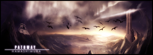
^^ Espacilly the blue one you just posted.
@ Des - I didn't touch her face - or left eye for that matter.
Thank you Des and Myst for the comments.
And I had promised to re-make the signature for Hamashimura. It only took me a month? ^^;
This one I like much, much better. I had to use that stock because it had such a nice flow, and tried out another vector style signature with it. 8D It says RahXephon Reika Mishima, and Hamashimura flipped upside down and horizontally.
I love the warm colours. :3
And the flow is wonderful in this. Did you create pen tool shapes near her? Because, well whatever they are, they make the flow much better. 8D
You maybe could have sharpened the focal area a bit more.
And the left side, near the text looks a little empty. Maybe you should have made the text a tad bigger so it could fill that space up?
Like the border as well, good idea on putting the fatter side on the left to take up negative space.
hmm its wonderful, wish I could make something as good as that. *0*
The shape to the left of her is a pentool shape I created, yesh. :3
I cut the canvas by 30px, it was originally 420px, now it's 390. And textwork textwork... I'll try to learn from you. D: Thanks for the comment, Dottie. ♥
I wish I was better with coloring avatars. ;_;
There are currently 1 users browsing this thread. (0 members and 1 guests)
Bookmarks