


8-09-09
Misato C.G
8-08-09
Hitomi C.G
8-04-09
Yuzuki C.G
8-01-09
C.G Kaisuke update
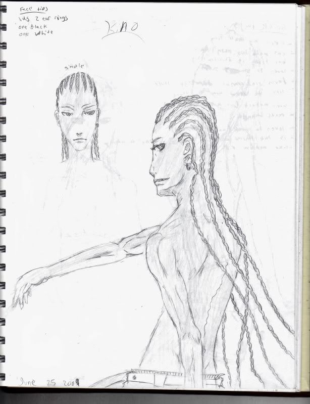
How is this art style this is just the front view crit. it down below.
1.Can this work in a action manga
2. is this very similar to other styles?
 AnimeGalleries [dot] Net AnimeGalleries [dot] Net |  AnimeWallpapers [dot] Com AnimeWallpapers [dot] Com |  AnimePedia [dot] Com AnimePedia [dot] Com |  AnimeGlobe [dot] Com AnimeGlobe [dot] Com |


Bookmarks