


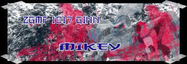
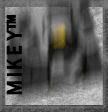
Yup, I've had an attempt at my own set, I'd love some constructive critism from the seasoned set makers here.
 AnimeGalleries [dot] Net AnimeGalleries [dot] Net |  AnimeWallpapers [dot] Com AnimeWallpapers [dot] Com |  AnimePedia [dot] Com AnimePedia [dot] Com |  AnimeGlobe [dot] Com AnimeGlobe [dot] Com |
| AnimeGalleries [dot] Net | AnimeWallpapers [dot] Com | AnimePedia [dot] Com | AnimeGlobe [dot] Com |


Yup, I've had an attempt at my own set, I'd love some constructive critism from the seasoned set makers here.

Hmm...they're really nice ^^ I like it~ But to be honest, the siggy's background is abit plain tho. Still it's nice ^^ keep it up i'd like to see more
concrete jungles where dreams
are made of,
there's nothing you can do~
I ♥ NY

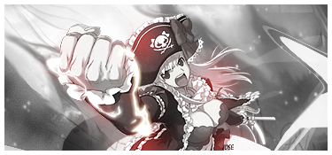
well done...i usually saw people using cute girl in their sig but not you. i think the text's color aren't match. or may be you make it red so that we can see it clearly
*sorry if i talk too much*
Last edited by kwnbintang; 08-23-2007 at 01:07 PM.
rarely on now.....>.>
Text is off and doesnt match. Sometimes fancy text isnt the best way to go.
The blurred background isnt working. You have no effects at all. Blending is always good. Also no borders. Borders are a must. Practice more and i am sure you will get the hang of it.
Hmmm...text is...well,the color of text doesn't fit,and background is...blurry...I think?
But it's still good,and it's way more better than anything I could do ^_^
Keep up,there's always room for improvement...
I can't give you any tips,since I suck when it comes to sigs T.T
...a gift from Balance...the legend itself...
~ click the button,I dare you ~

hmm..the font and colour isnt working wid the image ur using.they're both really contrasting.sumtimes contrasts work but not here.^^' maybe change the font to sumthng that looks thick or bold to complement the mech unit u have.^^ background culd be a little better.maybe copy the layer a few times and play wid it?just a suggestion.anyway, since this is ur first u show promise.keep it up, ill check ur stuff now and again.^^


nice but the text what do you use to make it?
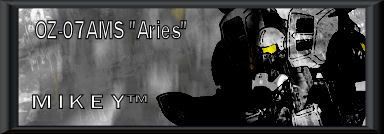
Thanks for the advice guys, I've took it in and took another stab at it, same Aries set, but this time with some improvements.
Yet again, constructive critism would be helpful.
Oh la la,darker colors,nice ^_^
Let's see...Now I'm satisfied with the background,but the text again...
It maybe just me,but the text color...
Dunno...Maybe if you used letters without black border line...
Yet again,this is better than the first one...
Since I suck at comments,I shall give out my rating,so you could see how much I like/dislike your work...
My rating for this one would be: 8/10
...a gift from Balance...the legend itself...
~ click the button,I dare you ~


The background is nice. I like the blurry effect.
But maybe you should use some more brushes?
The text is sorta kinda like blur/fuzzy ish.
Maybe you should just use a normal font?
I can't tell whats in the avvy.
Or maybe its supposed to be like that?
The text is black so with the already dark avvy,
its hard to see.
Maybe you should try using a gradient? And have it more colorful?
Just some suggestions, but I do like your work.
Very extremly good for beginner. Hope to see more. ♥
Much better~ Much better ^^~ Hmm...try using some more fancier text that'll look better.
concrete jungles where dreams
are made of,
there's nothing you can do~
I ♥ NY
Has a nicer background, and i like the border
Work on your text a bit though xD Keep up the good work ^^
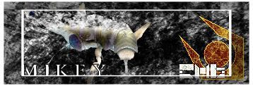
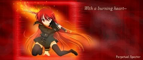
Ok, here is another attempt at a set, this time, based of the Combine from Half-Life 2, hope you like it.
ur second one:very nice.improving.^^ i thnk the text in the sig passes muster but the avi one looks a bit off.not a bad one tho.^^ ur newest one looks great.i think its a pretty balanced composition, not too complicated but not too simple either.good job.^^ the avi looks ok too but culd be improved. maybe u culd put a picture of that worm thing in? sorry, i didnt reali play half life 2 so i dont know wat that is.^^' il be looking forward to more stuff.
Thanks for the comments, the more the merrier ^_^.
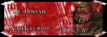
Ok, here is my third set attempt, this time its Xan Kreigor from the Unreal Tournament series.
As you know, constructive critism welcomed.
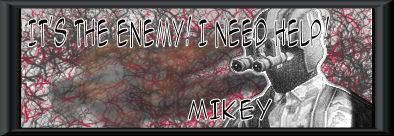
*BUMP!* Yes I've made another set, this time the base is the Gurlukovich Tanker/Shell 1 Core Soldier, hope you like it!, also please comment on the last set I made (the Xan Kriegor one) thanks!
Okayyyy, fun!!!
Xan Krieger:
Its good. I like the bright colors. They make it stand out. The way you did the border is really cool. I like it. Though the text is still somewhat unreadable. Could you try another font maybe? And it might look good if you tried another color. But I really like the avva. You made it really nice. I like how its light and then bright in the rectangle. And the border is nice like the siggy.
New one:
It made me laugh. I think you have really improved. The brushes in the bg are different and they give it a nice effect. The border is cool just like the other one. This text is readable. Nice nice. The avva is even cooler. I like how you did the color change.
Wow, M I K E Y, I love to watch your work. I hope you make more. ^^

They all look good, I like your choice of content for your sigs. The writing is not all that clear though, maybe you could change the font or color. Xan Krieger sig is friggen awesome though =P
Last edited by Santa Clause : 25/12/1bc at 00:00 AM. Reason: I felt like it, you idiot.
Hi again, got another set to put up, this time it's a set based of Operation Flashpoint.
Oh, btw, you don't have to comment on my new set, you can comment on my older ones if you want.
Last edited by The Governator; 09-07-2007 at 02:49 AM.

I like that set.I think it looks unique.

You should change the text color but it looks great!!
D.Gray-Man Quote-
"My left is for the Akuma. My right is for the humans. Both define me. Both are important to me... so now I will answer you. These humans... and these Akuma... BRING THEM SALVATION!" -Allen Walker Volume 9
@ Shingami: Really? well, I don't see anything wrong with it, I mean I can read it and I need glasses so, the colour and font are fine.
Well folks, here is my new set, I went abit experimental on the Avi, so lets see what you guys think, I'm also going to do another version of this new set soon, when I can be botherd lol.
Last edited by The Governator; 09-10-2007 at 09:18 AM.
Well, as it is called my sets n stuff (the thread) I thought I'd post some of the pics I have edited aswell, if thats allright.
[REMOVED DUE TO LANGUAGE]
Found the pic when I searched for a pic of a cardboard tank, it made me laught and thats about it, also, comment my sets!!!
ADDITION: This forum is for SIGS and AVATARS ONLY ... photo manipulation goes in the Photography forum!!!
Last edited by FlashD; 09-13-2007 at 10:46 AM.
Well, I got to say, I'm sorry bout posting photo manipulations.
Ok then, new set based of the picture of Haraku on the FLCL OST III CD Cover.
The quote, if no-one knows is a really funny part from FLCL Manga 1.
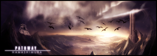
Hmm...long time no visit...
Let's take a look at your latest stuff...
~ Your current set...
Very nice,I like it!
Nice bg,and definitely very well balanced!
Congrats for this one,one of your finest works...
And the text...nice and truthful...
~ From post 22...
Avatar is quite messed up,but since I like mess it's allright...
Pretty average...
As for the sig,stone background and black sig background kinda...doesn't fit?
It might have look better if you place light-grey color instead of black?
Dunno...
~ Latest...
I never liked FLCL...it somewhat...funny,but confuses me...
But I gotta admit,this sig is good!
BG effect is nice,and you chosed good character pose...
I'm confused about the text...?
Worry Takkun!Be happy! ...confusing...
Again,well balanced...
Well,in general,your sigs are varying...some are good,some are step back for you,but in general they're good...
I can't really say anything for improvement,since I'm not sigmaker,so I shall just rate 'em...
Watching all your sigs,I say (my opinion only) you get rating about... 8/10
Keep up!
Last edited by Hamashimura; 09-17-2007 at 12:41 PM.
...a gift from Balance...the legend itself...
~ click the button,I dare you ~
There are currently 1 users browsing this thread. (0 members and 1 guests)
 Posting Permissions


 |
| 


Bookmarks