=OOO. thanks for the comment Pheonix channn <3. i'll comment on your recent work, from post 53.
Halloween Set: wow this one's just fab. i love the position of the text and the color, very creative, also i love how you put Halloween Jack and Santa Jack together as a whole siggy x] nice job.
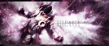
Miyavi Set: Whoaa girl, this ones great! it doesnt suck, its awesome! simply it is, simply the best. i also like the spilt splat brushs you used ^^ great effect.
Post 66:
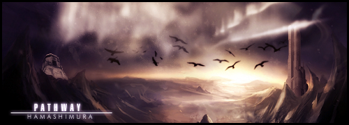
Hama Set: ohh *o* my eyes went glowing on that hehe, very nice text font and totally love the black and white background ^^
Winter has come: ^^ the characters emoticon really suits the text ^^
Summer has come: this ones nice as well, maybe you could add some dolphins or fish jumping out the sea. my opinion, dont take it in mind
On a night like this: great effect, like the star, it suits the whole siggy, maybe just add a moon on? o.O'
Over all of them, you make better siggys than i do, pretty straight forward hehe, keep up the good work, looking forward to see more! *rates joo thread 5/5*


 AnimeGalleries [dot] Net
 AnimeWallpapers [dot] Com
 AnimePedia [dot] Com
 AnimeGlobe [dot] Com
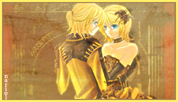

 Heske ~ Cousin


 |
| 


Bookmarks