


Yeah and I got to say, I'm also surprised that I made something like that. EPIC! lol
 AnimeGalleries [dot] Net AnimeGalleries [dot] Net |  AnimeWallpapers [dot] Com AnimeWallpapers [dot] Com |  AnimePedia [dot] Com AnimePedia [dot] Com |  AnimeGlobe [dot] Com AnimeGlobe [dot] Com |
| AnimeGalleries [dot] Net | AnimeWallpapers [dot] Com | AnimePedia [dot] Com | AnimeGlobe [dot] Com |


Yeah and I got to say, I'm also surprised that I made something like that. EPIC! lol
I'm really on a creative streak lately, so another one! YAHOO!
UP SEVENTH!
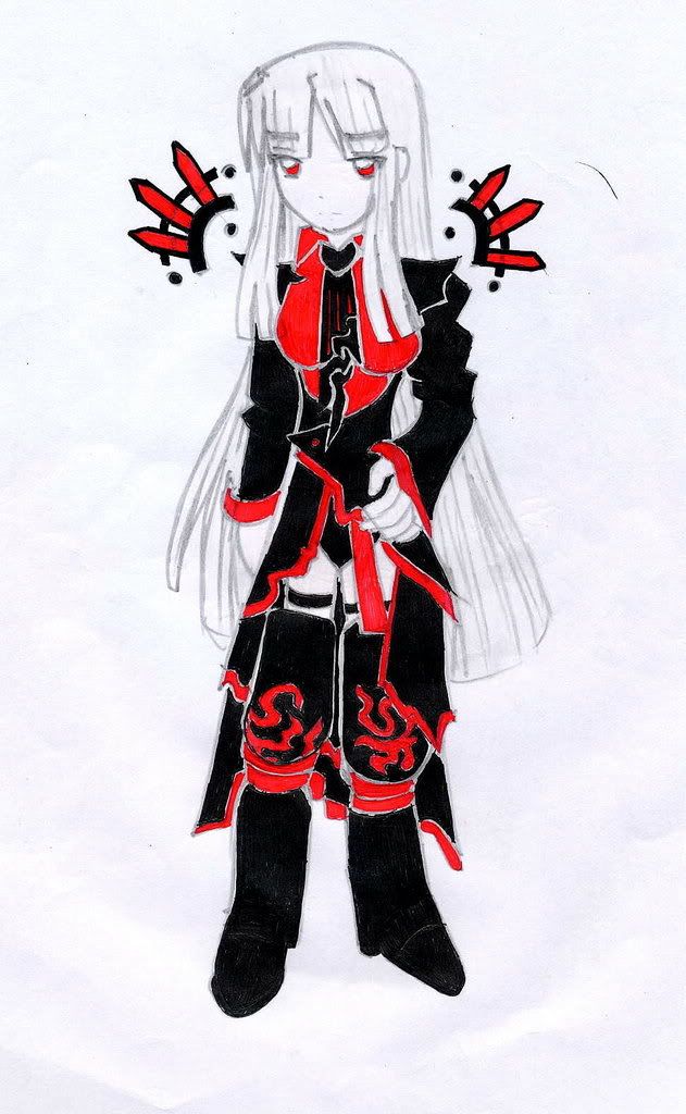
Description: Well, this is the drawing that Death-Angel might like. This is an original artwork from me. The coloring procedure is just like my 3rd Artwork.
Post comments please. I also appreciate constructive criticisms. Thanks!
Last edited by maximillian_cross; 05-10-2007 at 12:09 PM.


Hm,this is what I call awesome^^
Her face is now truly well done,she's so cute!
Another thing that you did great is that you have coloured it in only to colors:red and black (yeah,those are my favorite colors)
One thing that catches my eye is her body...It's kinda thin,too thin for head and hands...
Oh,the hands!!!Yay!
Hm,fingers aren't in best condition,but never mind that...
Still,if you could practice a bit more on the fingers,you'll do great...
Very good,I really love it^^
Oh,and one more thing - can you tell me what is that black/green thingie behind her?
Last edited by Hamashimura; 05-10-2007 at 12:33 PM.
...a gift from Balance...the legend itself...
~ click the button,I dare you ~


6th one: XD that nose...reminds me of how i usually would try to draw cartoon characters
7th one:of course ima gonna like itand i saves this one too
I'm not
Watch some Lucky Star
@ hamashimura - Heh, looks like we both have the same favorite colors. Mine is Red, Black and White. Thanks for the comment again. -__- Just wait for the epic android. Black/Green Thingie? Whatsat? Ahh you mean the Black/RED Thingie. Oh, nothing just an exaggeration. lol
@ raven - yeah well, I kinda made her breasts big cause I was quite horny when I drew that. lol Didn't mean for the body to be thin though. -__-
Last edited by maximillian_cross; 05-10-2007 at 01:26 PM.
Now let's see
FIFTH: Fingers and face shape could use some work, but you were already told that... Theonly thing I have to say is that maybe if you had outlined it with black it, it would look more clear overall. But still I love it: colors, details, etc.
SIXTH: Ah, it's unfinished, but pretty good. Nothing to point out; only that I really like it.
SEVENTH: Black white and red is my favourite color combination so yeahReally like the clothes you draw. She could use a bit more hips, but nothing too serious.
I don't think hands are the hardest thing to draw, actually I love drawing them >_< For me the most troublesome part is the neck+shoulders...
Well keep them coming~
my 'ART' GALLERY <<
< if you like my work, add this to your sig and support my Orange Heaven~ !Arigato Gozaimashita!
Yeah well, I posted the sixth especially for you since you want to see how I draw in a different position. Too bad about the nose though. lol
Well that makes three of us then. Hamashimura's fave colors are black and red, mine are black, red and white and yours in black and red too. haha
Anyway, one thing I really put in my drawings are absolute details! I'm a perfectionist when it comes to that. But sometimes, I'd forget about something else too. haha
Meh, I'm also a perfeccionist, but also VERY lazy so those kinds of details, backgrounds and coloring are my "No-no's" lol... Backgrounds are like... none lol And coloring, every now and then.
When I said that I'd like to see pictures of characters standing in different positions, it wasn't exactly to see how good you are at it... It really was because variety is always important in one's portfolio. I never doubted your skills on that matter ^__^
my 'ART' GALLERY <<
oh the new one looks really cool
Nice colors...maybe you should have put some color on the hair. her eyes are great
I like my sig, thank you Jagan Eye ^^
@ Ore Wa Tenshii - Oh, I see. Thanks. I saw your gallery too. Great work on proportions! Maybe I have to work on mine cause I make mistakes.
@ Crippe - Monoshift summon whatchawhateveryacallit??? lol Anyway, thanks for the comment again. Anyway, her hair has color, it's silver.
I'll be posting the remake of my 2nd artwork later! Stay tuned cause it's EPIC! YEAH! But for now, I'll post something new! Woot!
UP EIGHTH:
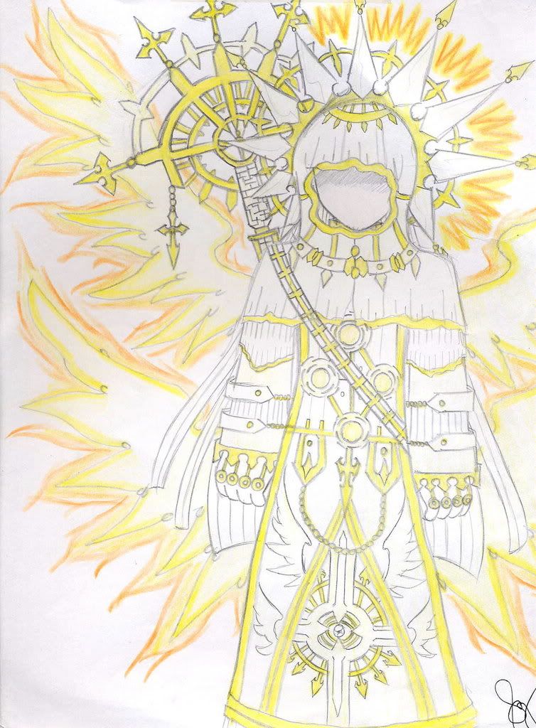
Description: Alright. Another original art of mine. This one is called The Guardian of the Shining Heaven. Hehe, anyway, Just used color pencils on this one. Oh, and I didn't put on his face to give him that "mysterious look". lol
Post comments on this one too please. Thanks!
wow!!!a new one already lol..^_^its really great!! plus i like the color!! post some more!more! XD! also its has awesome details..
Last edited by death-angel; 05-11-2007 at 12:17 AM.
commenting again..
7th art..
-this would be one of the best of what you've shown here.. I love the hair and how you've done the dress.. the only kind of bad point here is the body..
but all in all.. great.
8th art..
the thing on the back.. looks spikey, haha.. nice. One thing though i dont get the idea of the dress for the part of covering the arm.. kind of big for me..
but pretty nice for the background.. nice..
^^ Thanks for the comments again. Anyway, I intended my 8th art's dress to be quite big for his body. It was intentional. I'm happy you like the staff that's behind him.
That staff is what I call the Shining Maximus. ( Derived it from my name lol ) I put everything in my soul to detail that staff. Hooh.
Gorgeous! Love the coloring, it really gives a certain sparkle to the character! Also love the clothing you put on him~
my 'ART' GALLERY <<
Heh, thanks for the comment, ore wa tenshi. I think this is the brightest drawing I've ever made. Anyway, I'll be posting again something later.
ooh that's impressive ^^ nice bright colors and lots of details on the staff and cloths. This really great
the wings are cool ^^
I like my sig, thank you Jagan Eye ^^

Thanks for the comment, Nymia. The 7th artwork is also one of my favorites!
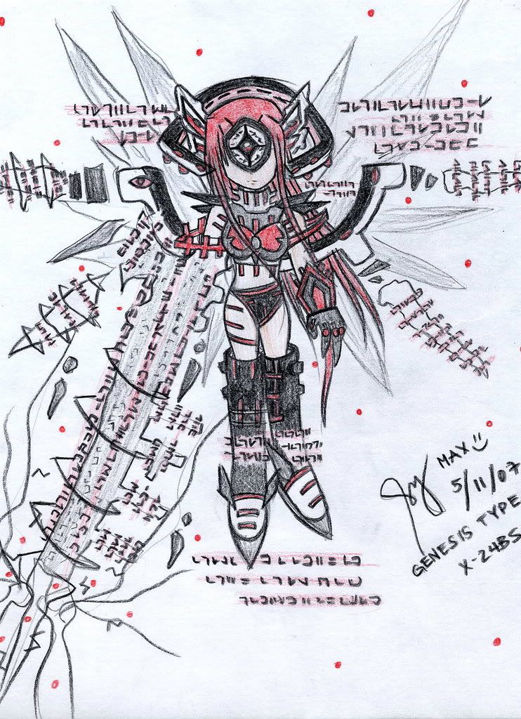
Alright, here's the remake of my 2nd Artwork. Hope everyone will like it.
UP NINTH:
Description: This is colored purely in colored pencil. The outline is also black colored pencil cause I kinda ran out of sign pen ink. Anyway, I think this is much better than the original. I like the colors too.
Oh, if anyone is gonna ask what that thing on her left hand is, it's a Data Cannon, a bigger version than the original one. She has complete wings now, in both sides. Her hair is longer and I changed it to red. The suit is black. It's really kind of like the vice-versa of the original one especially the colors used.
Post comments on this one please. Thanks! Oh and please tell me which is the better, the original or the remake?
Last edited by maximillian_cross; 05-11-2007 at 10:37 AM.
comment.. comment.. again.. haha..
9th art:
-pretty great.. I love the hair..!
-the body is quite small.. around the leg part.. considering the cool boots youve put..
-haha! i love the mix of black and red.. as usual..
- background is great.. having those.. red particles falling.. im capturing the idea of your genesis type and the weapon.. great..
keep it up.. n_n
Thanks again zyro. Well, that's first in line in my android series, considering the name, GENESIS. ( The Original is not included in the series ) I'll be posting the EXODUS, Omega, Beta, Sigma and Alpha Type in the future. Hehe.
Oh, yeah, I made the boots bigger than her legs cause she's not really a human, just a robot.
In any case, which one do you like better, the original or the remake?
Last edited by maximillian_cross; 05-11-2007 at 10:37 AM.
hmm -thinking- that is a hard decision..Originally Posted by maximillian_cross

the original looks clear and techie..
the remake is more complete..
could i say both..?? then.. both.. sorry.. I cant really choose well.. ehe' n_n
Well, I guess that's understandable. Thanks.
the second one looks really nice and the eigth one isnt bad either but i noticed that his top arrow thing looks a bit messed up in some way
What the--- 2nd and 8th? I'm talking about comparing 2nd and 9th, Raven.
Last edited by maximillian_cross; 05-12-2007 at 01:10 AM.
There are currently 1 users browsing this thread. (0 members and 1 guests)
 Posting Permissions


Bookmarks