


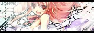
just made a new one^^
C&C^^
 AnimeGalleries [dot] Net AnimeGalleries [dot] Net |  AnimeWallpapers [dot] Com AnimeWallpapers [dot] Com |  AnimePedia [dot] Com AnimePedia [dot] Com |  AnimeGlobe [dot] Com AnimeGlobe [dot] Com |
| AnimeGalleries [dot] Net | AnimeWallpapers [dot] Com | AnimePedia [dot] Com | AnimeGlobe [dot] Com |


just made a new one^^
C&C^^
Over-saturating since '07


Now that's cutesy. I love the way it turned out, even if it is of a cutesy nature. Probably cause I'm not one for extra fluff cutesy stuff. But you do have a way of giving cutesy a coolish style so it's not so fattening.
I love your sigs!!
Would it be okay if I asked you to make me a sig, please?
If not, I understand.
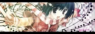
Ah,the new one...
Very good,it looks wonderfull(though it's i bit bright for my taste),but it's good...
Background nicely follows the character (if you know what I mean),and it is well composed...
Well,as I already said,the only thing that I dislike is brightness,but that's only the matter of taste^^
Keep up!
...a gift from Balance...the legend itself...
~ click the button,I dare you ~

Hey, awesome sigs! I really like your sig style, and your blending abilities are fantastic.
It looks like you're using some grunge brushes - do you make your own or get them from another site?
I agree - you should make some tutorials.
Last edited by Mira Kaiba; 05-17-2007 at 04:47 PM.
Thanks for the comment everyone ^^
@Dizzy
Ill try! Just PM me the details
Make some tuts? ill think about it.... anyways which one of the sigs do you want me to explain how to make? Maybe ill try to make a tut on the super mario sig.
Over-saturating since '07

These sigs truly dazzle..... Aargh I want to be able to make them like you do... tries to snatch some of unlimited's skillz and runs for it ....
Last edited by UrusaiSevera; 05-20-2007 at 03:24 PM.

i've been meaning to come see your work. lol i've been procrastinating with doing that but, your artwork is marvalous. it's absolutly grand and i love your colring scheme too. ^______^
Gandy-Man and Bunster, Saving One Pimp one Porn-star at a time+~Fun Fun Banana Time~+

Your sigs are seriously breath taking!! I love them all, they are so... *searching for the words* I can't even explain it. Keep up the awesome work!!
PM me if you want to be friends...And this sig was made by ~*Dizzy*~
i just finished Dizzy's requested sig
And Max's requested sig (not really new.... XP)
need some help on this one ^
c & c
BTW anyone still up for tutorial?
Last edited by Famahama; 05-21-2007 at 10:59 AM.
Over-saturating since '07
Wow your sigs are really nice, i am now one of your fans!!! Keep up the great work, love em!!!
Set made by Megami91 ~Thank you so much<333i'm so rad! [:
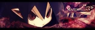
The on for Max doesn't need any further improvement,I like it this way...
Still,if you wanna improve,you might want to put some different background,and that would be it...still,cannot reccomend which one >.>
Hm,and if character would have neck,it would look better,oh,and background should be a bit brighter,so that characters hair can be clearly seen(dont get me wrong,but it's not easy to see his hair perfectly...)
Oh well,this is only my opinion,so it shouldn't bother you...
But just in case,try it out with different background,just to see if it would look any better^^
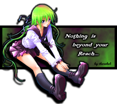
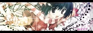
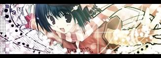
Hm,the Dizzy's sig...
Background can be a bit confusing,but that's only me(dont change it,I like it,but it has some confusion effect on me,lol)...
Sig is well balanced,and character really fits into sig - what I mean is that you've chosen very good background for this characters,they really go together well^^
What can I say,keep up the good work^^
...a gift from Balance...the legend itself...
~ click the button,I dare you ~
@Hamashimura
Ill try to change Max's sig soon.. thanks for the info ^^
and the dizzy sig,..... maybe i put a little too much of the white circles and lines there... oh well
BTW this is how it looks like without the white circles. Shows more of the character's arm and BG.
Different vers (removed the text and inverted the image horizontally)
Another different vers
Inverted and added gradient map(more depth, i think XP)
Didnt use any C4 render, custom brushes or anything else(except some of my own pattern and the font). Just started from the extracted image.
Last edited by Famahama; 05-21-2007 at 11:46 AM.
Over-saturating since '07
Thanks! They look awesome. :3
very nice sigs. i like the style of them and colors and the size is good. great job on them.
A new one ^^
---
---
c & c
@mira
I rarely use anything custom(C4 renders,download Brushes) I did use some on my earlier works though. I did used a C4 on Max's sig T_T
Over-saturating since '07
i like those sigs. Highly different from most others. I really love the way you did the coloring on both of them.
Another one
i kinda like this one ^^
My first attempt at photo manipulation
c & c (i really need it T_T)
Last edited by Famahama; 05-25-2007 at 02:08 PM.
Over-saturating since '07


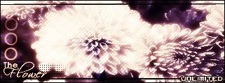
oooooooooooooo, the flower sig!
x333333
As for the photo manipulation...what did you do? I looks like an actual photo/painting thing [if that makes sense] >_>;;
I also really like the set for Dizzy, and I agree, it looks better with the gradient. HOWEVER, since you flipped the image, the text on her shirt reversed too...gotta watch out for stuff like that ;D
All in all, youve got some great stuff here
.-.
(o.o)
|=|
__|__
//.=|=.\\
// .=|=. \\
\\ .=|=. //
\\(_=_)//
(:| |: )
|| ||
() ()
|| ||
|| ||
==' '==
I really like th flower sig. It looks very good.
@maru
i made it with four pics(the girl, the railing, the BG and a brick wall) and thats what i got ^^( added some shadows)
and youre right about Dizzy's sig. Didnt notice the text was reversed T.T
Made a new one
c & c
Over-saturating since '07
wow.... I'm in awe ... I love it.. just love it....
onliest thing i have a "negative" comment on is her hair on the rightside... it looks a bit "boxy" ....
That's all!!! *still in awe*
@ Irai - If you want people to comment on YOUR signatures, you make YOUR OWN signature thread.
@ Unlimited - You're getting better and better. Amazing works <3 Share your skills xD I love the new one, especially that... square pattern or whatever it is, suits so well and colours looks really good. Love all the line-looking things also.
Good work, keep it up!
Ah,the fresh new ones^^
Let's see what you have there...
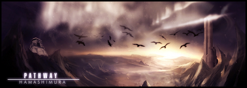
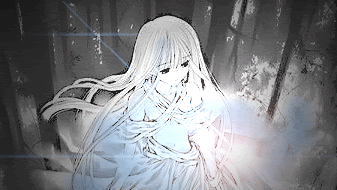
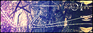
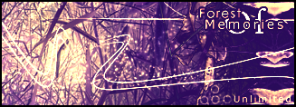
Forest of Memories...Lol,sounds soo deep...
Well,they are different from anything else you created by now,but that is some strange loooking forest if you ask me...
They are good,but you really can do better than that...
Flower sig...
Yup,it got my attention,it's really good and I may say that this is one of your finest sigs ever...
Photo manipulation...
Hehe,dont be mad,I copied it to my pc...
No matter what other ppl thinks about it,I really love it,just awesome!!!
Looks so mystic and...well,simply said-I'm amazed!!!
Reps!!!
Create some more like that,please...
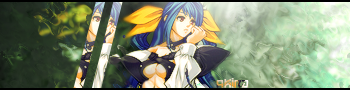
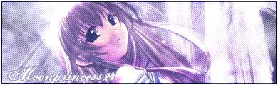
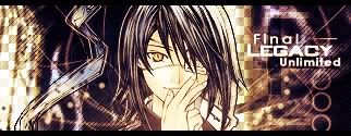
Hmmm...Final Legacy...
I can say that everything is in harmony in this one...
Colors are going well with character,background is very good,just one thing I find negative:the right side of hair is...how should I put it...well,I'll try this way(hopefully you'll understand,lol)-the right side of hair looks like it's gonaa come out from the sig...but again,it's just me...
Great work,love them,keep up^^
...a gift from Balance...the legend itself...
~ click the button,I dare you ~
*kicks self for not getting back to this thread sooner* Wow, I am so far behind. But as I see, you have done some very nice work. I like #1, and #3 of post 63. Although #1 is alittle bright for my taste, (photosensitive vision, namely to light and brighteness.)
I'll have to keep better tabs on your thread, so I can comment on each work as you post them.
Last edited by The Rebel; 05-27-2007 at 09:27 PM.
There are currently 1 users browsing this thread. (0 members and 1 guests)
 Posting Permissions


Bookmarks