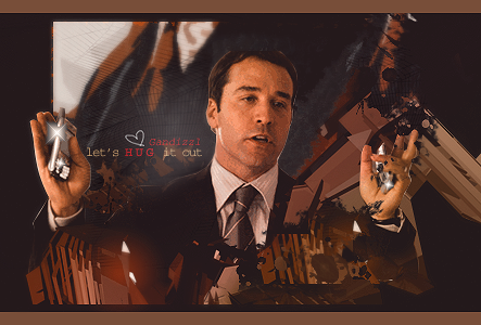
Hi everyone,
I made myself a new set.
I'll probably keep my current sig running for a few days than change it with this one.
Any ideas for improvements till then? Any C&C are welcome.
Have fun,
Elfenstein.
AnimeGalleries [dot] Net | AnimeWallpapers [dot] Com | AnimeLyrics [dot] Com | AnimePedia [dot] Com | AnimeGlobe [dot] Com |
Hi everyone,
I made myself a new set.
I'll probably keep my current sig running for a few days than change it with this one.
Any ideas for improvements till then? Any C&C are welcome.
Have fun,
Elfenstein.
*Squeal* OMG It's so adorable!!
I like it a lot! I don't see anything to change. I think it's perfect. **looks harder**
Okay if I had to change one thing about it, it would be the font, not that the current font is bad, but it doesn't fit exactly with the sig. It's small but it just doesn't like a piece of a puzzle that's gotten wet and warped.
It's still really great!. I'd give it a 9.1 out of 10.
**Aura**
Sig and Avy by KuroTan.
Are you a fan? Pm me if you want a custom sig from me.
Adorable. Personally, I don't think you need to change the font from what Aura said. It looks fine. Keep it up.
-Dots-
I am, I am, I am.
Thanks for the comments. Glad you like it
@Aura: Which font do you mean? The one in the avy, the one of "Smart kids read" in the sig, the one of "Elfenstein" in the sig or all three?
Have fun,
Elfenstein.
The avy is fine. It's the "Smart kids read"
Sig and Avy by KuroTan.
Are you a fan? Pm me if you want a custom sig from me.
Nya, this set is nice~
Personally, I kinda agree with Aura of the Twilight about the font in your banner, it's a bit hard to read because it's red while the background colour is sort of brownish. Maybe the glow around the words can be brighter, but it looks good enough^^
Keep it up nya~!
SIG DONE BY ME~^^~ Comes with a set~!
PM me for requests~!
Family: LadyWolf14: Ever loven Auntie~danie-chan: auntie~ Princess Elli: Mother~ Kittyninjamewmew: older sister~ Hitsugaya389: older sis~
cute puppy (?)
antway, i like the way you did. backgrowns is amaizing and quality is very good... only siggy a little to big, but... this one is wery good...
KoD
Onew by Ωmega"If my joy brings you happiness, I am thankful"
Aaaah, it's so cute X3
The ava is great, nothing to say on that.
The sig is also good, but the text looks a bit off...
I would say some other font (maybe the one you use in your ava.
And the outer glow, not a fan of it.
Other than that, it's a nice set :3
Thanks for the comments and critique.
I tried and changed the font.
I also experimented with the glow effect around it. Dropping it completely left the text very ... pale. It had no contrast to the bg. So I decreased the size of the effect a bit.
I don't know if I like the changes. Have to think a bit about it.
Have fun,
Elfenstein.
i like first one better and i wanna see more ^^
Onew by Ωmega"If my joy brings you happiness, I am thankful"
The font, yes, the lowered glow, no. Why? Because I think the glow should be alittle brigher than that if your going to use that font, it doesn't look right paled down >.> But I think this sig is Kawaii!*glomps it* Where did you find the extraction for it? Well anyway it good. I would of liked to have seen a version though with the whole extraction, with the black strips of the background cut off so you could move the bg behind the middle of the character so it look as if it was floating. Lol confusing I know but still this subperb work so nice job Elfie!
Well, it's no extraction. I found the source (see attachment) on danbooru if I remember correctly.
I seldom use extractions, mostly I make them myself.
As you can see, the image doesn't show the whole chara, so a floating one isn't that easy. For my try on one with a floating chara, without black bars and a brighter glow, also see the attachment. I'm not that fond of how it turned out though.
Have fun,
Elfenstein.
OOOOOOHHHH. Its cute. I likes it. =3 You going to make more? And what did you use to make it? And I think you should just keep the font you have on the sig and maybe either make it a bit bigger?
Sebastian is my new waifu. >w<!!
Chronic WoW Player. ♥
Eeh, the text issue. I think it would look a whole lot better if the sig was a little smaller and the font would be different. Like a simple Book Antiqua, for instance. It would also help if the text was placed closer to the chara and with a different color, chosen from the chara itself.
[This is just me though. I can't help a lot if I'm not working with the sig myself. >_>;]
The set isn't that bad, though. The stock, idea and quality is very good.
So, keep it up. ^^
EDIT: I liked the black-stripe version better.
Set by me
There are currently 1 users browsing this thread. (0 members and 1 guests)
Bookmarks