


My first two sigs, if only I knew the artists so I can credit them T_T.
 AnimeGalleries [dot] Net AnimeGalleries [dot] Net |  AnimeWallpapers [dot] Com AnimeWallpapers [dot] Com |  AnimePedia [dot] Com AnimePedia [dot] Com |  AnimeGlobe [dot] Com AnimeGlobe [dot] Com |
| AnimeGalleries [dot] Net | AnimeWallpapers [dot] Com | AnimePedia [dot] Com | AnimeGlobe [dot] Com |


My first two sigs, if only I knew the artists so I can credit them T_T.
No power in the 'verse can stop me...


They are pretty good.
In the first one though, the text isn't very good; somewhat blurry and it just doesn't go well with the background. I think the transition from the purple to gray isn't done very well either. Maybe you should just have it purple or gray.
The second one is very nice. Did you make the background or is it a bigger pic that you cropped?
The first got kinda screwed over when I changed it to .jpg, and the reason for the red text is because I was more concerned with finishing in a hurry than the quality.
The backround on the second one was a cropped image.
No power in the 'verse can stop me...


Perhaps a bit of blending between the purple part and the grey, if you are going to stick with those colours? It just look a bit stuck on the end.
Maybe a bit of cross over with the smoke effect?
The main pic itself is quite nice.


the first one.. well the pourple doesn't go with the gray but if it has to be these colors then try to blend them together. the way it is now, it creates a sharp edge that don't fit there, and it's same on the other side to, it's an edge there to. maybe you could make an extraction of the girl and then do a simular background with no edges?
the other one I like though.
well thats just my opinion
__________________________________________________ __________
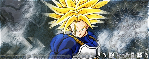
An older sig, this one I made for a friend.

No power in the 'verse can stop me...
That one is also blurry but both are still impressive. Just a bit more work and then they will be pro.
There are currently 1 users browsing this thread. (0 members and 1 guests)
 Posting Permissions


Bookmarks