


Gonna Have to agree with Jagan Eyes on this one.
But the idea is great!
Can't wait to see more!
^_^
 AnimeGalleries [dot] Net AnimeGalleries [dot] Net |  AnimeWallpapers [dot] Com AnimeWallpapers [dot] Com |  AnimePedia [dot] Com AnimePedia [dot] Com |  AnimeGlobe [dot] Com AnimeGlobe [dot] Com |
| AnimeGalleries [dot] Net | AnimeWallpapers [dot] Com | AnimePedia [dot] Com | AnimeGlobe [dot] Com |


Gonna Have to agree with Jagan Eyes on this one.
But the idea is great!
Can't wait to see more!
^_^
Thanks Utilael Keep Up The Great Work! d^_^b
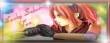
Best Friend-Luck_Sharingan_Sakura


Well, I second the opinion of the posters before me. With better source images and extraction, they'd look quite good.
You did this with paint?! I didn't know anyone uses that, except for a whacky contest or something. Why don't you download GIMP? It's free and gives you nearly the same functionality as Photoshop.Yeah I know they kinda suck bt i gotta use what I have and all I have is paint
Have fun,
Elfenstein.

These are very nice signatures, except for the picture quality. That could use some improvement. Like some others have said, you should use a photoshop. Adobe, even. And there's one place- LunaPics.com - that you can create animations if you ever feel like going to that level as well. Using those two should help you greatly.
"Ah..this land is fertile...we will thrive and rule over this land...and we will call it..'This Land.'"
"I think we should call it.. your grave!"
"Ah! Curse your sudden, but inevitable betrayal!"
"Ahaha! Mine is an evil laugh. Now die!" Attacking.
"Oh..no God! Oh..Dear God in Heaven!" Beep.

If you've been using paint all this time, then your sigs are really good. But I agree with elfenstein; download GIMP. I'm looking forward to more of you sigs. ^_^
Made by my lover ♥ Jagan Eye

Wow, great! ^^ I think your siggies are great, considering that you only use paint for everything. I've to say the image quality is kinda a bit, well, low. But other than that, I like your siggies!
>>Enter My World<<
Thanks to Ms Lucy for this awesome, funny gif.
The person that you are now is not the person that I used to know. You're becoming a stranger that I've never met before. Not liking the change though.
I got a new imaging software but I'll be posting 2 of them and maybe one last paint sig.^_^
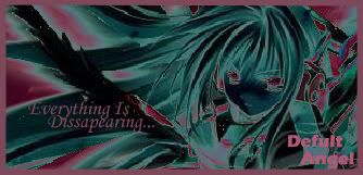
Paint Sig-
New Sigs (same kind of pics but diffent kind)-
(I know it looks like there's no difference but I think it looks beter than the paint sigs....??)
heres a new set I just made it's one of my 25 mins set & my opinion one of my bests!!^_^ Hope ya like it!
Av-
Sig-
Nice Comments Please!
hi so very srry I havn't made any new ets, but i'm back with a new set and banner.
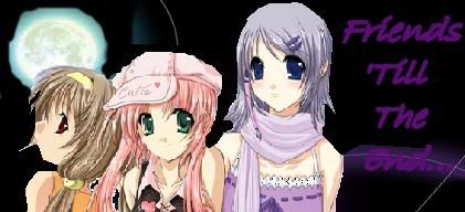
.::Set::.
.::Banner::.
(this banner was used for my myspace network thing)


alright i like your new set, u should try downloading gimp though at www.gimp.org
i think u will enjoy it more, works just as well as ps
you could add a border to your new sig as a nice touch up, and get rid of the green text
the image is cute though, and the bg is a great start
Well it still looks good to me. The banner you made for AF. i like the way you did the background to it. Anyhow i also like the colors. good job.


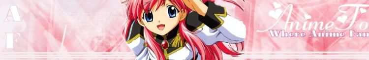
Hmm ... the banner is made wrong O_o;;
You should take into consideration there is a part which repeats and the way you made it just screws it up.
To fix it just put the character on the left and the text on the right of the first part so everything will be on the first part of the banner. Currently the text gets over all 3 parts which makes the middle (repeating) part look awful.
Also ... fix the character's extraction ... Milfeulle's right shoulder seems cut off while on the left hand and on her hair are visible anomalies from the extraction.
Other than that it's up to the artist to decide how to make it
I like the background though, playing with brushes for backgrounds was always fun. ^_^
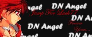
Signature and avatar made by Trinity Muse!
I like what you did to the background of the banner for AF, but the words are cut of... And the set with the green-haired girl in it is lovely, except you should take out the green part from the sig.. Over all you have improved! ^_^
Thanks Utilael Keep Up The Great Work! d^_^b
Best Friend-Luck_Sharingan_Sakura
I really like the banner that you did for the forums! Just like the others said, just change it so that the text is not over the repeating part, and the left side of the shoulder looks kind of cut off. Other than that, it looks awesome!
Keep up the great sets - they're getting a lot better! ;p
the image is better then the last but for some reason it looks choppy. Was it big and you didnt resize it or something. It just looks choppy but then again it could be my eyes.
I really like the background, but the image seems a kinda jagged and not well cut out from the original image. Also, it seems oversharpened. You might want to work on blending the image into the background. But other than that, I really like the banner! ^^
i like the first kitty one, but some of your sets r a bit small other then that u have some good ideas for ur sets
Thankz for the advice everyone! When I did the banner I felt something was wrong, but I couldn't tell what. I'm gonna re-do it just blending it like Mira Kaiba said, making it less choppy like Mystic said, and ect.

For paint those are really amazing with paints basic tools but why don't you try GIMP. I'm pretty sure its free and its the next best thing to photoshop.
for windows
http://gimp-win.sourceforge.net/
go here for tutorials
http://www.gimptalk.com/forum/forum/...-Tips-8-1.html
Last edited by Ike44; 06-29-2007 at 05:39 PM.
My Stuff
PM me if you have a request
My Favorite:
My Latest:
There are currently 1 users browsing this thread. (0 members and 1 guests)
 Posting Permissions


 -A Fan


 -
- -
-
Bookmarks