I've been trying out a new program, what do you think of my pictures? I don't mind honest answers, I want to improve the quality of them. Do you think the moon needs to be brighter?
AnimeGalleries [dot] Net | AnimeWallpapers [dot] Com | AnimeLyrics [dot] Com | AnimePedia [dot] Com | AnimeGlobe [dot] Com |
I've been trying out a new program, what do you think of my pictures? I don't mind honest answers, I want to improve the quality of them. Do you think the moon needs to be brighter?
My Family:Little Sister:DaRkAnGeL_2919
Wolfish Cousin:Aoshi's_Wolf201
Well, I'm a total klutz with drawing programs, but here's what I think:
I like the one on the left, it's cool.
The Inu Yasha one (I'm assuming that's Inu Yasha... if I'm wrong, it's not your drawing, I just don't watch it... never seen it b4 in my life) is good too, but yeah, I think the moon could be a bit brighter... just experiment with that.
On the whole though... I think they are good.
We think a flower on a cliff is beautiful
because we stop our feet at the cliff's edge,
unable to step out into the sky
like that fearless flower
- Kubo Title, Bleach, Volume 12
My Fanfiction
My deviantART
I think its nice. The inuyasha pic looks a little blurred or dark or something but it is a good picture of inuyasha I like the moon effect. I really like the other one has no probs or atleast none that I can see. Keep going with it and you will have no trouble at all!
Wrong forum ... this should be in Dazzle Us
Anyways ... the first pic's quality is terrible ... try to clean Inuyasha a bit and make it less transparent. In my oppinion the moon is just fine, just cut Inuyasha's parts that are outside the moon. I think it will look better. For the text ... I don't know ... maybe a "magical" font would suit better. Either case try to play a bit with your fonts.
The second one is nice ... nothing to say about it except that I like it. The character's colors perfectly suits with the background and the effect you used on the character make it appear some sort of magical. Very nice job.
Keep doing the good work. ^_^
Thankyou for your comments, they have been very useful. This picture is one I have done recently. What do you think?
My Family:Little Sister:DaRkAnGeL_2919
Wolfish Cousin:Aoshi's_Wolf201
It seems that you have developed into a better artist. The picture looks better than the previous one. Yet, it still need anti-aliasing so that the line becomes smooth. Try to use eraser if you're still a beginner user. The colour of the title for the wallpaper seems not fit with the picture. Maybe you should try softer colour such as beige. Ah yes, overall I like the picture (don't have the reasons to dislike it 
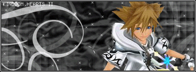
). I give 6 out of 10.
i like the angel one ^.^ wow its really nice the rest are good too but they just rnt as good
SDK lover 4ever
family in my journal pm me if u wanna join
Yep! The Inuyasha one is better, but i think that if u make the moon brither it would be a pretty wierd contrast with his face, and we won't be able to see it very well, on the other hand it could make his face shine, that would be nice!
I have done these two signatures, what do you think?
My Family:Little Sister:DaRkAnGeL_2919
Wolfish Cousin:Aoshi's_Wolf201
I love this one because of it's vivid colors and the second one at the top too coz to the vivid colors too!Originally Posted by Inuyasha's Guardian
Madness
I like the 1st sig better than the 2nd because the 1st one makes it more themed.
They're okay.
I think their great! Yeah, the moon could be a bit better if brighter.
I'd like to know though, since I have been experimenting with a new program as well, Photoplus its alot like Photoshop but not quite. I have jaz finished my very first 'attempt' at coloring a drawing of mine. Howeve,r I don't know how I can share it online. Can anyone help me please? I tried photobucket but the format is .Spp && they dont accept anything other than that. Please, I will take any advice jaz pm me! Thank you so much! I would gladly appreciate it!
The first one has more detail, its brighter and looks more active, if you lightened up the second one it Might look as good as the first one.
i like the 1st sig, i like the dragon.... but i think it's better if u add effeck or background behind the dragon...
I just LOVE the first one but it looks a little bit bad because of its transparensty (i can't spell it =P), the moon looks (JUST) a little bit realistic, but the transparensty (however you spell it) isn't, oh, and inuyasha looks really good. I think the second one is good but, yue is a little bit too bright.I don't like the picture that much. Anyways, nice drawings. I love them ( especially the first one).
...You Know This NaNaN...
definetly the second is better but i don't like the dragon in either.but i do like the way you drew the phoenix. and about your other pictures...i think that the one that the inuyasha one is kind-of, well, to transparent. if you cut out the part of inuyasha thats outside of the moon,Originally Posted by Inuyasha's Guardian
it would look alot better. and the one with the anel guy...i have nothing to say but amazing you didvery well on that one. and the castle in the sk like one is very well drawn, infact im sort-of jealose that it is so great lol.
Awesome... *smiles* Those are cool as heck!
There are currently 1 users browsing this thread. (0 members and 1 guests)
Bookmarks