


<3 oh Gan, it's so pretty!
No more comment...I don't have comments..O_o
 AnimeGalleries [dot] Net AnimeGalleries [dot] Net |  AnimeWallpapers [dot] Com AnimeWallpapers [dot] Com |  AnimePedia [dot] Com AnimePedia [dot] Com |  AnimeGlobe [dot] Com AnimeGlobe [dot] Com |
| AnimeGalleries [dot] Net | AnimeWallpapers [dot] Com | AnimePedia [dot] Com | AnimeGlobe [dot] Com |


<3 oh Gan, it's so pretty!
No more comment...I don't have comments..O_o

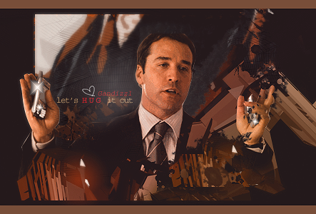
hahahaha!!OMG....TAWIMS changing spree really got to you huh?xD...maybe you should make a club of food lovers...O_o...Tai made a great job in it....and if u need to do some changing kinkle spree...just ask me...>.>...I got tons of money in my bank...<.<...anyway nice kinkle club button?o_o...seriously I have no words for it....


Haha, yeah. TAWIMS went crazy so I thought why not.
Btw it says "Kinkie club" just that every second letter i big so it becomes "KiNkIe club"
Ari Gold set by dotmyztick <33


Wonderwice fan nr.1
|Gan, Lettuce and CFA.. Corrupting the Masses since 2006|
Gandy-Man and Bunster saving one pimp and one pornstar at a time.
Wow. You are so awsome. Keep it up!
Sig made by the lovely: Nespa
"Don't look back. If you got something to do, then only look forward."- Kurogane ( Resiervoir Chronicle)


lmao! so you figured the food thing was me? >_< obivious i know..lol.. I was just bored and I had lots of money in the bank. So yea. ^^ But yanno, I'm happy to make a banner for the so called club XP And I can make the food lovers banner...XDDD I just up and made banner yesterday night. Hope the name changing doesnt irk you guys..^^;;
And nice banner for the Kinkie club..lmao
Ty ^^
Still wondering how TAWIMS ever came up with "Teh KiNkIe club" O.o
It seems it's the next big thing; clubs
Anyway... todays creation is a pink'ish set request for JAG ^^
Hope you like it ^^
Ari Gold set by dotmyztick <33
Wonderwice fan nr.1
|Gan, Lettuce and CFA.. Corrupting the Masses since 2006|
Gandy-Man and Bunster saving one pimp and one pornstar at a time.
oohhhwwiiee...how cute <3
Ty SO much Gan! -huggles-
I'm so gonna use it <3


kinkie club...intersting concept
anyway, I like the set you made for jag! Nicely done.
Another one of my favs was the set for Kurumirina....the one with the border effects was extremly nice...hope to see more soon
.-.
(o.o)
|=|
__|__
//.=|=.\\
// .=|=. \\
\\ .=|=. //
\\(_=_)//
(:| |: )
|| ||
() ()
|| ||
|| ||
==' '==


Lolz... I came up with it, out of the blue, Gan... And what a pretty set... Even if it's a bit too pink. >_< At least it's not the horribly bright pink ones that burn my eyes out. By the by, it has wonderful text.Originally Posted by Gandizzl
[[ I really am just an Emo :: A Halloween story ]]
"...And before light, was Damon. Sitting on a rock, reading a book and generally having a good time throwing erasers at hapless morons..."
- - - The Chronicles of the Gravy, Volume VII, Chapter Three, Part Two
TAWIMS, blame me for the pinkyness, it was my request, a pink sig, yup ^^
how did you come up with the idea of the Kinkie club? It's now...taking over the AF O_o
Gan, can't wait to see your next work <3
Wow, some fantastic sigs on this testing thread (I'm spanning out ^_^ Becoming a fan of loads of great sig makers it seems!!) anyways lol The set for Rina is amazing, very nice and the sigs for JAG rawk ^_^ Amazing work here. I shall check back regularly ^_^
Ty *bows* ^^
You gotta feel the pink TAWIMS.
Well...
There is two words I should not connect to me anymore "Advance Pixelstretch".
Can make a lot of cool sigs this way, but this was just not my thing.
This was a really miserable try at that technique...
One of the reason it turned out this bad was because of the moronic me using this render as it's mainly white >.<
Probably last time I try this...
Last edited by Gandizzl; 03-08-2006 at 01:10 PM.
Ari Gold set by dotmyztick <33
Wonderwice fan nr.1
|Gan, Lettuce and CFA.. Corrupting the Masses since 2006|
Gandy-Man and Bunster saving one pimp and one pornstar at a time.
I had to make a new set to forget the last horrible sig >.<

Ari Gold set by dotmyztick <33
Wonderwice fan nr.1
|Gan, Lettuce and CFA.. Corrupting the Masses since 2006|
Gandy-Man and Bunster saving one pimp and one pornstar at a time.
Nice set ^_^ I love the bg, it matches the stock really well, fantastic job on it. Love the stock ^_^ and the font is a nice pick. Great job on the avy too ^_^ keep it up!
hmm... that Advance Pixelstretch sig is pretty good, I wouldn't call it a horrible sig. ^^; you just have to fix that biiig white space in the bg. O.o; but besides that, its pretty good. ^_^
Now that brown sig you made is kind of dark, and the render looks good, blend it a bit more.
to make it a bit ligther, put a new layer over the whole sig, execpt the render layer, and place the layer mode to 'softlight'. Then press 'd' to put it back to your default colors (black and white). Then grab your gradient tool and place it anyways you like it until you think its good. ^^;
Thats pretty much all the final touches you need on your sig. Which you did a nice job on.
Ty ^^
I'll edit the set sig a bit later.
The reason the big white area is on the advance pixelstretch sig is because you make the background with your stock and I didn't know that it would turn out that white.
Now...
Some months back I tried a manipulation tutorial at school, but thougt I had lost the result.
Today I discovered I hadn't lost it ^^
Kadaaj from FFVII:AC
Have two more versions where I played with the eye you can see.
Blue:
Red:
I took him out of this pic.
Ari Gold set by dotmyztick <33
Wonderwice fan nr.1
|Gan, Lettuce and CFA.. Corrupting the Masses since 2006|
Gandy-Man and Bunster saving one pimp and one pornstar at a time.
wootz!!Kadaj!!yeah!!...hmm...nice pic....I like the blue one better though....the red eyes look a little fake to me...;__;...can't say much cause my nails are short and I'm not used to typing it when it'z short...~__~
Ty ^^
Yeah, I like the blue better myself, fits better.
I fixed a bit on the sig for the last set I made (now new "Tai Edition")!
Ari Gold set by dotmyztick <33
Wonderwice fan nr.1
|Gan, Lettuce and CFA.. Corrupting the Masses since 2006|
Gandy-Man and Bunster saving one pimp and one pornstar at a time.
Oh Gan <33 I love it, so pretty!
She stands out, the font is cute, the bg is good blended ^^
If I were you I would use it O_o it's better then the set I made
^.~
Very nicely done...the only thing I dont like about it are her gloves...I just dont like them...but thats not your fault...you didnt draw her =)
.-.
(o.o)
|=|
__|__
//.=|=.\\
// .=|=. \\
\\ .=|=. //
\\(_=_)//
(:| |: )
|| ||
() ()
|| ||
|| ||
==' '==

very good gan, keep it up
Uploaded with ImageShack.us

pm me for a free avatar or signature
Nespa's advise for newbie's: don't add someone's msn adress without asking them.
my sigworks sig sets my wallpapers
Ty *bows*
I think the glove looks bad cuz I've put a 1px stroke on her >.<
It's not really any hard lines on her so a sudden thick line kind of ruined it.
May edit it later and put up a V3... but now I'm to tired after making this:
Was listening to "Evergrey - When The Walls Go Down" and it's pretty touching so that's where that is from ^^
Ari Gold set by dotmyztick <33
Wonderwice fan nr.1
|Gan, Lettuce and CFA.. Corrupting the Masses since 2006|
Gandy-Man and Bunster saving one pimp and one pornstar at a time.


Very nice
awsome sigs

Thats awesome
Friends: battlecherry, lord_sesshomaru_15, giantevilbunnie,
http://progamerzxl.proboards92.com/index.cgi
O_O OMG! Gan! -falls of chair-
that last set is amazing ... <33
you really have to use it...
it's so pretty <3
border fits the image, as well as the background does ^^
love the font...and the text, heh heh <3
There are currently 1 users browsing this thread. (0 members and 1 guests)
 Posting Permissions


Bookmarks