
Originally Posted by
the SWORD LIBRARY

Hello, I'm an amateur like you too! Here's some of my layman opinion:
1. I would say you definitely need a better quality Uchiha symbol, it's pretty pixelated.
2. If I'm interpreting your image right, the theme is the conflict between Sasuke and Itachi. Therefore, Itachi probably shouldn't be faded that much. The Uchiha symbol is also too big and diverts the focus out of your key points, which are Sasuke and Itachi.
3. The font color feels a bit 'soft' to me as well for a word such as 'revenge'.
Keep working on it, and all the best!


 AnimeGalleries [dot] Net
 AnimeWallpapers [dot] Com
 AnimePedia [dot] Com
 AnimeGlobe [dot] Com
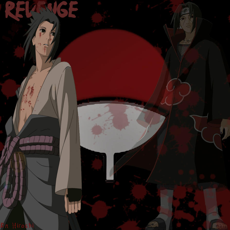
 Reply With Quote


Bookmarks