


Just a few kind of recent ones. I haven't made sigs in well over 2 years.


 AnimeGalleries [dot] Net AnimeGalleries [dot] Net |  AnimeWallpapers [dot] Com AnimeWallpapers [dot] Com |  AnimePedia [dot] Com AnimePedia [dot] Com |  AnimeGlobe [dot] Com AnimeGlobe [dot] Com |
| AnimeGalleries [dot] Net | AnimeWallpapers [dot] Com | AnimePedia [dot] Com | AnimeGlobe [dot] Com |


Just a few kind of recent ones. I haven't made sigs in well over 2 years.
Last edited by Ape; 08-06-2012 at 01:05 AM.
 Mugiwara-no-Basuke thanked for this post


Hmm, I can make a sig but i don't have this level of skill. I like the 2nd and the 4th one. They're really awesome.
 Mugiwara-no-Basuke liked this post
Appreciate it
Another quick one, took probably 10 minutes xD

Last edited by Ape; 07-25-2012 at 06:17 PM.
Mugiwara-no-Basuke liked this post
I'd say this and the spider man signature looks very well done. I would like to say that perhap ease back and the use of so much sync of multiple images and work mainly on one solid color such as pink and white like you had in the middle plate and try to allow the text and effects flow a bit more smoothly. The use of so many side images looks a bit sloppy and to others can cripple your work. Just try to work on this and you work definitely will improve once you put more time into them.Originally Posted by Ape

Last edited by blueangel06661; 07-25-2012 at 10:12 PM. Reason: Do not quote images


In your first post you have there, what catches my attention most would be your 3rd signature. The softness and I love the shade of blue very much. I think it would feel so complete having a border in the signature. I mean, not all signatures should have one but maybe with that one will make it feel like it's all done when you have a white border for it.
http://i.imgur.com/JyvOM.png
This signature here, perhaps you can tone down on the lighting there. Maybe it's my computer screen making it look all bright but the brightness needs to be settled down a little. ^^'
You're pretty good with all of your works, overall. If you want to show off more of your graphics, by all means, go join in Signature of the Week contests (SOTW) and everything. Keep posting more because I'm looking forward in seeing more from you.
your sigs are amazing the ones that caught my eye was i think its ed elric (4th one), and the last one with spider-man
amazing job on these! keep up the good work!

I'd have to pick the 1st and 3rd as my favorites. The only criticism i'd have would be for the spiderman sig.
1. The text is really hard to read.
2. When you look at spider and the building he's on, he appears to be about 15ft tall if not taller.
But thats all that i can say. You're very good at picking colors that work together very well.
Hmmm... Been a whileSit back some time and simply ask yourself, [Link]->"Do you even lift, bro?"<-[Link]
Thanks for the feedback guys. Here's another quick one. Is there any place to fill requests and what not? I wouldn't mind doing that to keep me occupied lol. I'm not the best but I can get stuff done at least.


We have a request section here where people post request: http://www.animeforum.com/forumdisplay.php?147-Requests
If you get enough of a demand for your request you may ask a mod (myself or @Seung-li to open up a signature shop) But otherwise fulfill request in that area. If you'd like I could add you to the Illuminated Spirits GFX group so you could start fulfilling request in the IS thread (There are plenty unfulfilled request in the groups thread we'd be happy if someone could take) Plus you'd get access to the locked section of IS.
今日...明日...永遠に...
Interested in Pop-Up Cafes in Japan? Dango News is the place for you.
Dango News | Twitter | Facebook | Instagram
If you think I'm worthy haha. Sure, I'd gladly be a part of it. Is it all types of requests or just signatures usually? Regardless, I'm down, and I appreciate the offer.
http://i.imgur.com/51YMi.png
I really really love to look at your signatures, you know? :]
May I give you a suggestion though? It seems a little too yellow for me, maybe have it lighten up a bit until it is between yellow and white. I hope that made some kind of sense. ^^' Its so unique and lovely, you really nailed on making the signature balance altogether.
I use a lot of washed up colors, I don't know why it just looks interesting to me. Here's kind of a different color scheme then what I'm used to.
c/c
blueangel06661 liked this post
You can create more depth if you have certain sections be blurred. It seems a little bit too sharpened so now the render is harsh-looking and not so soft. Your typography looks pretty interesting, it has a 3D look and its appealing to the eye. Something pretty as your render shouldn't be busy looking, I suggest keeping it moderately simple, creating depth using some blurs around your signature here and there. But I do adore your typography style and how you got it to look like that.
Ape liked this post
I had a lot of it blurred until I got until the end, and I guess I got lazy :P I see what you are saying though, and I appreciate the feedback. It's really helpful!
Thanks Ayu! You're awesome :P
Yeah, they are all look really great! I really like the lighting and the coloring in them
Last edited by blueangel06661; 07-27-2012 at 10:13 AM. Reason: Answered your question via PM
Thanks, and yeah it would seem so lol
Just a work in progress I'd like some critique on
No Render:
Render / No Text:
Render / Text:

@Ape just a heads up I had to combine your threads in doing so I changed your thread name to something more general, if you prefer something else just tell me and I'll change it.
However your sense of depth is STUNNING. I'm amazed, where have you been these past few years? You've obviously became very skilled elsewhere. I love the render version of it, it looks very pretty and mesmerizing. With the render the render fits in nicely too..... And then we get to the text... And it killed it. The text is just waaaaay too big. I just don't care for it.. I'm horrible at text too but, yeah it needs some work ^-^;
今日...明日...永遠に...
Interested in Pop-Up Cafes in Japan? Dango News is the place for you.
Dango News | Twitter | Facebook | Instagram
Ha, thanks for the critique. I thought the text was just funny, I wanted to take up some unwanted space. But yeah it's baaaad haha. Appreciate your comments <3
Newest signature, tried making something a little small then what I'm used to :P No realistic backgrounds with anime/cartoon foregrounds anymore either haha. Strictly c4d work this time, besides the render of course. c/c
this one too lol

Last edited by Ape; 07-31-2012 at 05:11 AM.
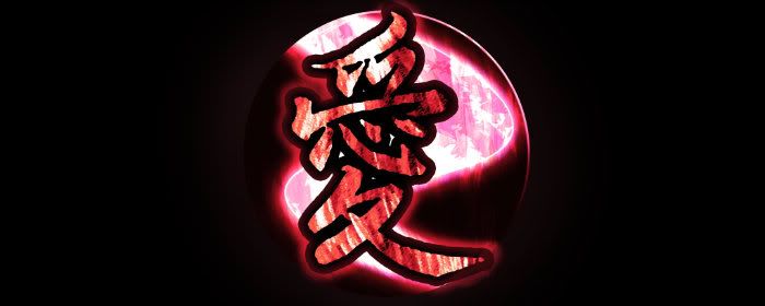
wow... i love the lip/text
also
http://i.imgur.com/m6Q0h.png
the glowy ball of magenta... ive always wanted to know how to do that *pleads* >_____<
Last edited by blueangel06661; 07-31-2012 at 04:54 PM. Reason: do not image quote
It's actually just an effect c4d that I added some linear dodge to haha. I'll put the psd out there eventually just for shits and giggles.
Edit: Made another tag haha. Don't try and read the text, it's backwards. Just thought it looked cool and the text was unreadable anyway lol. c/c

Last edited by Ape; 08-01-2012 at 08:40 AM.
New sig, no real inspiration though when I got to the renderSomeone should collab and finish this for me, I hate the outcome :P
edit: no c/c geez my work can't be getting THAT much worse :P
Last edited by Ape; 08-04-2012 at 09:59 AM.
[x]

These are all flawless what the hell.
I especially love the two in your sigspace :>
ein, zwei, drei, vier bin endlich weg von Dir
fünf, sechs, sieben, acht Du hast jetzt keine Macht
♥
Ape liked this post
I definitely wouldn't say that haha, but I appreciate it Jellal. It is very kind of you
[x]
There are currently 1 users browsing this thread. (0 members and 1 guests)
 Posting Permissions

 Reply With Quote


Bookmarks