Attachment 62602
This wallpaper reminds me of that time I was chained to a giant stained glass clock, watching (with my good eye) the Boojums on Parade. Well ... I don't really REMEMBER it exactly, but it's in my diary, so ...
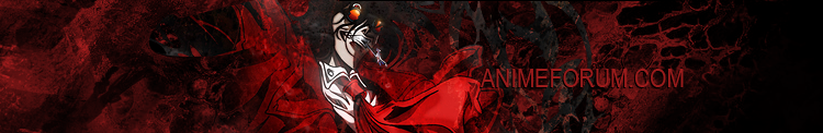
Resources used include screencaps featuring:
Chihiro from
ef: a tale of memories Episode 5
minions of Charlotte from
mahou shoujo madoka magica Episode 3
Please may I have the hat? I need it to complete my outfit for this year's "Don't be a Monkey" protest at Otacon and I can't find it anywhere! Thanx!


 AnimeGalleries [dot] Net
 AnimeWallpapers [dot] Com
 AnimePedia [dot] Com
 AnimeGlobe [dot] Com


Bookmarks