


Sorry for the delay everyone, I planned on posting this Sunday but things got quite busy around my house. Voting will be a little different for this phase. All three signatures will be battling each other, and one sig will be eliminated.
Seung-li/Marudashi vs. Ellipsis/Daken vs. Tatty/Xanfiore
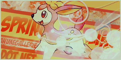
Maru/Seung: Right away this definitely feels like Seung's style, but after digging a bit deeper Maru's style becomes evident as well. The blending is nicely done, but the area on the girl's lower right feels odd, like it should be more opaque. It would be nice to see more done with the clock idea instead of just having it in the background as well. The piece has a very nice spring feel to it, although it could use some more spring-ish colors. The text is nicely done as well, although AG.net is a bit odd, and the border seems kind of weird with the one side being bigger than the other.
Ellipsis/Daken: Both styles here are evident which is nice. There's a very nice flow going on here, and the girl is blended well. The biggest area of concern is that it doesn't feel like spring. The girl reminds me of spring, but with the combination of the orange colors and the leaves in the background, it feels more like fall. The text is also very awkwardly placed and the font doesn't fit the mood of the sig at all.
Xan/Tatty: Tatty's style seems to be dominating here, but Daken's style is noticeable. It has a very nice spring feeling to it, although the little spring banner in the background probably doesn't need to be as large as it is. The biggest flaw with this piece is that there's this dark overlay over the sig which subtracts from the spring feeling.
This was a tough battle, as all three signatures had their flaws. The deciding factor really was the theme. With that said, the team of Ellipsis/Daken will be eliminated.
Moving on to the next round will be:
@Xanfiore
@.Tatty.
@MaruDashi
@Seung-li
 AnimeGalleries [dot] Net AnimeGalleries [dot] Net |  AnimeWallpapers [dot] Com AnimeWallpapers [dot] Com |  AnimePedia [dot] Com AnimePedia [dot] Com |  AnimeGlobe [dot] Com AnimeGlobe [dot] Com |


 Reply With Quote


Bookmarks