


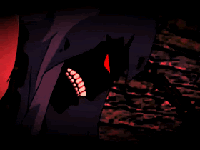
Avi: 6/10 - Could've used a tad more more effort in terms of imagination (It's basically a crop of the sig despite alternative characters for text), but it's an attractive image nonetheless and the cropping's well thought out.
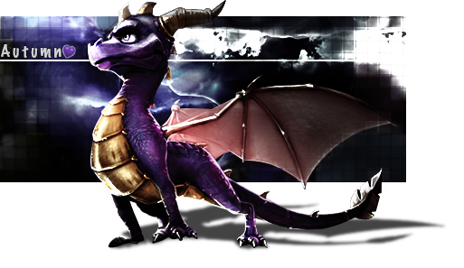
Sig: 7/10 - The intricate details and subtle colours of the background complement the focal subject well, but the oversharpened appearance of the latter does spoil the consistency a bit. The font's a little on the big side imo and could have been used more creatively, but otherwise it nicely suits the overall slick'n cool appearance.
Set: 8/10 - Both the avi and sig unify well as a set; slick looks and decent presentation overall.
Overall rating: 7/10
 AnimeGalleries [dot] Net AnimeGalleries [dot] Net |  AnimeWallpapers [dot] Com AnimeWallpapers [dot] Com |  AnimePedia [dot] Com AnimePedia [dot] Com |  AnimeGlobe [dot] Com AnimeGlobe [dot] Com |
 Reply With Quote


 .
.


Bookmarks