


Avi-Chan vs. Seung-li
Judge 1:
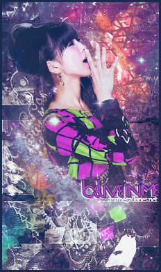
Avi: I like the grungy style of this sig. The colors look good, and it makes the text pop nicely. I think the text is a little too close though, maybe adjust the kerning, so they're little easier to read (I had no idea what it said for a while). A quick sharpen over he face would've gone a long way as well, but it's still a nice solid entry.
Seung: I like the depth and colors you went with on this one. The text works well too, but I gotta say I'm not diggin' the rounded border. My only other problems with this one is that some parts feel a little too sharp, and the C4D (I think that's what it is?) on the right is a little sharp as well. A little blurring would've taken this to a whole new world.
Seung-li gets my vote.
Judge 2:
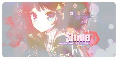
Both of the girls don't seem to blend into their signature well, the first one is cluttered and the other one looks like they just added the render at the end, the border for the second one also looks like it was done in Photobucket, it doesn't look nice, at all, the border that is. The first one also has a typo, I have to go with the second one.
Judge 3:
Avi-Chan
This piece has some awesome blending. I think the effects compliment everything nicely. It seems a little crowded in front and empty in back, but overall not a bad balance. My biggest issue is the it's a bit hard to tell what the text says.
Seung-li
Not your usual style, but I kind of like it. The background is amazingly done, but I would have liked to see some more blending to make things flow a bit better. "My World" seems to work out pretty well, but "create" doesn't fit at all.
I'll go with Avi-chan on this one.
Marudashi vs. Avido
Judge 1:
Maru: I love this one. The text fits the whole sig nicely, and it sorta reminds me of a greeting card. The colors and low contrast sort of give it that hazy autumn sunset feel. from how it was executed and the concept of it, I think it couldn't have been done any better. Maybe lose/lower the drop shadow a bit, and you're gold.
Avido: Liking the text and the concept/challenge of two characters. Can't say I like the border too much (Mainly the right side), but it's not a big deal. I really appreciate how you managed to put two (three if you count text) potential focal points, but my eyes aren't scanning the whole thing for what to look at. Overall though, the only thing I dislike is that the characters contrast seems a bit overdone. Or it's over-sharpened, something like that. I love the colors you used as well as the smudging.
Marudashi gets my vote.
Judge 2:
I will be basing this on the looks,the first one just looks like a photo edit, there's only a few effects. The second has a bit more work on it and looks better overall. Second wins.
Judge 3:
Maru Dashi
I feel a little disappointed because its not her usual works that are creative and artsy so to speak. This one feels like she added text and a border on an image. I must be wrong and I even hate saying that, but I would expect a little more from her in BOTM entry. I hoped she changed it. A good footnote is that the simplicity is nice, I believe simplicity is genuinely beautiful. Typography doesn't bother me at all, I just don't like how it's displayed for me like she can't think of anything, and I know she's better than that.
Avido
I really really like this one. The colours are so bright and vibrant. And it fills my eyes, it's appealing, amazing. I think a vertical signature did pretty well for this work. I didn't like reading the type the other way, maybe it bugged you a little but it could of been worse as if you put it horizontally for type. It's outstanding and a very good job.*
My vote goes for Avido.
Takenoshin vs. illu
Judge 1:
Takenoshi:
I like where you were going with this one. For an only-anime-tag, you seemed to have gotten a good deal of depth out of it. However I feel like the background shapes don't contribute anything in particular to the sig. It seems to just be there. Also, the text isn't bad. I think a more fitting color would've made the sig pop more, but it's still okay from where it stands.
Illu:
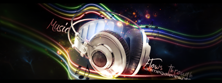
Favorite sig out of this batch. I love pretty much everything about this one; the colors, concept, lighting. It's all fantastic. Only suggestion I might make is the bottom text, "Flows Through", could've been set behind the headphones so as to give it a little more depth. AG.net got a little cut off too, but that's nothing big. Fantastic job though.
illu gets my vote.
Judge 2:
The girl just looks wrong in that signature, they colour of the background could have been changed to something that suits her better so like a yellow-green would have works. Nnnngh That text, why is Lemon there? It's confusing, it also could have been moved somewhere else so it doesn't get singled out in the corner. Now for the second one, this one is better when it comes to looks but music? When was the theme changed to music? Flows through also looks like "Hows through", they should have added a space so you can clearly tell there is a difference. I don't know for this one, I guess I'll go with the first one.
Judge 3:
Takenoshin
I don't come across signatures like this one. I do say it's unique and its composition is very well balanced. However, I'm not a fan of the typography and font you used on it. It won't bring your point down if you'll ask me. Good job.
illu
It's so dark and I don't like how your render seems so blurry to me to your signature. I think it should been a little more alive when you make your signature. I'm not a fan on the font you used in your type. It could been used by something that can go better with it. *Your flow in your signature is quite nice and I love it, wish there could be more done with it. Lastly, I don't like how animegalleries is placed randomly like that. It seems so last minute.
My vote goes for Takenoshin.
Xanfiore vs. Garzhvog
Judge 1:
Xanfiore: I really like the font on this one. The blending isn't too bad, but their seems to be a light overlay that is really taking away from the signature. I like the dots, but the red isn't doing much for the sig
Garzhvog: I have to say, I really love this signature, it's beautifully done. The font and colors work well, and it's simple but not too simple. My only nay say about it is that the light in his mouth is a little too bright and the lights on the creature don't add much.
Garzhvog gets my vote.
Judge 2:
The first signature is simple, maybe too simple, the thing I saw first was shine and not the girl. Their both important in a signature, the creator should have erased some of the effects that landed on the face. The second, I don't know, the text is just awkward. But overall it has better aesthetics then the first one, it looks like more work went into making it, the second one wins.
Judge 3:
Xanfiore
It's so bright and it's a busy busy signature. Don't get me wrong I find is pretty and all cute, but don't over do it with the texture, it ruins the natural beauty of the render you're using so it should stand out more than texture. I say the type is meh, but it's not my cup of tea. And nice job with the border, too. So there is some flavour in it.*
Garzhvog
It's the opposite of Xanfiore, you have things in a good balance and it doesn't seem so cluttered. I love your focal point on your render, the colones are fantastic, and you moderate yourself on things you put on your signature. Wonderful wonderful type, it's a very well done signature.
My vote goes for Garzhvog.
Those who will be moving on to the next round:
@Seung-li
@Avido
@Takenoshin
@Garzhvog
 AnimeGalleries [dot] Net AnimeGalleries [dot] Net |  AnimeWallpapers [dot] Com AnimeWallpapers [dot] Com |  AnimePedia [dot] Com AnimePedia [dot] Com |  AnimeGlobe [dot] Com AnimeGlobe [dot] Com |


 Reply With Quote
Bookmarks