


Sorry I'm so late on getting these up guys...
blueangel06661 vs. Ultear
Judge 1:
BA: Very nice sig. The style reminds me of tatty's . From the way it's made, I can't really say anything bad about it. Everything looks pretty good, but the stroke around the girl could probably go away.
Ultear: I like this sig, it's different, and I don't think I've seen a style quite like that in a bit. Although, right off the bat, my main problem is the size/placement. I think maybe if he wear centered more or if the sig was shorter, it'd work out better. From how it is though, it looks very empty.
Vote goes to BA
Judge 2:
Blueangel: I love the colors and the fact that they do not distract from the main image. You have a very evident focal point that you know you should be looking at and there is great eye flow to draw the eye to it. The three things that I would reconsider, if this was my signature that I had made, would be to perhaps make her a bit smaller and get more of her body into the image, as she looks a little awkward in the pose that she's shown in. Perhaps adding more of her form would help this. Also, for the softness of the image, the thick stroke around the girl seems clunky. If this is changed, however, the font that was used should maybe also be changed, perhaps using a lighter, thinner font may then work. Perhaps a thin white stroke around her that would repeat the stroke along the bottom and top of the image, which I rather like as it keeps the eye in the image that you're looking at. However, I really enjoy the colors that were used and worked with. Good job.
Ultear: I like that the person was placed off to the side, in this signature, however, the thick line of orange/yellow across the middle is fairly distracting and leads the eye right off the page. Either toning down the colors or perhaps separating them, so that you have a strip of bright colors across the top and bottom boarders may be nicer but with it as it is, it makes that the main focal point instead of the figure. Considering a different color for the font may also be helpful. I'd also like to see the font not crowding what is supposed to be the main focus of the signature. However, I enjoy the colors that are being used. Good job.
My vote goes to blueangel.
Judge 3:
Blue: What I love about this piece is that you put a big emphasis on the person's name. The blending isn't the greatest, but I love the effects done. The color scheme also helps draw my attention to the girl in the piece.
Ultear: I love how my attention is first drawn to your main character, which is good. The background also really helps draw out the character. I feel like the signature could have more though. It's a cool job for only smudging, but I feel like the right side could use something more to it. Also, the font on the text works well with the piece, but the color could go along with the color scheme a little more.
Vote goes to blueangel.
Seung-li vs. Garzhvog
Judge 1:
Seung-li: Okay, first off, this was hard to decide, because I really like both of these, but I had to look at who they were made for and the functionality of them so that I could pick one. With that being said, on to the critique. I really enjoy the colors that are being used in this one and I enjoy that she's been placed off to one side, so that she's not directly in the middle, we, as humans, tend to find this more visually pleasing to look at. However, the background is distracting from the figure and it would be nice if it was toned down (maybe if the opacity was adjusted). The font is hard to read and that means that it will be less effective as a signature. Perhaps using the dark purples that are in the kimono would help this stand out more. However, I think that you've picked something that would describe Chii very well and I enjoy the stroke around the outside of the signature-it keeps the eye within the frame. Good job.
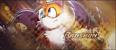
Garzhvog: Elli, this sig does well to describe Mac and I think that you did very well to show him in this signature. I'd love to see a little bit more of the orange of Tails coming through in parts of the background, however, the toned down background is nice and doesn't distract from the main figure. The font is close to the figure but doesn't crowd it out and you have a very nice flow going for the figure. I would maybe like to see the stroke around the outside just a LITTLE bit thicker. Not too much, because Tails eyes lead right off the page and you need just a little bit more to hold you down to the sig that you're supposed to be looking at. Good job.
Vote goes to Garzhvog.
Judge 2:
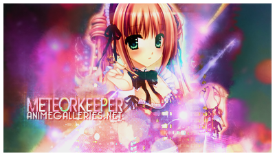
Seung-li: Aw man, I really love this piece. Somehow you managed to incorporate real life and fantasy together wonderfully. I love how you blended the girl into the picture by putting flowers in front of her, and blurring part of the background was pretty cool. In fact, my only complaint is that the text is a little hard to read and the AG.net font doesn't really fit with the rest of the piece.
Garzhvog: Gah, I really like this piece too. The color scheme is awesome and really brings out Tails. I like how you blend Tails into the signature and the font is awesome. I also really love the lighting you did on Tails' right side. The part in the lower left is really bugging me though. It just seems so plain compared to the rest of the signature.
My vote goes to Seung-li.
Judge 3:
I'm gonna cast my vote for Seung-Li's sig. The reasoning being that while it does have a somewhat abnormal size, the colors and background seem to not only match the stock but bring it into a single image. The typography also seems to match the stock better along with the effect to the right of the text. Overall I feel that the image is blended together quite nicely.This isn't to say that the other isn't good or blended but I get a feel that all of the portions of seung-li's image belong where they are. In other words it's the smaller details that caused me to vote for it though both entries made it difficult to choose.
Avi-chan vs. illu
Judge 1:
Avi: Avi's sig got my attention first <3. I'm automatically attracted to colors, sue me. But there are some things I dislike. The effects are a little smudgy looking with a grungy font. I don't think it's working for this one, maybe if it was a fully grunge sig, it would've been a little better. It's not a bad sig though, I actually like how it turned out. I think the background smudging could've been a bit cleaner though, or better blended.
Illu: Another colorful sig yay. I like the text in this one, but the swirly font looks a bit odd. The rest of it is your basic signature, but I like the simplicity of it. The colors look great too, so illu gets my vote this time.
Judge 2:
Avi: I really enjoy the color choices that were used in this signature. I do like the boarder, but I do find it a bit too thick, and I think maybe slimming it down and changing it to one of the other colors in the signature may have been a good route to go. It doesn't seems to flow with the light playfulness of the rest of the signature. I find that the pink under the pink for the font is hard to read. I would have liked to maybe see the darker colors in the signature (the purple in place of the pink). I do think that the font that was used was a good choice and maybe the boarder could have been slimmed down to about the same size as the thickness of the font. Good job.
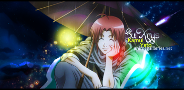
illu: I enjoy the image that was selected and the offsetting of the figure in the signature. However, the text seems to heavily crowd the face, and maybe would have been nicer if it was placed off to the left side. Also, the font doesn't seem to fit too well as does the streaks of bright green, yellow, and red. They seem very out of place for the image that was selected. Perhaps matching colors to the actual image used and then toying with the vividness of the colors or adjusting the opacity would have been nice. However, because it is a night scene, I do enjoy the black strokes that were used along the top and bottom of the signature is nice. Good job.
My vote goes to Avi-chan.
Judge 3:
Avi-chan: This one has some amazing blending and colors. The colors match the stock almost perfectly, and I absolutely adore the text. The issue I have with this one is the weird plan teal area to the right.
illu: Man I love this piece. There's some subtle blending going on here, which enhances the piece. I also love the lighting going on here. The text and font is also really well done. I would've liked to see more done with the background though.
This was a tough one, but my vote goes to illu.
Odd one out: Marudashi
Those who will be moving on to the next round:
Participant list (4/16)
@blueangel06661
@Seung-li
@illu
@MaruDashi
 AnimeGalleries [dot] Net AnimeGalleries [dot] Net |  AnimeWallpapers [dot] Com AnimeWallpapers [dot] Com |  AnimePedia [dot] Com AnimePedia [dot] Com |  AnimeGlobe [dot] Com AnimeGlobe [dot] Com |


 Reply With Quote
Bookmarks